Play game
Cluck Hunt's itch.io pageResults
| Criteria | Rank | Score* | Raw Score |
| Enjoyment | #3247 | 2.606 | 2.786 |
| Presentation | #3284 | 2.806 | 3.000 |
| Overall | #3424 | 2.762 | 2.952 |
| Creativity | #3548 | 2.873 | 3.071 |
Ranked from 14 ratings. Score is adjusted from raw score by the median number of ratings per game in the jam.
How does your game fit the theme?
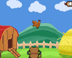
Role Reversal on the concept of DuckHunt, Where you play as the hunted instead of the Hunter
Did your team create the vast majority of the art during the 48 hours?
Yes
We created the vast majority of the art during the game jam
Did your team create the vast majority of the music during the 48 hours?
No
We used pre-existing audio
Leave a comment
Log in with itch.io to leave a comment.


Comments
the hit box is too big - i dodged those snipes bro
Fits the theme wonderfully, not to mention the game looks (and sounds) wonderful too! Only problem with the game would be the somewhat inconsistent hitbox on the shots, as well as how long they last. I noticed I lost a life by going over a place that just got shot at (as cued by the sound effect), and I had also noticed despite not being in the crosshair at all I got shot all the same. But to reiterate, the game is very fun and I enjoyed my time with it greatly!
Huh, Funny that's happening, But thank you for the Rating!
Balancing the hitboxes was a slight challenge as having too accurate hitboxes in some areas meant that the game could just be Cheesed by standing in corners or small blindspots, making them fix that problem meant that at some places, the hitbox would get slightly large enough to just hit a player who might not be in the crosshair. It needs some tweaking in that regard.
Definitely fits the theme! The spritework is really good, but you have inconsistent scaling going on (see Cluckle's sprite vs the cat's sprite, the pixels are different sizes). I think you could make the whole thing pop more if you had a more consistent aesthetic. Gameplay wise, the game is solid- since moving the character with the mouse directly makes it easy to dodge, maybe you could consider something more like flappy-bird style movement for Cluckles to make dodging more difficult. Nice job!
Thanks for the Rating!
We weren't too sure of how we'd like the movement to be, and eventually, we felt that it might make more sense for the main character to have free movement to make the gameplay more dynamic. In the initial builds, I kept the reaction time needed to escape some shots a little too fast, which made it quite difficult, so I lowered it to make it a bit more accessible for everyone.