Play game
Economy To Scale's itch.io pageResults
| Criteria | Rank | Score* | Raw Score |
| Creativity | #2908 | 3.163 | 3.417 |
| Overall | #4717 | 2.495 | 2.694 |
| Enjoyment | #4770 | 2.315 | 2.500 |
| Style | #5966 | 2.006 | 2.167 |
Ranked from 12 ratings. Score is adjusted from raw score by the median number of ratings per game in the jam.
How does your game fit the theme?
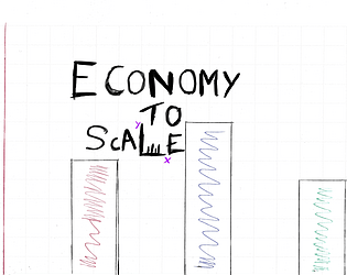
You must SCALE your way across Bar Graphs that you must manipulate the scale of the Bars to reach the exit.
Development Time
96 hours
(Optional) Please credit all assets you've used
All assets were created by me and my teammate.
Leave a comment
Log in with itch.io to leave a comment.


Comments
I liked the concept, and appreciated the way the game introduced the concepts gradually. Would be great to see more ideas around the graph concept modelled out. Overall a great POC
Currently it is a little bit too easy to raise and lower the platform while you are standing on it. It would be interesting to see if variety of level design is possible, like horizontal graphs or a different movement mechanic like a bouncing golf ball.
This is a great mechanic with a _lot_ of room to explore - an excellent proof of concept!
I'd love to see even more of this: maybe with more graphs, manipulating the underlying data, and maybe more communication of whether or not there's a hidden key (getting to the exit for it to not work feels off, but a different door sprite with a lock could fix that!)
I had no idea Godot supported Rust. Wow good for you.
REALLY creative take on the scale theme. I love it! I feel like this mechanic can be extended in so many different ways! My only complaint is there wasn't a lot of visual feedback to indicate what needed to be clicked or when you max'ed min'ed a bar column. Really cool concept though, I had fun!
+1 respect for developing this in Rust.
I enjoyed the art style. The character movement was ok, I found that if I kept holding space when I landed the character did an akward "bounce". I initially thought that was a feature but it wasn't enough of a bounce to get me to the next platform.
The sticky note levels were cool but it would have been nice to see this picture clicking mechanism utilized with more creative level design. You're on to something with that bit!
Good job!
A nice fun concept. The platforming was quite basic, but functional for what you need it to do. I really liked the simple ingenuity of simply taking a photo of a post-it note. The manipulating of the bar charts was quite interesting, but the interface was a bit wacky. At one point a bar began switching between two modes, eventually pushing me off. Also, removing people with a right click was unexplained, and seemed inconsistent. Celeberty_B could not be reduced to zero people, whist Celeberty_A could. That felt inconsistent. I wish you good luck with any future endeavours.