Play game
SHIFT's itch.io pageResults
| Criteria | Rank | Score* | Raw Score |
| Creativity | #5570 | 2.291 | 3.500 |
| Style | #6036 | 1.964 | 3.000 |
| Overall | #6091 | 2.000 | 3.056 |
| Enjoyment | #6341 | 1.746 | 2.667 |
Ranked from 6 ratings. Score is adjusted from raw score by the median number of ratings per game in the jam.
How does your game fit the theme?
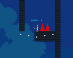
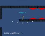
The scale of space shifts throughout the game, not in size, but in the ratio of length and height. This offers some interesting tradeoffs and platforming potentials.
Development Time
96 hours
Leave a comment
Log in with itch.io to leave a comment.


Comments
Quite a cool idea! Execution definitely could’ve used some work though. I only got as far as the part where you’ve gotta increase the height of a jump in order to bypass spikes, but after making that jump fell out of the world and was reset to the start.
My first piece of feedback would definitely be to implement checkpoints. Having to restart the game whenever one messes up is quite troublesome. It was also odd how while falling off the world only resets the player to the start, hitting spikes resets the game as a whole. They may as well be the same, since usually after being put back at the start the scale has shifted such that it’s impossible to progress.
I think the scale mechanic would feel better if it didn’t require energy crystals to do. It would also prevent the player from getting stuck after shifting the scale the wrong way, and being unable to shift it back.
The character animations were a bit off: seems like it’s not always recognizing when it has landed on ground, so the character is stuck in its airborne sprite even whilst grounded. Also, sometimes the player seemed to get stuck on a tile while walking. I suppose that stretching the colliders of the tiles has some issues that’ll need to be ironed out.
Anyway, the idea for the game is quite interesting, and it seems you’re planning on turning it into a full-fledged game, so I wish you all the best with that! Good job on what you managed to make for the jam! Oh, also I liked the funny text in the game’s background. Love that kind of stuff.
Not gonna lie everything is very confusing. From the UI to janky controls. Also, it’s hard to read when you need to constantly jump to have the text in view. There is a kernel of a good idea. It just needs better realization. I can admire your dedication and it’s impressive you guys got here at your age. Kudos.