Indie game storeFree gamesFun gamesHorror games
Game developmentAssetsComics
SalesBundles
Jobs
TagsGame Engines

Fover

136
Posts
1
Topics
16
Followers
139
Following
A member registered Sep 02, 2018 · View creator page →

Creator of

Recent community posts

Cool game! I liked the bit of dialogue around the start, and the giant robots were very cool.

My first two plays I was able to win simply by spamming attacks as much as possible, as I didn’t realize you could also move around. (Since it wasn’t in the controls menu. Though I really should’ve tried the arrow keys anyway.) So I was going to give some feedback saying that for the enemy to have more damaging moves, perhaps some that require use of different perspectives to properly avoid, would be nice. However, upon replay, I’ve found that the asteroid move, when one isn’t getting super lucky with it as I apparently was, fills that role pretty well. I do think that the purple projectile from the enemy could’ve used more range, as most of the time it would dissipate before reaching me.

I found a super dramatic bug where if both the player and angel - sorry, I mean enemy robot - die at the same time, neither a game over nor a win will trigger, leaving time frozen as the townspeople stare on… It’s hardly that problematic a bug but I figured I should mention it.

Despite some of my criticisms, though, overall very nice game! Great work on this.

Ah, I see. Thanks for the feedback!

Thanks for playing! Glad you found it fun and the energy field cool.

By the time I got around to implementing sound effects, it was the night before the jam deadline, so I didn’t end up implementing as much as would’ve been best. Definitely gonna add more in a post-jam build, which will probably help provide more feedback for the player’s actions.

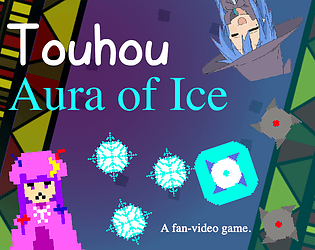
Cave looks cool! Imma definitely check it out for myself sometime. As for the Touhou references in this game, as far as I know both the player character (Cirno) and the boss (Patchouli) make their first appearances as bosses in Touhou 6: Embodiment of Scarlet Devil. The more you know ☆

Thanks for playing!

Indeed, one of the things I’ll definitely try to implement in a post-jam build will be some seeking with the frozen saws. Probably not global seeking, since I do want the player to have to wait for the opportune time to throw them, but enough such that shurikens that aren’t directly below Patchy don’t just end up useless. Thanks for the feedback!

Awesome game! Had a lot of fun playing. The mechanics were fun to use and the inclusion of enemies made some rooms very tense. Liked the way that small cubes could be used as projectiles. Would’ve been nice if they could stun enemies. The game’s atmosphere was very well done, also.

Wish there were some levels encouraging more prop surfing. At least in my experience, I had to be careful around the enemies so had to play more slowly and deliberately, which wasn’t bad (actually quite fun) but I wish there were some levels where, for instance, you had to quickly traverse a gap by jumping across of boxes spawned mid-air.

My main criticism would be that, at least at first, the buttons felt quite fiddly to press. Having to get the size of the cube just right is troublesome when there’s the matter of perspective to consider as well. Found that I got the hang of it (mostly) by the end of the game, though, and it did feel pretty satisfying whenever I was able to consistently get the box sizes right. Some more leeway in the size requirement would probably be best, however.

But besides that, thought the game was very well done! Definitely one of my favorites I’ve played this jam. Great work!

Fun game! The gameplay loop is pretty fun; getting points based on how close you are to the order, rather than on a binary succeed/fail system, is nice; and the game’s art and music are nice and fitting. Good work!

Not sure whether the intended behavior of the bananas was to be movable only slightly or freely. Most bananas exhibited the former behavior, while the smallest one was able to be moved freely.

Very nice pixel art, but the gameplay feels pretty rough. Wish the cooldowns on actions weren’t so long (especially on the reflect move) or were at least shown on the screen. Godot’s built-in progress bar nodes could probably be helpful for such things. The boss’s projectile move was nice, giving you a gap to dodge through, but its rushing and jumping attacks seemed too often undodgeable. It was, in fact, EZ for him to kill me every time…

Again, though, very nice pixel art. (I didn’t recognize Suika in the thumbnail, having only seen her a few times in some fangames, but when I saw the title screen I was like “No way…”) And the size switching mechanic seems cool too, especially with each size having a different ability. Execution just needs some polish.

Didn’t expect to see another Touhou related game in the jam! I made one as well, ha.

Awesome game! I absolutely love the concept and while the first two levels had me skeptical as to the the idea’s value, the latter two had me thinking! Might even go back and see if I can three-star level 4…

Great job! Makes me thankful I grew up in an era where school busses ending up on the tops of mountains is no longer commonplace.

On another note: NOOOOO!!! I NEED TO SAVE THOSE KIDS IN LEVEL 5!!! YOU MONSTERRRR!!! AAAAUUUGGGHHH!!!

Cool twist on Tetris! Do wish that there wasn’t a time limit, though. I’d play a lot more if the game went on until you topped out, as usual. Good job in any case.

Reminds me a bit of a ROM hack for NES Tetris called “Shrink Mode.” Worth checking out if you happen to be a fan of NES Tetris.

Cool game! I particularly liked the switches that trigger when a window’s over them. ’Tis a good and interesting use of the window moving mechanic.

Some indication as to a window’s maximum size may have been nice. For instance the window changing colour if it’s stretched as far as it can go.

Overall well done game. The theming and such is nicely done also. Good job!

Was confused for a moment, thinking that you were the developer commenting on his own game, before realizing that the game you submitted isn’t Banana for Scale but Banana for Sale!

Nice game! Definitely pretty janky, but in a sort of fun way. Was also pleased that I was never softlocked or anything; seems there were measures to make sure the player doesn’t get stuck.

Searching for the last item was somewhat troublsome. It’d be nice if there was something to help the player locate the items. An idea I had whilst playing was that it could be neat if the ants tended to gravitate towards the items, which would help the player find them but have the tradeoff, of course, of the items then being guarded by ants.

The surprise after collecting all the items (I thought for sure I’d never find that boot, but eventually stumbled across it.) was nice also.

Overall good work! Love the funny idea the game is based on, as well. How funny it is to use bananas as scales, when everybody knows that the only real unit of measurement we’ll ever need is football fields.

Ah. Getting Over It with Playerdox.

Made it to the fifth strand of hair before stopping off. The punishing way you can fall all the way to the bottom is no doubt funny, but it’s not necessarily motivating for players. Checkpoints would be a welcome addition, and then perhaps you could provide the option for a “hard mode” that does away with them, like the way the game is now.

Swinging 360 degrees to build up momentum was cool, even if I only managed to pull off a jump making use of it once.

Good game, in any case! And I like the theming, what with all the hair.

Extremely fun game! I love being the King of France!!!

Throwing ladders was a cool and fun mechanic. While the lack of a trajectory indicator made it a bit difficult to initially figure out how changing the hand position changes the trajectory, I think overall the lack of it made the ladder throwing more fun and goofy.

Combat was also pretty fun, serving to split up all the ladder throwing a bit. Great choice to add that in. Do wish there were more opportunities for enemy-ladder interactions. Clambering over an enemy whose head I threw a ladder over was one of the highlights of my playthrough. (Though it paled in comparison to becoming the King of France, of course.)

Music was nice, as well, and the visuals fit the game’s style, I felt.

Great job on everything! A great game, and an even better historical commentary on the flaws of the infamous Maginot Line. (Well, not really due to the time period.)

Interesting game! Admittedly didn’t keep me occupied for too long, but it was fun seeing how many of each colour box could be stacked upon another until the latter collapses, and making an attempt at an arch, and going “Gah!” when the foundations of my arch collapsed, resulting in a lopsided thing. Grabbing building materials from the river is fun, also.

I do think it would’ve been nice if blocks could be moved or destroyed after being placed. Perhaps there could be an item you pick up from the river that lets you destroy boxes and such.

Would be interested in seeing what this idea turned into a fuller game would look like. Also, I like the game’s sort of surreal-looking thumbnail image. Was what got me to check it out!

Well done game! Explores the pillar scaling mechanic in a good variety of ways. Even if it’s relatively a simple thing, just seeing the horizontal pillars for the first time I found cool.

I do think some of the later levels were a bit too mechanically challenging, though. They made great use of the mechanics but their difficulty could perhaps be toned back a bit, perhaps by adding more frequent checkpoints.

Besides that criticism, though, an extremely well made game! Great job!

Thanks for playing! What exactly are you referring to when you say there was inconsistency in the pixel art?

Some tips for myself, for next time I use Godot:

  • If the scripts straight up ain’t running, it’s ‘cos there’s a mismatch between what node type a script extends and the type of node it’s attached to.
  • If an object’s position seems weird and offset, it probably really is offset. Check its local position.
  • Don’t make the silly mistake again where you fed an object a sprite instead of a prefab thanks to quickload.
  • Have fun! (Ideally…)

I like the idea of the game. It was fun using the scale to determine how many of each item I need to provide the customer, and the stealing hands you’ve gotta catch are a very fun touch.

The execution here’s somewhat cumbersome, however. The items (at least those at the start; it seems later on you’re meant to build up to selling ships) are so small while the play field is so large, and the fact that you can only move one item at a time has things feeling quite tedious. A smaller playfield and larger items would make the game feel much better.

I can definitely see what you were going for with this large playfield; throughout the game the player is meant to progressively sell larger and larger items. However, the game’s feel at the very beginning, when dealing with small items, should have been prioritized, as otherwise new players won’t decide to play long enough to the point where they’re selling the titular ship.

I for one didn’t get very far, as there came a point when I ran out of items to sell. I think it would be nice it items passively spawned, such that the player can’t really run out and find themselves softlocked. (Or maybe they did passively spawn, but too slowly for me to notice.)

Sorry for all the criticism. The game’s idea is pretty good and would be quite fun if the execution is improved. Good work on it!

Cool idea with the scale gun. Do wish it’d have been possible to remain on a platform even as its size increases.

Made it to the green, which I assume is the win condition, even if I wound up burnt to a crisp in the end eventually…

Next jam make sure the restart button in the death menu works. Mighty troublesome having to reboot the game each try. If making a button to reset in a menu would take too much time during a jam, at least having a script in your project that resets the current scene when the ‘R’ key is pressed is a good idea.

Good work in any case! I liked the lava themed look of the menus.

I liked the idea of moving a magnifying glass around in order to zoom in on the ants and the food. Though it seemed a bit redundant as one can already see the ants and the food without it. Besides that, couldn’t quite seem to properly place the lasers, let alone use them to cull the ant population properly. Interesting idea, but the execution could’ve used some work.

I like the idea of the scale gun! Being able to increase and decrease the size of blocks at will was fun. Thought it was a shame that really only the first level gave the player the freedom to really do that.

While initially one would think that the idea of blocks that can only grow and blocks that can only shrink would make sense to provide the player with constraints, in practice I don’t think they worked very well. The blue blocks you would just shoot once and be done with, meanwhile the red blocks would force you to restart the level if you increase their size before moving past them.

The enemy projectiles not directly killing the player but rather simply pushing them was rather interesting. I was thinking it would be cool if there were projectiles whose size were affected by the scale gun, such that they could be grown for use as platforms, or shrunk if they need to fit through a small gap.

The game was pretty good overall, but again I thought that there should’ve been more opportunity for the player to freely increase and decrease the size of platforms like in the first level. I thought doing so, especially when I was on the very platform whose size I was modifying, was very fun.

Ah, I just remembered what the scale gun’s platform size modification was putting me in mind of. Put me in mind of those sponge platforms in the singleplayer campaigns for Splatoon, which is a good thing as those platforms are indeed fun. In Splatoon, also, enemy projectiles will decrease the size of the sponge, which would be an interesting mechanic to implement in your game as well; another way the enemy projectiles could affect the player without directly killing them.

In any case, good job on the game, and great job getting it done in only 48 hours, also!

Fun little game. Not too much nuance to the size mechanic, but it did serve its purpose as both a time and move limit to challenge the player into navigating the levels efficiently.

Switching the player’s controls around for the last two levels made for an interesting twist, though it could’ve been communicated better (perhaps simply via a quick menu screen hinting to it between levels), as it initially made me think the controls were broken.

Not sure whether the gradual falling during stage 3 was also intentional. I suppose it must’ve been. Such a mechanic was kind of interesting, but its implementation here felt a bit janky, and more like a bug than an feature. If it’d been ironed out more it could be nice.

Good work overall. Trying to navigate the tile-based levels as quickly and efficiently as possible was a fun challenge.

Like the other guy, liked the music but alas, the game kept on crashing between levels. Farthest I made it was level 3 on a lucky go. Can’t really judge how well the game’s mechanics play based on those first three levels, as they were simple introductory levels, but it did seem like they could lend to a fun puzzle game. And especially with that nice BGM, a fixed version of the game would probably be quite enjoyable.

If you don’t mind some additional criticisms: the camera movement would feel better if it rotated around the puzzle, and some indication as to when one block is blocking another would be nice, otherwise it just seems as if that’s however far a box can go. Also, sometimes clicking on the player box would not register.

Good job in any case. As I said, with the crashes fixed this does look like it’d be quite enjoyable.

Very fun! Building bridges and stacks out of the blocks, and using the magnets to stick to the ceiling were both cool mechanics that felt quite good when used together.

My main piece of feedback would probably be that the first room (the first one with spikes that is) should have a checkpoint even if walking back from the start isn’t so bad. Most players will probably die at least once when getting a handle on the block spawning mechanic (I know I did), and that little bit of walkback can feel troublesome when having just started the game. It’s a minor thing, but theoretically it could cost you a player so I felt I should mention it. Oh, and also perhaps it’d have been nice if the spacebar could also be used to jump, as using W to jump feels a bit troublesome when you’ve got to then press S to spawn a block whilst in the air.

On another note, absolutely loved the confetti party at the end. That was awesome and made me laugh.

Great work! I found the game to be very enjoyable.

Quite a cool idea! Execution definitely could’ve used some work though. I only got as far as the part where you’ve gotta increase the height of a jump in order to bypass spikes, but after making that jump fell out of the world and was reset to the start.

My first piece of feedback would definitely be to implement checkpoints. Having to restart the game whenever one messes up is quite troublesome. It was also odd how while falling off the world only resets the player to the start, hitting spikes resets the game as a whole. They may as well be the same, since usually after being put back at the start the scale has shifted such that it’s impossible to progress.

I think the scale mechanic would feel better if it didn’t require energy crystals to do. It would also prevent the player from getting stuck after shifting the scale the wrong way, and being unable to shift it back.

The character animations were a bit off: seems like it’s not always recognizing when it has landed on ground, so the character is stuck in its airborne sprite even whilst grounded. Also, sometimes the player seemed to get stuck on a tile while walking. I suppose that stretching the colliders of the tiles has some issues that’ll need to be ironed out.

Anyway, the idea for the game is quite interesting, and it seems you’re planning on turning it into a full-fledged game, so I wish you all the best with that! Good job on what you managed to make for the jam! Oh, also I liked the funny text in the game’s background. Love that kind of stuff.

Even though, as you’ve said, the game’s kind of broken, I liked what I saw! Going into a game called “Monster Builder,” I sort of expected it to mostly comprise of some kind of menu where you select monster parts. Let out a surprised “Augh!” when I was thrown into a creepy warehouse with a first person view, and a 4-slot inventory harkening to Lethal Company!

While there wasn’t much to do, I liked looking around the very nice environment you’d crafted for the game, then creating a slime, and finally using the slime to jump atop the operating table whatzitcalled.

Despite it not quite turning out completely functional, great job on the game! I’d like to see what it looks and feels like in a completed and/or function form, to be frank.

Some random thoughts, if you don’t mind: the vastness of the warehouse put me in mind of a combat arena. Having to sometimes fight and subdue one’s own creations would be very cool. Or even crazier, having to sic one’s creations on authorities cracking down on one’s illegal monster building business would be awesome.

Cool idea. All three building options are quite fun to use. Using the reverse-gravity for the first time in particular felt quite cool!

There seems to be an odd bug where the music resets whenever the player presses the space key, which is troublesome for those who like to use that to jump.

And in the final puzzle of the cave zone, that long moving platform is able to push the player through that small gap. Pretty sure that’s not intended.

Stopped off at the checkpoint underneath those giant waterfalls as I couldn’t figure out how to progress, and some of the platforming had become rather difficult, and not quite in a fun way. In particular the spacing between that higher platform and the first of the small floating islands felt quite unfair, and I was only ever able to make it once. Implementation of “coyote time” would’ve made the platforming feel much better. The wall jump timing also felt a bit janky.

Despite my criticisms and my not finishing the game, I dad fun with it and thought it a cool idea. Making decisions as to which build option to opt for made for some interesting little puzzles, and again I thought the gravity switch was fun. Perhaps such puzzles came later on, but levels where you must place platforms, then switch gravity to utilize them, I think would be very cool. In any case, good job!

Though it was just one level, I enjoyed that! I really should’ve expected it, but the ball suddenly growing that large startled me in an amusing manner. The controls felt a bit off at times, particularly when the ball builds momentum, as you have to wait for it to slow before you can regain control. But slight criticism aside, good work! I had fun.

Fun game! Loved being able to customize my machine periodically, and the gameplay was fun, albeit easy (but that’s better for a jam game, honestly, since there’s so many games to play and rate…). Ah, the menus were a bit janky sometimes, though, but never to the point of great frustration.

In the second iteration, liked using the gun as a sort of sonar to track down fish, by listening for a hit confirm sound. Thought that was cool. Switching to side scrolling platformer for one level was also very nice! A good change of pace in the middle of the game, which made sense thematically as well. Oh, and the sound effects and such for consuming fish in the ocean levels were very satisfying.

I do think it might’ve been cooler had the machine not undergone slightly less radical design changes each iteration. Because of its radical design shifts, and the fact that your upgrade choices from previous iterations doesn’t seem to affect those later on, it felt a bit like we were simply controlling a new machine each level, rather than building on a machine that’s gradually growing larger. Of course, with the size leaps involved it does make sense for the machine’s design to change radically, but for some of its old self to remain would have been cool, I felt.

Now, this is a bit of a tangent now, but I’m now thinking about how cool it would’ve been if, in its first few iterations, the machine had some key weakness, that in its later iterations would become difficult to exploit, only for it to be the machine’s unexpected downfall right before it was able to wipe out the last of the universe… Sorry, I just had to put that out there.

Anyway, overall great game! Had fun playing. As others have said, great gameplay, and the sound design was also fantastic as well! Good job!

Yaaa!!! Baka janai yoooo!!!!

Thank you for the comment and the funny video!

Thanks for the feedback!

Getting rid of the base shot and adding homing to the reflected projectiles were both things I’d considered. I decided against the former since I thought “Ah, but a shmup where you can’t shoot would feel a bit off…” and I found that it was nice to be able to whittle down the last bit of the boss’s health when the damage from your reflected projectiles comes up a bit short. Though in the bit of playtesting I’ve seen (unfortunately not done ’till after the jam, ha), it was indeed the case that the existence of the normal shot tended to impede players from getting used to the sawblade reflecting.

And regarding homing on the reflected projectiles: I considered adding that but didn’t feel as though I had the time. Definitely one of the first things I’d implement in a post-jam build, though.

I’m glad you liked the concept! To be frank I myself was pretty happy with the idea and thought it could perhaps even be made into a full game, so am glad to hear the same from somebody else!

Oh, and yeah, I totally should’ve put the boss indicator at the bottom of the screen. Had some other weird idea I didn’t get around to trying where the boss’s HP indicator is some kind of line drawn from the boss to the bottom of the screen (making it easier to see where they are without looking up) but apparently missed the obvious QoL adjustment. Another thing to try changing in a post-jam build.

Don’t worry about getting frustrated on the third pattern. That one annoys even me… I can’t imagine who would deign to design such a dastardly thing!

Was worried for a second that this would just be one of those mindless numbers games, but quickly realized it was, in fact, a mind-racking numbers game instead.

At the moment I don’t quite have the time to make it all the way to the end of the game, but what I saw interested me enough such that I’ll most likely return to it sometime to see if I can indeed scale this tower…

Really like the 1-bit visual style, also! And seeing an Armoury and a Bank in a strictly tile-based game like this immediately put me in mind of ZZT, which is a definite boon. Fantastic work!

Interesting game, in art and in structure and story. Didn’t end up going past the knife dodging, though. When I hit a knife the character disappeared and it seemed as though the minigame wasn’t going to reset, and I didn’t quite want to replay the cannon part. The random-ish placements of the platforms during the cannon bit (It seemed as though a random arrangement was picked each time.) felt a bit janky. Bouncing off of the tongues of fish to reach the moon was a most interesting experience, however!

Good work, though definitely could’ve used more polish in terms of gameplay.

Quite fun. Loved the flavour text, stats, and grainy images for each of the moguls. Wouldn’t it be crazy if “Elliot” and such were real? Do wish it’d say what the stats do, assuming they do anything.

Would’ve been nice if as the map expanded there were more buildings. I mean, there’s a new building every now and then, but at least on the run I just did there were hardly any buildings by the time the map had maxed out, so it hardly felt like the company had really scaled at all. Maybe I just got a bad seed. Actually, I may have gone with a blank company name there, so maybe that was my karma for laziness.

Very cool how the company name serves as the random seed for a run, also.

Very fun! And fantastic presentation as well! Love a good dodge ’em up.

Very cool how the falling notes match up with the music (I’m quite sure, though at times it didn’t seem too in sync, but that might’ve just been me.) though it did mean that, at least for the first while, one can simply camp the right side of the screen where there are hardly any notes. Though, what with the speed of the falling notes compared to that of the player, camping a low projectile area is pretty much essential to survival…

While I didn’t think the laser beam was difficult enough to really keep me on my toes whilst camping the side, I really liked it. I love laser beam attacks like this one, and your sound and visuals on it were really great!

I was thinking that if the coin crossing the screen was a projectile the player had to avoid, that’d be pretty interesting. I actually initially thought it was a fireball! What with its waving motion greatly resembling those in that old Mario Bros. game. Perhaps any sort of horizontal projectile, perhaps one the player had to jump over, would’ve make things more tense.

Anyway, sorry for a bit of a long comment. I just had to mention the thing about the coin. Great job on the game!

Very good presentation and the gameplay feels very smooth, though seems to be quite difficult. Very difficult to accommodate for some of those pieces, so my tower never got very high… But despite that the aforementioned presentation and smoothness of the gameplay had me trying quite a few times! (In fact, I’m even now feeling tempted to play more, but there are other jam games to play…) とにかく楽しだった!あれ?

Alas, my car too kept imploding… On another note, really liked how gramps moves about on the menus!

Cool game! The attack mechanic is interesting and feels really cool when you’re big, though quite less good when you’re small, especially with how adept those green dudes sometimes are at running away. Punishing the slower attacking gears is fun, and I always love a good laser attack.

Great work, and love the slogan.

Get big. Stay big.

That was fun. The calm music against the crazy eating sound effect was most amusing, though I think it might’ve been nice if the sound effect was a bit quieter…

Main menu is difficult to navigate since the mouse is invisible. Gotta set that differently in the menu as opposed to in the game.

Good work in any case! Oh, and the Mac version indeed works.