Play game
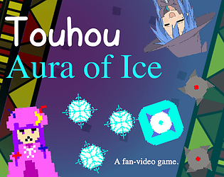
Touhou: Aura of Ice's itch.io pageResults
| Criteria | Rank | Score* | Raw Score |
| Enjoyment | #1836 | 3.223 | 3.636 |
| Overall | #3263 | 2.955 | 3.333 |
| Creativity | #3508 | 2.982 | 3.364 |
| Style | #4179 | 2.659 | 3.000 |
Ranked from 11 ratings. Score is adjusted from raw score by the median number of ratings per game in the jam.
How does your game fit the theme?
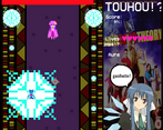
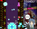
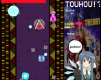
Around the player character is the titular "Aura of Ice," which increases in scale when snowflakes are collected and decreases in scale when fire is hit.
Development Time
96 hours
(Optional) Please credit all assets you've used
Credits are in a txt in the download. Hope that's alright.
Leave a comment
Log in with itch.io to leave a comment.


Comments
You don't see energy fields doing things like this in Bullet Hells that often, was nice to see it in action. Though I wish it had more of a feedback when hitting the enemy, shooting etc., Also wish I knew the references, I'm more of a Cave fan than Touhou, sorry there! But fun game overall.
Thanks for playing! Glad you found it fun and the energy field cool.
By the time I got around to implementing sound effects, it was the night before the jam deadline, so I didn’t end up implementing as much as would’ve been best. Definitely gonna add more in a post-jam build, which will probably help provide more feedback for the player’s actions.
Cave looks cool! Imma definitely check it out for myself sometime. As for the Touhou references in this game, as far as I know both the player character (Cirno) and the boss (Patchouli) make their first appearances as bosses in Touhou 6: Embodiment of Scarlet Devil. The more you know ☆
"cool" game :) I like the mechanics, would be cool when the frozen shurikens are auto aimed at the enemy.
Thanks for playing!
Indeed, one of the things I’ll definitely try to implement in a post-jam build will be some seeking with the frozen saws. Probably not global seeking, since I do want the player to have to wait for the opportune time to throw them, but enough such that shurikens that aren’t directly below Patchy don’t just end up useless. Thanks for the feedback!
Nice game. Cool mechanics. There was slight inconsistency in pixel art but other than that it was an enjoying and mind blending experience. Hope to see more of you in future!
Thanks for playing! What exactly are you referring to when you say there was inconsistency in the pixel art?
The inconsistency lies in the mix of pixelated and high-resolution elements, such as the pixelated main character versus the non-pixelated background. This creates a visual clash, disrupting the overall visual coherence. Other than that, it was cool.
Ah, I see. Thanks for the feedback!
CIRNO BAKAAAa!!!!
https://youtu.be/sRwIKlacTX4?si=eRvogkYx38UTlUDE
Yaaa!!! Baka janai yoooo!!!!
Thank you for the comment and the funny video!
Let's go, a shmup! I certainly like it, though I did get frustrated at the third pattern - there were just too many things for me to track at once, and my micrododging sucks (I am much better at macrododging patterns). I feel like getting rid of the base shot would work better, since it only deals meaningful damage in the first phase and it kinda prevents you from learning about how the aura works there. I would also love to see the boss indicator at the bottom of the screen, it is genuinely really helpful in touhou-style shmups. Some weak homing on the reflected metal projectiles would be also nice, so that you wouldn't be forced to occupy the same 20% of horizontal space as Patchouli, which is certainly an issue for streaming patterns.
Don't be discouraged by my list of criticisms - I did very much like the concept, and these things I said are pretty much just some minor adjustments. Hell, you could even take it further and make a full-blown shmup out of this.
Thanks for the feedback!
Getting rid of the base shot and adding homing to the reflected projectiles were both things I’d considered. I decided against the former since I thought “Ah, but a shmup where you can’t shoot would feel a bit off…” and I found that it was nice to be able to whittle down the last bit of the boss’s health when the damage from your reflected projectiles comes up a bit short. Though in the bit of playtesting I’ve seen (unfortunately not done ’till after the jam, ha), it was indeed the case that the existence of the normal shot tended to impede players from getting used to the sawblade reflecting.
And regarding homing on the reflected projectiles: I considered adding that but didn’t feel as though I had the time. Definitely one of the first things I’d implement in a post-jam build, though.
I’m glad you liked the concept! To be frank I myself was pretty happy with the idea and thought it could perhaps even be made into a full game, so am glad to hear the same from somebody else!
Oh, and yeah, I totally should’ve put the boss indicator at the bottom of the screen. Had some other weird idea I didn’t get around to trying where the boss’s HP indicator is some kind of line drawn from the boss to the bottom of the screen (making it easier to see where they are without looking up) but apparently missed the obvious QoL adjustment. Another thing to try changing in a post-jam build.
Don’t worry about getting frustrated on the third pattern. That one annoys even me… I can’t imagine who would deign to design such a dastardly thing!
if only i were better at STGs........
Don’t fret. I made the game too difficult on account of not getting around to having playtesters play it…
If you don’t mind I’ll use your comment as an opportunity to list some tips/explanations that I meant to include in a txt with the game but forgot:
Thanks for checking out my game! I’ll give yours a shot later when I’ve got the time.