Play game
Dungeon Roller's itch.io pageResults
| Criteria | Rank | Score* | Raw Score |
| Creativity | #4133 | 2.282 | 2.700 |
| Presentation | #4376 | 2.113 | 2.500 |
| Overall | #4495 | 2.057 | 2.433 |
| Enjoyment | #4839 | 1.775 | 2.100 |
Ranked from 10 ratings. Score is adjusted from raw score by the median number of ratings per game in the jam.
How does your game fit the theme?
In the game the player character and enemies are dice, and to attack the player must first use a roll action which selects a random attack type that can then be used
Did your team create the vast majority of the art during the 48 hours?
Yes
We created the vast majority of the art during the game jam
Did your team create the vast majority of the music during the 48 hours?
Yes
We created the vast majority of the music during the game jam
Leave a comment
Log in with itch.io to leave a comment.


Comments
I don't get what is going on and how to play. Compared to the screenshots, something is wrong with the player dice as no pips are showing up (maybe depth ordering issue). Enemies just swarm me and force me to completely quit out and start again...
Never mind, I randomly mashed the keyboard and found out the E to roll and then space to attack keys. Really would have been nice to have some indication of these.
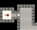
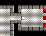
After that the gameplay becomes trivial as you can just camp the doorways in absolute safety and snipe the enemies from there with sixes and was it 4 that was the beam attack.
This whole rerolling and manually attacking felt unnecessarily complicated. The rolling would have made more sense to happen per movement and attack could just me automatic when trying to walk against the enemies.
Went for some more runs and it actually seems like it's pretty much impossible to play (or at least survive) without this corridor camping cheese. The enemies just swarm you and since you can't change the attack direction when they're close to you, you're just pretty much screwed. And the random attack patterns don't make it any easier.
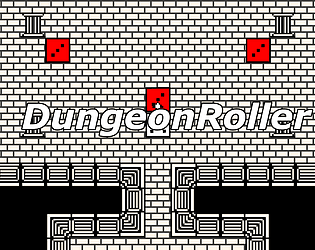
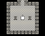
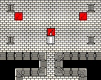
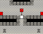
The look and sound scape was ok I guess. Everything fit together pretty nicely and the simple three color palette (black and white with one extra color, red is a good choice) is always effective. I wasn't a huge fan of who the dice bodies jittered out of control really. It didn't really seem the fit the aesthetic and mood of the game otherwise had.
And by the way, the Mac version requires this extra bit for it to launch properly but I guess most Mac users are already familiar with stuff like this...
Would have liked to see a better balancing of the mechanics and obviously more content but good job anyways! 👍
Not my cup of thee to play. Its not everyones game to play but nice to see your effort and joining the jam! well done!
The game taught me 2 things: 1. Reds cannot be trusted. 2. If you are cornered, you are finished.
A good idea but realy simple in the musics and the arts, by the way, the attacks aren't making so different damage
The game is good, but i really can't aim the enemies with the way it's done and it's ruining my enjoyment