Play first project
Ruler of the Dice's itch.io pageResults
| Criteria | Rank | Score* | Raw Score |
| Presentation | #3115 | 2.646 | 3.500 |
| Overall | #4354 | 2.110 | 2.792 |
| Creativity | #4771 | 1.984 | 2.625 |
| Enjoyment | #5011 | 1.701 | 2.250 |
Ranked from 8 ratings. Score is adjusted from raw score by the median number of ratings per game in the jam.
How does your game fit the theme?
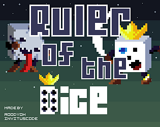
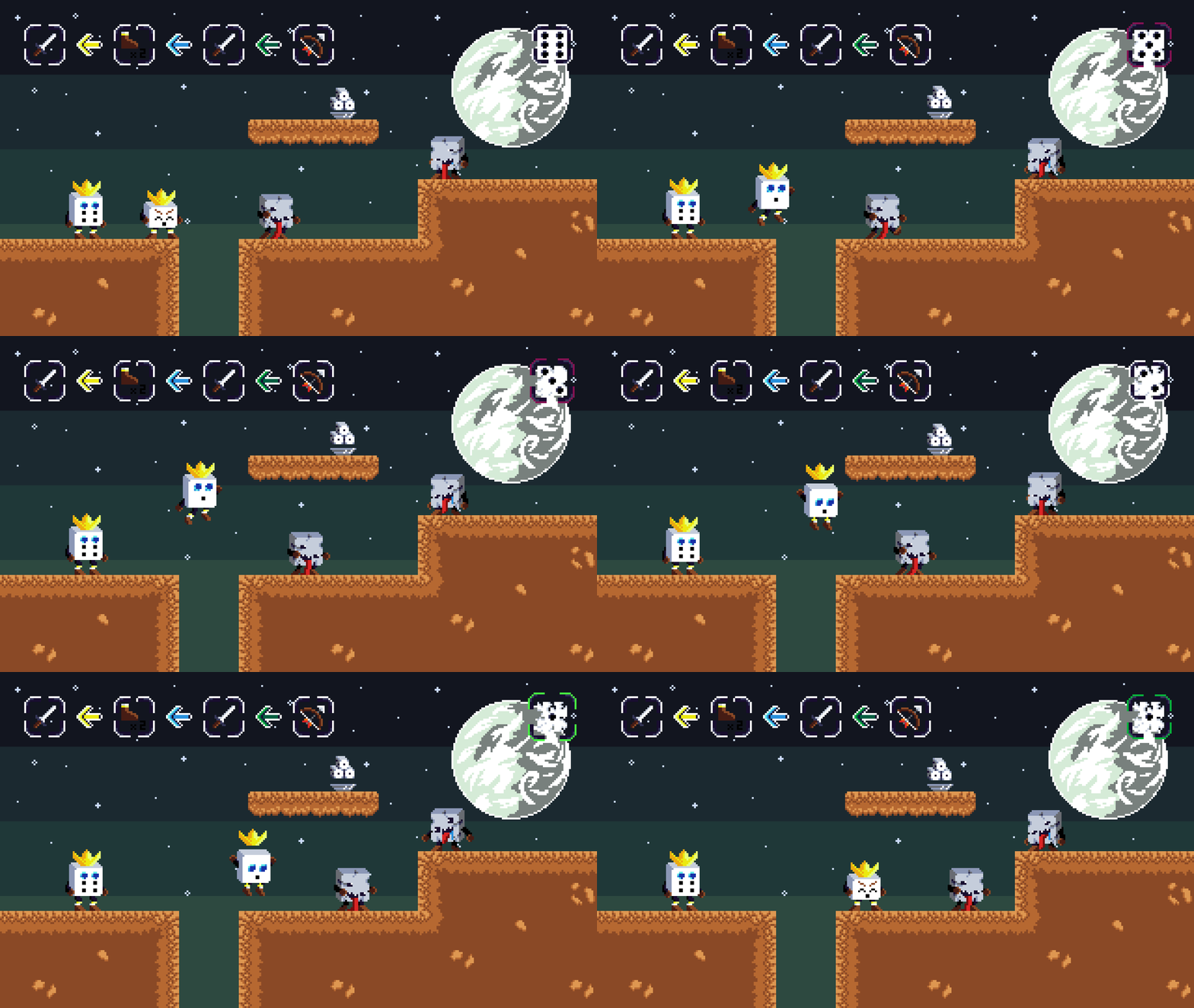
Our very first game! We did a very direct approach and changed "Roll of the Dice" to "Ruler of the Dice". Our main feature and HUD is due to a bug near end missing, but it still fits the theme!
Did your team create the vast majority of the art during the 48 hours?
Yes
We created the vast majority of the art during the game jam
Did your team create the vast majority of the music during the 48 hours?
No
We used pre-existing audio
Leave a comment
Log in with itch.io to leave a comment.


Comments
So, I'm not exactly sure what's going on, but this seems to be a fairly standard platformer. The art and presentation is pretty good and has potential, I can see you really going somewhere with this. You even kept a pixel consistency which many people seem to not do. Props for that!
I found that whenever I fell into a hole, there seems to be no sort of death condition. So I end up having to Alt+F4 to restart the game. Also, the main gimmick seems to be nowhere to be found. These may be bugs and will probably be fixed in the future.
Again, good job with the art! I think the gameplay needs a bit more work though.
To be honest we considered not uploading the "game" since it is buggy as hell, but since it was our first experience struggling with code and didn't want the artwork go to waste we uploaded it nonetheless!
As I love pixel art I'm pretty fond of pixel consistency and I think the presentation of the game is half the battle to get a good game! :D
The problem with the pit was a last minute change as we intended to change back to the main menu and therefore had to decrement the scenenumber to change to. And guess what? I was so wasted that I incremented the scenevalue and since there's no scene coming after that nothing happens and you're running on this hitbox!
Our biggest problem was that we've used Git to merge our work progress and at the final hours we had merging problems and even lost code. Many things would have worked out if it wasn't for the merging problem and that's pretty sad!
We'll come back for next year and then go big!
I really like for animations :)
Thanks! I wasn't sure if it came oit good enough as it was my first time making pixel art for a game
I enjoyed the art-style of the game. Very interesting and neatly animated.
Stay crunchy.
Thanks! We put obviously more work into the artwork than the gameplay. In the end it was a mistake as we didn't have enough time to finish the gameplay:(
It's important to learn more than anything else. Reaching your personal goals. You finished a game! This is a huge thing and it ultimatively doesn't matter how good the endproduct ist. To finish a game is giving you motivation to go on, try something new and thats the goal of a jam. Test out things, test stuff that you don't know well and just do it.
The experience is what matters the most. There are plenty of jams coming and you can always try out things differently than the last time :) Head up, be proud and never stop developing!
Stay crunchy.
Thanks for your kind words! Actually I feel motivated to pressure on with game dev after that jam. It showed me what we were able to do in such a short time and were we can still grow and nurture of skills! aAnd since pixel art is already a hobby of mine I am fond of creating a game in the near future! I've got plenty of ideas and I think I'll work on something else than fixing that 48h mesh of untangible code :D
And ofc, keep it up, too! If I get the chance I'll gladly look into some games people did for the jam later :)
As everyone has said, the art is super cute. I can tell you two put a lot of thought into the character animation. And wow, that planet in the background looks amazing!
I found it difficult to parse the foreground elements with the background. Maybe consider lowering or raising the background's brightness to contrast more? I was also in desperate need of a restart button for when I got stuck in the pits!
It's too bad you didn't have time for the main mechanic. I hope you guys can get it to work!
Thanks! We really put a lot of time into the art and therefore had less time for the actual gameplay. We havn't considered enough time to deal with bugs and in the end had merging problems of the code so that even more is missing than we had ready to show :(
And yeah, the planet took less work than the actual character animations, I only needed 20 - 30 minutes for that, was pretty lucky it came out like that! :D
Art is cute. But this game is so baggy. Colliders dont working, ui just disappeared and i should close game to restart. But it's your first game, so good luck!
Thanks for the response! Sorry for the bugs, in the last hour of submitting we had a merging problem in Git which resulted in a loss of lot of information such as the HUD, the kill zone from working, having buggy animations and even the goal from not working anymore. But since we fit the theme at least in artstyle we wanted to submit it anyway! Thanks for your invested time, really appreciate it :)
Cute Artworks, nice Animations. The Zombies almost scared me to death O.O