Play game
Set in Stone 2021's itch.io pageResults
| Criteria | Rank | Score* | Raw Score |
| Presentation (itch listing) | #15 | 2.857 | 2.857 |
| Level Design | #18 | 2.429 | 2.429 |
| Art Direction | #18 | 3.143 | 3.143 |
| Audio | #20 | 2.857 | 2.857 |
| Overall | #21 | 2.531 | 2.531 |
| Game Play / Game Feel | #22 | 2.429 | 2.429 |
| Storytelling | #23 | 1.857 | 1.857 |
| Innovation / Experimentation | #28 | 2.143 | 2.143 |
Ranked from 7 ratings. Score is adjusted from raw score by the median number of ratings per game in the jam.
Judge feedback
Judge feedback is anonymous and shown in a random order.
- Cute little game, could use a bit more polish especially in terms of player movement and interaction with the world. The game was hard to get in to, and I had to give up quite early because I got stuck. Remember that it's always better to start too easy than too hard. I am confident this game will reach its full potential after a few polish passes
- Really like the overall design! The key controls really don't work that well, and/or the mechanics associated with the key actions are just not well refined. I sadly did not get very far in the game because it was difficult to discern what I was supposed to do - and the controls didn't help much.
- My 2D jumping ability is below that required for this game. It's not you, it's me!
- This is a solid platformer that makes me curious for more. I am NOT a good Metroidvania-style player, so I struggled a bit but I think the lasting impression is pretty good. The music is solid and I like the level design - nice pacing too, in describing the different actions/verbs and then showing how to string them together. It worked pretty well. I very much enjoyed collecting the big blue heart, it felt like an achievement. Since I'm very old, I would like to express both a happiness that the artstyle is used, but also a bit of sad in my face, since I think it was slightly overdone. The effect made things a bit too smeary for my taste (other's will probably disagree) and I had a hard time trying to figure out what the enemies and obstacles actually were - I gave up and just decided "Yellow ball shooter - bad", "Rock thing that bumps me back - bad", etc. The art direction gets a lower score than it could have had because of this too-smeary effect. When it comes to "Innovation/Experimentation", I think that this was kind of lacking - it's a pretty standard game type, in my mind, very "smack in the middle of the road", so to speak. This isn't bad at all, in fact, it can be very good: "I understand what I see in front of me and I like what I'm seeing" is a good thing. Just explaining why that score was low. The storytelling got a 1, because I can't really see a story in the game, so it means "N/A" and not that it is a bad story Thank you for giving me a fun (but a bit frustrating because of the controllers) time :)
- I'm so sorry but I didn't get past the tutorial. I got to the point where you introduce the right click but from there I couldn't continue. A bit glitchy from time to time and the jumping mechaninc and feel can be improved. I also had a hard time knowing when I could use my hookshot again, maybe a sound can feedback this. As I couldn't continue past the tutorial it is hard to judge but maybe that is something to think about.
- The pixelated effect is a neat effect and if the game had been made with this in mind it could've been very pretty. Once you get used to the controls the game does feel very nice with very interesting and creative movement mechanics that are well executed.
Leave a comment
Log in with itch.io to leave a comment.


Comments
Hello Creators!
I wanna start by saying this is a wonderful little game! It was exciting and the music was wonderful! (i just set it a little lower - thanks for that option!). Very creative concepts, such as the the Hookshot and the shield (although i personally may have found a little difficult to use, lol). The level design was very interesting and well thought-out. I collect all 7 hearts!
I would have hoped that the key-binding would work, i just could not open my map with alt. So i switched it to "M" and it still didn't work. I also would have liked to go back to the menu when I was done, but i get it, you rushed the game lol (ik how it feels, i've made a couple games myself). Another little bug was when i killed the bird and their "blue soul" fell to the ground, i was unable to pick it up (Something wrong with the collision it seems).
Oh, and im not sure if its a bug or meant, but i found a nifty hack where i could do a hookshot at a wall and then double jump. It was way to OP that it saved me like so many lives (especially in the spike area).
Otherwise i loved the game, and i enjoyed trying to figure out which way was the exit to get out! Wonderful game! Creative concepts! Used your own assets!
I'll give it 8.5/10! :)
- Amiracle
Wow! Thank you so much for your comment!
The map had to be cut from the game last-minute due to some errors when building, but we didn't change the tutorial text in-game to reflect that :( Our apologies for the confusion!
Technically, at the end of the game you can go back to the menu by pressing Esc ;D But yeah, the ending of the game was definitely not focused on since this is just a vertical slice, so we wanted to prioritize the gameplay itself. We're also aware of the bubbles not being able to be picked up when they hit the ground, it's indeed a collider issue ^^
Some of the dev team indeed agrees that the hookshot is OP, others say that it's supposed to be that way. It'll be something that we'll discuss internally...for a long time probably xD
Thank you again for your lovely feedback and for playing our game!
I couldn’t make the second jump. I don’t know how many times I tried (20?) but I always fell short. It looks as if my side-scroller skills are too low to play this one.
Hi Richard! Were you double-jumping (pressing Space twice)? If you were, you may instead try to right-click in the direction of the ceiling (if you can't see the ceiling then jump first to get in range, then right-click to hookshot). Let us know if that works or if you still have troubles, we'd love to help you!
Yes, I did try double-jumping (it told me to). I banged my head on the ceiling.
I've taken your advice and done the hookshot. That got me across the gap. Why was I told to double-space then?
I'm now standing between a worm and a wall repeatedly left-clicking like it says to do, endlessly watching a line come out of me and the worm move.
Right, would you be able to come to our gather.town booth today? We'll be here from 13:00 - 16:00 (Sweden time), but if you have another time you'd prefer then let us know. It will be much easier to teach you how to play while you share your screen and we communicate over voice.
I could learn to play by watching the video. The thing is, people who play this game in the wild won't read the instructions or watch the video or talk to the developers, so you need to account for that. I'm sure the game is fine - other people really seem to like it - but coming to it cold like a newbie would, I had problems. This is the kind of thing it's often useful to know, which is why I do it (I've done it for all the games I've played, by the way, I'm not picking on you, honest!).
Our targeted audience are people who are already experienced in platformers and games of this genre, so we didn't intend for the game to be perfectly learnable by people who haven't played other platformers or metroidvanias before. Though there are definitely aspects about the tutorial area that we can improve upon!
What a fun little game. I absolutely adore the quirky axolotl. I was a bit confused as to what the buttons did (or didn't) at first, but I managed to get the hang of it quick.
As Andy already pointed out, the movement and collision was a bit glitchy at times.
It would also be nice to get some better feedback on when you take damage.
The sound design is wonderful, and the soundtrack isn't overbearing.
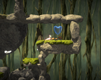
The level design is great, and to the point. It was easy to figure out where to go next, and the bonus hearts were hidden, but not too hidden. Perfect.
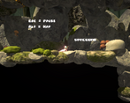
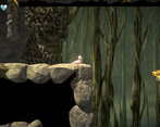
The only real big issue was the pixel filter. A lot of details were lost in the process, and the text was hard to read when you don't know what it says. it also gave me a bit of a headache.
I wish you all good luck in the showcase!
Thank you so much for the feedback and lovely comments! We'll definitely make changes and adjustments to the pixel filter as we've had internal discussions about it as well. The font was a slight oversight as it was already a pixel-style font 😅So it essentially became even more pixelated.
This was really pretty, and kind of an interesting idea (the various modes and tools). For a platformer though i found it a little glitchy in the movement / collision, and got frustrated i couldn't always see what i was standing on or in, since sometimes the environment occludes the bottom of the character. In windowed mode the text/instructions was hard to read.
The sound did a great job of flowing with the game.
Thank you for playing our game, Andy, and for your feedback! We'll keep these issues in mind when working on future iterations of the game.