Play game
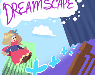
Dreamscape's itch.io pageResults
| Criteria | Rank | Score* | Raw Score |
| People's Choice Vote | #107 | 2.750 | 2.750 |
Ranked from 8 ratings. Score is adjusted from raw score by the median number of ratings per game in the jam.
Team Members
-Sunfished (Me) - Programmer/Coder
https://twitter.com/sunfished
-Clay - Game Design/Graphic Design
https://twitter.com/Modeling_Cloy
-Spooktune - Spriter/Enemy Design/Playtester
https://twitter.com/Nderman080
-Shay - SFX/Playtester
https://twitter.com/TheShaymoo
-Saucecoie - Music
https://soundcloud.com/saucecoie/
-Spookysauces - Writing/Music
https://twitter.com/SpookySaucez
Three music tracks are royalty free assets, provided by the following user:
http://freemusicarchive.org/music/The_Owl/
Engine
GameMaker Studio v1.4
Leave a comment
Log in with itch.io to leave a comment.


Comments
I loved playing this one. Probably my favorite in the platforming genre.
There were a few minor things that could make this an amazing game.
1. It could benefit from a little more direction. I saw many branching paths but it seemed like a lot of them lead to the same place, but with different rewards. That's fine but it makes navigating it without a map a little difficult.
2. You definitely need to make the enemies drop something. There is no incentive to kill them. I felt like most of the time I was running by them. And when I had to kill them there still wasn't that incentive to get excited about.
3. The game could use some collectibles, minor and major. Minor collectibles would be something like coins, rings, gems, etc. The platforming was lacking that incentive to take the more difficult paths. There was also not a ton of reason for exploration. Minor collectibles and maybe more major collectibles would help that. You have gloves and MP/HP upgrades for major collectibles but it's not obvious what areas they are in, so it still feels like running through a maze. And because of the lack of direction, there was never a reason to take a path that I thought would be backtracking. --Also maybe the characters you talk to could be a form of major collectible. They could give you a lot of minor collectibles or talking to all of them unlocks extra content at the end of the chapter.
These critiques mostly fall under polish so it's understandable. Good job on the game!
Thanks for your feedback! Ill comment in order:
Again, thanks so much for feedback! It helps us know what we can improve on next time!
Like I said it's all mostly polish and adding the fun factor to an already good game. It feels like this is heading towards the Metroid-vania genre. Do you plan on blocking off areas for when you collect glove upgrades?
Originally areas were blocked off, ya. An example of this is the flower glove being used as a large spring, letting you access high-up areas that were previously too high to reach.
As of now, we don't know whether or not we plan to continue this, since it was mostly made just for this jam and to test out the dual-wielding mechanic. Maybe in the future we'll flesh it out more!
Starting with this one, I will attempt to comment on the categories the judges are going to be rating the games on, just for fun
Gameplay
Pretty fun and solid mechanics. Physics were top notch. The map started out easy to follow through and became a lot more complex. I did stop after getting lost in the third section. Not sure if it was the last one but I was nearing the hour mark already. While I think the map favors exploration, it feels like it is too easy to get lost between the forest and dark area. Before stopping I got the following gloves (sorry for not remembering their actual names)
-The initial butterly close range one
-Cherry bomb
-Starry shot
-Doves
-Bouncy Flower
I loved the variety already. Pretty sure I missed at least one and I totally see you being able to go very far with this system. Very well done
I feel there are certain things that have no explanation, like how you can double jump or why there are doorways you just can't enter (unless they open later, but there were even open areas with no X sign that I couldn't get through)
Enemies felt a little frustrating because of a presentation issue. More on that below
Presentation
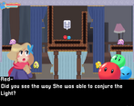
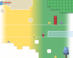
The game looks really pretty. The portraits in cutscenes are charming and cute, and the ingame graphics do a great job as well.
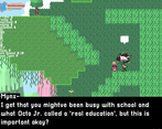
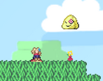
I found it difficult to distinguish decorations from actual terrain, and sometimes enemies would be outright invisible to me until I stumbled face first into them because of that.
Music is good and sets up the environment quite well. The sound effects are the best part of this game's audio however. They were just very cute, fitting and useful
The story was pretty charming and kept me curious as of what was I going to see in the depths of the main character's consciousness. I will probably attempt to go back and really attempt to get to the very end
Engagement
As stated in the previous section, the story hooked me in, but it is not the only thing that would keep me playing. The allure of finding new gloves was also something that kept me going
Potential
The multiple gloves, coupled with the HP/MP extensions give this game a lot of potential for expansion. In terms of story however, I am not sure where things would go after the characters resolves her nightmare, but really anything could happen
thanks so much for this indepth review! Ill reply in the order you commented.
We've gotten a lot of complaints about the 3rd area being difficult to explore, and that's on us for not providing a map. Our future projects that are similar to metroidvanias will attempt to have a map system, so thanks for that!
From what my designer told me, there are a total of 8 gloves, 2 of which are secret ones. You managed to find one of them!
The issue with distinguishing backgrounds/tiles/enemies is very prominent, and I agree with you completely that it is difficult to discern. One way we will try to avoid that in the future is by having a darker outline on things that can be interacted with, while making the background less prominent. Thanks for this bit of feedback!
That was fine, just a little hard and couldn't do accurate jumps and attacks, because I usually move with wasd keys. having keyboard options can make it better. Map are a little large and one time I got lost in one of them.
thanks for the feedback!
keyboard options are definitely something considered for future games, since one of our own team members also prefer wasd!
getting lost is also a common complaint we get, so we'll try to do a better job next time! the area in question seems to be one of the later areas, so hopefully you find your way out since youre near the end!
I like the art style, choice of music and story, but the enemies aren't compelling, the bosses are tedious and the areas are too big for the amount of interesting things in them. I think you should consider cutting some rooms and focus on making sure each part of the game is new and interesting in some way.
I found two bosses, the rabbit, and the pair of kirby trees. The rabbit has the issue that it's easier to tank the damage for the pink enemies than to try to avoid getting hit. They just spawn too quickly. The kirby trees seemed to have too much hp. They stopped being interesting to fight halfway through the battle. Also, if you're not going to use pixel-perfect hitboxes, I recommend you use multiple objects for enemies that are large and non-rectangular. in the case of the kirby trees, perhaps the trees themselves could have just the trunk for a hitbox with an invisible object covering the foliage that relays any damage taken to the trunk.
Thanks so much for the feedback!
I agree with all that you said wholeheartedly. My team didn't have enough time to playtest our own game, since we were still doing things right up to the deadline, which is why a majority of it feels bare bones. This also lends to the issue of there not being much variety in enemy types, and the bosses not being tested well enough for balance.
We will take what you said and do our best to apply it to our future games!