Thank you! one of the inspirations we had when making this game was smash, so im glad that it reminded you of it! the terrain generation definitely causes some issues, but im glad you found a solution to the issue!
Sun
Creator of
Recent community posts
thank you! i should clarify that ive been using unity for about half a year now, im only just now applying it in a time-restricted manner :)
thank you for the feedback about spawn protection, i actually did try to implement it but it isnt working as intended. the enemies shouldn't be spawning within a certain radius from the spawn!
that is very very odd. just to be clear, you have to hold up/down and then press the grapple button to hook up/down.
if youre doing this and it still doesnt work, can you send me the following info:
- which operating system are you using? (and whether youre using a virtual machine or not)
- are you using a laptop keyboard or an external one?
- using this link: https://drakeirving.github.io/MultiKeyDisplay/, are you able to make the keys highlight when holding up/down and pressing the hook button?
thank you for your feedback! this will help me fix a potential bug!
Here's the weird seam-thing in a gif!
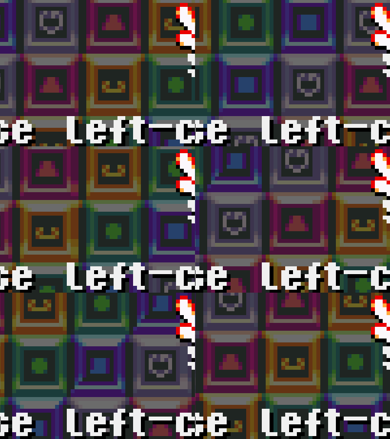
It's hard to notice in the gif, (much easier to see ingame since it's larger), but there's a small "wiggling" effect where I assume the pattern repeats itself. It's hardly noticeable, but I just thought it was something to note.
As for the bug, the green blocks were indeed poppable and had the glowing effect. I can't recall if I messed with that area beforehand, but I assume I didn't move a green block there myself, (otherwise I would have popped it as soon as I did). I tried to recreate it as best as I can in order to recreate the issue, but so far it seems to work as how it's intended. Hopefully you can find out what's wrong!
Really fun game! Has a TON of potential with different types of blocks, and the franticness of the timer getting faster and faster gave me a few laughs at trying to scramble around haha. Some feedback!
- I really enjoyed the gameplay mechanic of being able to move the blocks anywhere. Initially when you explained the concept I was a bit wary of how abusive this could be, but it ended up being really balanced with the timer putting pressure on the player. In the end I think I ended up reversing my thoughts, because it's such a different take on the match 3 formula that gives the game a really unique identity.
- Being able to pop the matching blocks at any time adds a fun layer of strategy to the game. I found myself building a hilarious mass of colors on one side of the field while working on the other side to keep the timer going.
- The artstyle is super cute! You did such a great job unifying the design of everything to make them all fit with each other. I also liked how you made the blocks have a visually distinct pattern too. I found myself relying more on the patterns than the colors haha.
- The menu system is very nice to look at. Very intuitive options and layout.
- Something I thought was a bit distracting were the B blocks having the shrinking ring. It might just be entirely me, but the ring kind of makes the initial run of the game really distracting since there's many of them on the screen at once, making it slightly visually cluttered. It also makes it a bit hard to know what ring belongs to which B block. If there was a suggestion I could make to this, it would be to have the B blocks have a meter on them instead of the ring. That way it would be easier to tell at a glance when they would go off!
- In contrast, I thought all the other visual feedback was nice! The game telling you which blocks are poppable was a very nice touch that helped me in pinches.
I managed to catch 2 bugs, albeit somewhat minor:
- This one was kind of hard to tell what happened, but there was a point in the game where I couldn't pop a chain of a decent amount of green blocks. After I popped another chain somewhere else I was able to pop the green ones. I can't recall how exactly the shape was laid out, but it was in a cross shape with a blobby part near the top left side. I don't know if this might be because my mouse wasn't picking up on my presses though. I did click it a few times and nothing happened just to check, but was able to pop another set right afterwards.
- The scrolling background in the menu seems to be distorted along where the graphic repeats itself, along the seams. It's a minor graphical thing though!
I would totally love to see this game developed like you stated in the discord server! Hearing that you have plans to add content to it makes me happy.
A very calming game! I think it does a good job with combining both themes into the gameplay. There's not a lot to comment on because of how early in development in the game it is, but here's a few thoughts on it:
- The artstyle is super cute! kudos to whoever was the one that designed it!
- It would be nice if the ui system was a bit more streamlined. Right now, scrolling through menus such as the shop or crafting menu is very slow. It might be because I'm using a trackpad to do it, though.
- This one is actually a bug! I found out that if you use a tool and then spam the direction keys, it would cancel the animation and thus cancel the use of the tool. This is easier to see on the axe because of how slow the animation is.
- Additionally, I noticed that the animation for the tools seemed to speed up or slow down randomly. I don't know if this is some mechanic that I didn't see explained, but I thought it was a bit of an anomaly. It could also be my pc lagging the game, but my pc is a bit beefy so I don't think it's a pc issue.
- I don't know if this was a bug or a feature, but I managed to "overbuy" grapes and ended up with negative money. This could work as a pretty interesting feature if it wasn't, since it makes the game a bit more calming to play.
In the end I was really surprised with how much of this system you were able to manage in the span of the gamejam. Very huge potential!
I liked how well the use of the theme of time fit in with the theme of delivering mail. It was also kind of neat to have to maneuver around the other cats too, which adds a bit of franticness to get to each location in time. Everything I would suggest for this game had already been suggested by the other commentators, so I'll leave it out of my comment!
All in all I thought this game had a lot of potential! It's very cute!
Fun game! I kind of enjoyed how challenging the game was, and the theme of time was very apparent throughout. Some feedback regarding things I think could be improved on:
- I think spikes should only be lethal when collided from the direction they're facing. There were a few times where I would accidentally die to spikes because I collided with them from the side going up. Two instances where this happened was the lone spike near the end of the game, and the second time when you have to wall slide down. The difficulty of these parts were fine though! Just that minor problem made it somewhat more difficult than I had imagined.
- I beat the game without having much trouble with time. I think it would be much more of a challenge if there was a bit less leniency with the time, to encourage players to keep on their toes.
- It would be nice if there was more control over the player's jumps. Sections like the wall jumping part near the end would benefit well with being able to "shorthop".
In the end, I think this game has a lot of potential since you have the framework of the mechanics down already, especially since it plays into the music. I would love to see how you evolve this concept with the music involved, because I haven't actually seen something like that done before!
I liked this game! The sprite work was very cute, and the boss fights had interesting mechanics that made them feel unique.
I think what I liked the most about this was the powerup system. It feels very roguelite-ish and made you consider your options before each fight. It would be cool if this powerup system was built upon, such as having them stack if you picked the same abilities as previous runs. For example, picking Adrenaline may increase the timer from 3 to 6 seconds!
The designs were also something I admired. The first boss was my favorite because of how well-themed it was.
This game has a lot of potential so I would love to see this developed!
Played this game and I was impressed with the ability to stop time. Here's some feedback I had on it:
- Outside of the graphics, I think the levels in general felt a bit too simple. I appreciated the little tutorial at the beginning though!
- I don't know if I missed the explanations, but ingame there was no indication of what buttons to press in order to execute some of the functions. The small tutorial in the beginning was nice to figure out the button to stop time, but during the boss fight I spent about 5 minutes trying to figure out what to do before I learned there was another button I can use to turn the flames blue.
- I did not figure out what exactly I needed to do to beat the boss, and ended up giving up after about 10 minutes. I don't know whether it was a bug or not, but I managed to fill the entire screen with blue flames but nothing happened. I believe I was supposed to push the flames into him but none of the buttons allowed me to interact with the blue flames at all.
Unfortunately I was unable to finish the game due to some of the problems listed above. If there was more beyond that boss fight then I apologize for not being able to figure out what to do :(
This game has a ton of potential because of the amount of possibilities the player can have with the concept of controlling other objects. I really would like to see this developed further!
I think the only problem I had with this game is that I had a hard time with the beginning of level 2 and 3, because I had no idea what the objects I was controlling did. It would be nice if there was a way to see what their functions are in the level they're introduced!
This game was very interesting in concept! I thought it was really cute, especially since the concept flowed very well into the theme.
What this game did super well on was the gimmick of having to navigate the boy and the girl seperately. It was kind of neat seeing how I had to make different choices on the path to take because of the boy having to collect the ring beforehand.
I think there are two areas where the game can be improved upon, as food for thought:
- The level themes were very cute and fitting, but I had problems in many of the darker levels because the platforms blended in too much. This, paired with how low the player's jump is, made platforming in these levels really difficult. I think it would be nice to increase the player's jump height and possibly change the color of the platforms in these levels so it would be easier to navigate.
- The time it takes to move between platforms because of the jump speed and fall speed makes it a bit difficult to complete some levels, especially if the player makes a mistake a few times. It would be nice if the player jumped and fell a little faster, or increase the time in the levels.


