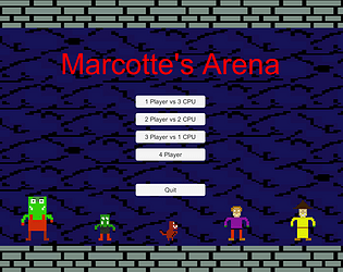
Play game
Marcotte's Arena's itch.io pageResults
| Criteria | Rank | Score* | Raw Score |
| Sound/Audio | #7 | 3.167 | 3.167 |
| User Interface (UI/UX) | #8 | 2.500 | 2.500 |
| Visuals(Graphics) | #8 | 3.000 | 3.000 |
| Fun | #8 | 3.167 | 3.167 |
| Overall | #10 | 2.833 | 2.833 |
Ranked from 6 ratings. Score is adjusted from raw score by the median number of ratings per game in the jam.
DevLog Link
https://marcotte173.itch.io/marcottes-arena/devlog/298343/improve-my-game-jam-17-devlog
Leave a comment
Log in with itch.io to leave a comment.


Comments
This was pretty cool, I like the turn and grid-based combat idea mixed in with possible co-op play. It was also neat trying to see how all the characters played. The only one that ended up netting me a win was the wizard and thats because luckily the AI all decided to kill each other.
Some of the mechanics and controls were obscured, like having to move into a character to attack them, and I'm still not exactly sure what determines how many times I can use a special attack.
The sounds being made with what seemed to be just your mouth I think was kinda charming in a way, worked with the artstyle.
Also I think the view window should have some better scaling because unless you make the game fullscreen the sides get cut off.
Overall, good work!
Fun but not Fair. Find a way to make this fair for all players. idk how but that will make it much better.
I really like the idea of turn- and grid-based combat! I'd like to focus on a high-level design concern for my feedback. It seems like the order in which people get to move will confer in inordinate advantage. My recommendation going forward is to add gameplay which allows for defensive or reactive play, i.e., using a turn to place an unseen counter, which anticipates a later player's attack and deals damage to the attacker instead.
Otherwise, I thought it was pretty fun to play!
hello, i enjoyed your game (even though i lost quickly... but its because i dont know how to play).. but there are few things you need to improve.. first is the UI... for some reason it is all misplaced and i cant read much
but it is playable...
and about the graphics.. i could recommend some pixel art tutorial to give your game a better look... there is a really good tool called MT paint that is perfect for pixel art and making drawings with a 8-bit palette.. if you want to i find some good pixel art tutorials you can just reply to this comment and i can find some good for you... another tip is about the styles... the fonts doesnt match the pixel arts so you could download some pixel fonts like More Perfect DOS and 8-bit eye to fit the style.. another tip is creating own styling of buttons and text boxes to make the borders dont look round and fit better the theme of your game... the DPI of the walls and background are different than the DPI of the characters... it means, there are less pixels/dots per inches in the walls than in the characters making the look of them dont fit so well... i hope that my tips can help your game to improve... it is a cool arena game in m opinion.. and the only things that are needed to improve are the graphics. also... go check my game Forespend and rate it on the jam, i will be really happy to get some feedback and tips for my game.
I liked the turn-based combat of this game. I also liked the different characters and abilities. I had some difficulty in figuring out how some things worked though. For example, it took me a while to understand that you had to move into another character to perform a basic attack on them. Also I didn't understand the rules for when your special attack would stop working. I guess maybe there's a limit to how many times you can use it in a single match? Or is it to do with those blue numbers? I found it hard to figure out.
Speaking of numbers, the dark background behind the characters' stats during a match can make them hard to see. They seem kind of bunched up right now. Also there's a bug where after you select your character it leaves another random one on screen to select and the box to type in your name is still there.
This entry was pretty decent! Well done!