Play game
Gauntlet's itch.io pageResults
| Criteria | Rank | Score* | Raw Score |
| Relevance (Creative Expression of Theme) | #60 | 3.556 | 3.556 |
| Aesthetic Flair (Graphics & Sound Presentation) | #76 | 3.556 | 3.556 |
| Overall | #98 | 3.111 | 3.111 |
| Technical Excellence (Design & Engineering) | #121 | 2.778 | 2.778 |
| Immersion (Gameplay & Storytelling Engagement) | #148 | 2.556 | 2.556 |
Ranked from 9 ratings. Score is adjusted from raw score by the median number of ratings per game in the jam.
Made by One or Two People
more than two people worked on it
All Original Content
yes everything was made during the jam
Leave a comment
Log in with itch.io to leave a comment.


Comments
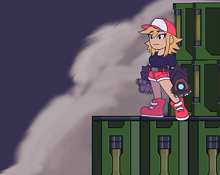
i really like the graphics, is hand drawn its must been took u some time, but some mechanics doesnt feel great especially the wall jump is a bit weird but i like the concept of its going to the same room with more challenges.
This has potential! I agree with the analysis of Valstaen and I should point out that the wall jumping mechanic seems slightly off, it feels more difficult than it should be and it sometimes fail for no apparent reason. On the positive side, the main character looks good and their animations are good! Keep getting better!
Nice platformer you've made! The graphics and music fit together well. Gameplay wise there was some issues (such as wall jumping and platform edges) but I feel Valstaen already had good insight about that. Also, clever use of the theme. Keep it up!
Gauntlet is a movement game similar to something like Just Get Through, Yooka-Laylee, Sonic, etc... In these types of games, the player's fulfillment comes from mastery of the movement system. So in pursuit of a fulfilling experience, the movement system should feel intuitive, fluid, and rewarding.
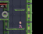
Where Gauntlet struggles in the intuitive department stems from the wall-jumping mechanic. Naturally a player will want to give a directional input as they jump from a wall, but more often than not this leads to a failed jump. After some experimenting, it seems that jump velocity and direction don't actually depend on directional input. Because of this, the wall-jumping mechanic feels like the player is fighting against it for control.
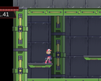
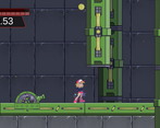
In terms of fluidity, the room just doesn't feel like it's designed to be moved through. Platforms that visually communicate that they need to be jumped on end up being just barely too high up, causing the player to get stuck on the sides of them and breaking the flow of movement. The spacing of obstacles seems to fully interrupt the flow of movement as well rather than having a clear path by which to navigate (such as a gunner taking up the full width of a narrow vertical chamber). The extremely slow speed of the wall sliding also seems dissociated from the idea of fluid motion.
Systems for rewarding movement might be beyond the scope of a game jam, but I would love to see rewards such as a speed boost or a higher jump or an upward wall-slide for good timing or difficult navigation to reinforce the principle of mastery over movement.
The use of the theme is clever. Iterating over the same room is a fun concept and I think you executed it well.
The gauntlet seems forced and unnecessary.
Summary: When designing movement games, mechanics and layout should aggressively cater to fluid motion, while obstacles punish mistakes in technical execution.
I agree with this assessment completely.
Thanks for the feedback, really insightful! The movement is a bit clunky and can be improved upon along with the level, definitely gonna revisit some parts to fix it up.
Really good art! The controls are a tad difficult at times, things like wall-jumping seems inconsistent, but I'm assuming the point is to make sure players are using proper timing.
Thank you so much, I worked really hard on it! - J
Part of it is definitely to help make sure players have proper timing, but we do need to work out some kinks to make the jump more fluid. Thank you so much for the feedback!