Play game
Cool Down!'s itch.io pageResults
| Criteria | Rank | Score* | Raw Score |
| Use Of Theme | #35 | 3.897 | 4.500 |
| Fun | #39 | 3.464 | 4.000 |
| Originality | #43 | 3.897 | 4.500 |
| Overall | #58 | 3.500 | 4.042 |
| Community Spirit | #97 | 2.742 | 3.167 |
Ranked from 6 ratings. Score is adjusted from raw score by the median number of ratings per game in the jam.
Team or Solo
I worked solo but my brother created the music track
Credit:
The unity-extention NavMeshPlus,
Richardkettlewell's script on the post: https://forum.unity.com/threads/lwrp-using-2d-lights-in-a-particle-system-emitter.718847/
Did you follow the theme?
Yes
Did you (you or your team) do the graphisms yourself?
Yes
Did you (you or your team) do the musics and sounds yourself?
Yes
Leave a comment
Log in with itch.io to leave a comment.


Comments
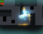
I really like the concept and the execution of the core mechanics here. Great job! The 8x8 art is really cute, although to avoid eyestrain I would appreciate some more contrast, or an outline on each of the sprites. I appreciated that the enemies sliding around while frozen.
I would also maybe apply a bit of knockback to both the player and the enemies when they are hit, and perhaps even a bit of hitstun to make that impact feel even juicier. That's something I got as feedback for mine so just passing it forward haha.
Thanks I think those are great ideas. I'll consider them and maybe I will be able to pass them to another person as well XD.
This is really fun! As for feedback, it's not very clear when the player has taken damage if you aren't looking at your health bar (my second suggestion improves this also) an easy fix is to add a sound effect.
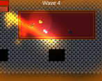
The second thing is to have the health/temperature bar attached to the player, right above the player. Since the focus of the game is in the middle of the screen, its a bit cumbersome to be looking back and forth between the progress bars and the player.
I noticed you are using unity, if you aren't sure how to implement this it can be done by making a canvas, setting it to "World Space" and making it a child of the player, then you would just have to copy over your progress bars and reposition/resize them. You could maybe even remove the temperature bar, since the player sprite/controller also gives you this information.
Some of the art is also a bit hard for me to see but I love this game overall, you did a great job as a solo.
Thanks for the detailed feedback. I will consider implementing these changes.
Great game! Its really fun to manage your temperature while trying to fight enemies, I did think that the holes giving you an instant game over were pretty frustrating.
This one looks great and the sound is also really fitting. Awesome job!
Thanks. I will consider making holes not kill you instantly in a future build.
Man, what a juicy mechanic. I love that there's no "ammo" and instead it's all about managing heat vs. cold. So you don't feel like you "have to" use fire or cold for most stuff (except the snails haha). I really enjoyed this a lot. I think I had the most fun on the endless throne.
Great game! It was really fun to shoot ice and fire! The game looked and felt really nice, but the enemies was bit hard to see sometimes. The endless mode was more enjoyable than the levels. I had one problem with the player hud, it didn't scale correctly. I was playing with 2560 x 1440 resolution.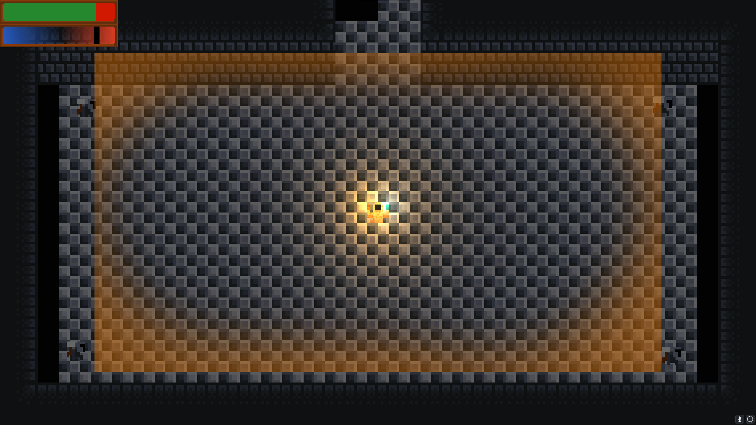
Thank's for the feedback. I already took care of this. Also Your monitor must be truly huge.