Play game
Duvet's itch.io pageResults
| Criteria | Rank | Score* | Raw Score |
| Overall | #1 | 4.438 | 4.438 |
| Overall | #1 | 4.438 | 4.438 |
| Originality/Creativity | #1 | 4.625 | 4.625 |
| Engagement/Fun | #1 | 4.313 | 4.313 |
| Graphics, Audio, and Polish | #2 | 4.438 | 4.438 |
| Magical Girl Design | #4 | 4.375 | 4.375 |
Ranked from 16 ratings. Score is adjusted from raw score by the median number of ratings per game in the jam.
How does your game fit the Magical Girl genre?
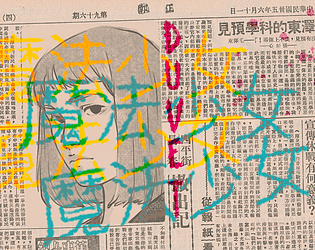
Duvet is a short adventure-puzzle game made in Unity about a dystopical world with militarized magical girls.
Which theme(s) do you pick?
Embodiment of [Scarlet] Devil
Hidden [Star] in [Four Seasons]
How does your game fit the themes above?
The themes are presented in the form of puzzles and plot that is revealed in the game.
Are all your graphics assets made by yourself during the duration of the jam?
they were created from before the jam or purchased
Are all your audio assets made by yourself during the duration of the jam?
they were created from before the jam or purchased
Comments/Suggestions about the jam
The 3d model, art and most event assets excluding some royalty free pictures were made by us during the jam.
The music is entirely original, but some sound effects such as footsteps were acquired and edited for the jam.
Leave a comment
Log in with itch.io to leave a comment.


Comments
Astoundingly well executed. Love the atmosphere, well told emotional story, and the aesthetic. My only criticisms would be the turn radius is pretty slow with seemingly no way to speed it up and I got a little lost at the rooms that had 2 exits and entrances near the bottom of the screen.
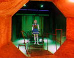
The Resident Evil influence is clear in the look of this game. The player character model looks pretty good, but the fixed perspective makes navigation difficult sometimes. The story hits the feels but could use some grammar checking to polish it up (for example, "man-manned?"). I did like that it's clear when you are near a location that can be inspected, but as other reviewers have pointed out, it would be good to have an indication where you can click inside these inspection zones. I found the symbols puzzle in the mailroom far too cryptic and put the game down at this point.
In all, it's clear that effort was put into this entry. It just needs a little more polish (especially on the presentation of the puzzles) to put it over the top.
The aesthetics and music merged into a beautiful and disturbing atmospheric mood that goes along with the story just as well! And those tank control took me way back to the psx era, I loved every bit of this game, congratulations! <3
This is another one that kind of came out of nowhere and blew me away!
It was actually longer or at least more involved than I thought. I was like "oh, this looks promising and it says it's short so I'll try it" and it took me an hour or two to get through it.
I also was not expecting the feels or the grimdark.
The storytelling was top-notch. The mix of walking around and point-and-click gameplay works well here, and telling a story in past tense via notes and objects worked great. The environments gave a lot of feel and emotion to the game just by the way they were designed.
I like how you showed us bits of the setting through small snippets and ambience rather than a huge infodump. I had enough context and understanding of the world to know what was going on, but without being bombarded with information.
I do wish you could review the notes, since you won't necessarily discover them in order. And I do agree with the previous commenter about it sometimes being hard to tell what can be interacted with.
The style of the backgrounds, combined with the postprocessing, gave the game a unique aesthetic that contributed to the tone and feel but it did start to get grating after a while. Sometimes I found it hard to see things because of the chromatic aberration and blockiness, and the environment could be hard to navigate because some of the areas look extremely similar.
It didn't really become a problem but if the game kept going I think it would start to be.
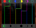
I think the puzzles are good but I found them very difficult. I don't think they are that difficult, but I don't typically play this kind of game. That's one of the downsides to jams; not everybody will be skilled at or into the genre of game you've made. I resorted to basically randomly guessing with the symbols puzzle and had a lot of trouble with the slide puzzle because I thought the star tiles needed to be in the spots indicated by the outlines. Someone with more puzzle game experience would be much more qualified than me to comment on these.
The game is teetering on the edge of needing save/load, length-wise.
I might have to give this one another playthrough once I've played all the other games in the jam. I still don't really understand the ending. Was that girl the other girl? Is she a vampire? The cheerful music kind of threw me for a loop here.
Overall it was a very good entry.
Hey there! We are glad you enjoyed our game!!
On the topic of length, we had a small pool of play-testers and found discrepancy among them, truth is that the length is now clear that it's closer to the hour or so.
Both mechanics you mentioned were things that we wanted to implement but due to time constraints was impossible, we might update the game with these quality of life features.
Perhaps the ending will make more sense on your second run, if not, let us know.
Thanks so much for sharing your experience, it motivates us to keep going forward-
This game successfully calls back to games such as Resident Evil in regards to camera use, tank controls and puzzles. These elements help to develop a tense atmosphere in a very short time. The magical girl design is interesting as it fuses the traditional school girl uniform with military elements, which complement the story and background.
The only issue I had with the game was the lack of mouse feedback in the clue finding sections which ended up with me clicking every corner of the screen just in case I missed something without realizing. Having the mouse go red when over a clickable part would be enough to remedy this.
I think what carries the game the most is the atmosphere it creates with the background images, main character design and backstory in general. I think it created a world worth exploring.
Thank you so much for playing the game and taking the time to write down a review for our game. It means the world to us.
It was certainly inspired by other games like Resident Evil so we are glad that it brought back some memories - and that our intention with the atmosphere of the game is reflected in it.
We agree regarding the mouse feedback feature and we will definitely take it into account for updates. This is for most of us a first time experience and we have a lot to learn from it, so we really appreciate any suggestion.
Again, from the bottom of our hearts, thank you!