Play game
Lightless's itch.io pageResults
| Criteria | Rank | Score* | Raw Score |
| Concept | #56 | 3.100 | 3.100 |
| Presentation | #73 | 2.800 | 2.800 |
| Overall | #75 | 2.750 | 2.750 |
| Use of the Limitation | #80 | 2.800 | 2.800 |
| Enjoyment | #96 | 2.300 | 2.300 |
Ranked from 10 ratings. Score is adjusted from raw score by the median number of ratings per game in the jam.
Team members
Developer - KrykiZZ, 2D Artists - Gis, ZecosMAX, Music Artist - Saxarok
Software used
Unity, Aseprite, Online Sequencer
Use of the limitation
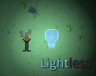
We have a two opposite characters where first one is a Lilamp and spreads the light and Evilamp who spreads darkness into the world.
Cookies eaten
We had no cookies but if you give us a bit we will be happy
Leave a comment
Log in with itch.io to leave a comment.


Comments
Nice game, I like the music and the art.
Congrats! Keep it up!
Thank you!
Thank you for the feedback. I try to improve that.
Cute graphics, nice soundtrack. Good use of Unity's 2D lighting system.
I like these exploration games, but unfortunately there is not enough variety in the gameplay to really keep things interesting in this case. I would suggest mixing it up just a little bit: maybe power ups, maybe enemies, maybe puzzles, etc.
Also, I was unable to get the evil campaign to run. I click the button, but the game doesn't begin.
Cute!
Cute and fun game! Love the concept, art, and the music.
Thank you for your feedback! We are trying our best!
Gameplay wise (sadly) this game is boring, but the artstyle and graphics are awesome for a game that was created in less than 3 days.
Cool game. I really like the screen flicker effect as it is pretty subtle but I really dig it.
I was just about to take a screenshot of the two characters next to each other and then... that happened. :D It's a shame it takes quite a while to get to the ending because a lot of people will miss it and I thought it was cool.
Most of the map felt barren, but you yourself mentioned the reason(s) for that. A few easy tweaks I would suggest, if you're interested - 1) make the collision shape of the player only around its feet for more realism, 2) allow the usage of the arrow keys or a key other than Q (because Q and WASD are right next to each other so using them simultaneously is uncomfortable), 3) make the lights easier to light up, and 4) make the map smaller and focus more on implementing story elements. Even if you don't want to touch this game anymore (which is basically me after every game jam), I hope it helps for next projects.
Thanks for you feedback and xD. Yeah, i don't want to touch this game anymore but only for learning purpuses i'l do that. The main reason for denying this game is bad code structure bc its my first attempt in unity. But after your words i want to do something with that. Thank you <3.
Wow! thanks for your review, you have provided very useful critics we will take into account into next projects
sadly it is very repetitive and the overall gameplay is too slow and that made the game tedious to play . The concept is ok tho, it has a good potential to be a better game if polished :)
I tried my best. Thank you for critics i try to do something with that later :)
not trying to be very negative but the game is very slow to be played. maybe tweaking the speed of character and furthermore polishing the game ? great work nonetheless :)