Play game
Hunger Blind's itch.io pageResults
Criteria | Rank | Score* | Raw Score |
Presentation | #12 | 4.333 | 4.333 |
Overall | #28 | 3.944 | 3.944 |
Enjoyment | #37 | 3.889 | 3.889 |
Concept | #62 | 3.889 | 3.889 |
Use of the Limitation | #64 | 3.667 | 3.667 |
Ranked from 9 ratings. Score is adjusted from raw score by the median number of ratings per game in the jam.
Team members
Cameron Burridge: https://www.artstation.com/camburridge22
Software used
Unity and Photoshop
Use of the limitation
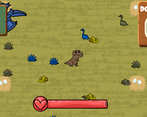
I created a game where you play as a color blind t-rex trying to eat but you cant tell which food is safe or not unless you use the non colorblind menu. So you are your own enemy because of your colorblindness. This gameplay was able to incorporate both themes as well as the players own hunger being the enemy as well.
Cookies eaten
1
Leave a comment
Log in with itch.io to leave a comment.
Comments
I like particle effect and art!
Thanks
Nice graphics, funny gameplay. Well enjoyed :>
Thank you!
This game was pretty interesting! It looks very polished and everything looks great! There was one bug I did find where if you are in the game and pause the game, pressing the pause button again seems to break the game but other than that it looked nice!
Thank you! Noted I need to rework the whole pause system for sure.
The game was very fun :) The idea of a colourblind trex is very funny to me for some reason and it's food being based on colours is very creative! Congrats! :)
Thank you!
art is so beautiful!! very polished and fun game! you even added a minimap, thats awesome! great work!!
Thank you!
The game was fun, I wish there was a web build available instead of downloading. I enjoyed eating my fellow kin (dinosaurs). I like the idea behind being a color blind dino who has to eat based on color was super fun and interesting.
Ya I wish I had a web build but I haven't made one yet so with the time constraint I didn't wanna try something new for publishing . Thanks for the comments!
This game is incredibly cute, love the look of all the characters and I might die for the pterodactyl (not sure yet).
I did find myself looking at the pterodactyl map quite a lot, which made me not realize when the color of the poisonous dinosaurs changed from time to time.
...maybe I'm just biased towards the pterodactyl. I can't not give him my attention when he starts cheering for me!
Thank you! I was really happy with how all the art came out. I really struggled with the position of the UI and its still not where I'd want it to be so not knowing where to look makes sense. Thanks for playing!
I really liked the graphics, reminds me of Starcraft animations from carbot. But there is a problem, the interface does not fit on the screen.
Overall, good game.
I loved carbot growing up so big inspiration from there. Thanks for the feedback on the UI and thanks for playing!