Play game
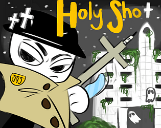
Holy Shot's itch.io pageResults
| Criteria | Rank | Score* | Raw Score |
| Presentation | #138 | 2.008 | 2.750 |
| Enjoyment | #151 | 1.643 | 2.250 |
| Overall | #156 | 1.598 | 2.188 |
| Concept | #167 | 1.643 | 2.250 |
| Use of the Limitation | #167 | 1.095 | 1.500 |
Ranked from 4 ratings. Score is adjusted from raw score by the median number of ratings per game in the jam.
Team members
6
Software used
Unity
Use of the limitation
Holy water shotgun to take down ghosts
Cookies eaten
21
Leave a comment
Log in with itch.io to leave a comment.


Comments
The art style does be looking nice! Awesome Job
I'm a big fan of the art style of the characters and the atmosphere. I'd play a full game with this art style and even concept if the gameplay were tightened up with at least the addition of sound and a better indicator if I'm hurting an enemy. Some context/story around the very stylish main character would also greatly enhance the experience.
I really like what is offered in this game! A challenge that mixes a house full of enemies with a labyrinth. I finished it on my third try! I enjoyed seeing the different kinds of enemies there are, and the way they were designed are quite spooky too! Along that, the main character is adorable. I also liked the artistic approach with the game, giving it a sort of paper-puppet theme! The music and atmosphere are also cool and continue to give a feeling of uncertainty!
The game plays well, but some of the front walls and the camera zooming in onto the main character makes it hard to see and feels a bit claustrophobic and unintentional(?). That made it quite challenging and a bit frustrating to work with when trying to find enemies or avoiding them.
Other than that, really cool and spooky work! Holy Shot is a great submission.
Thank you so much for the review!
As the artist who worked on this game, thank you very much. :) I tried to go for a creepy-cute game, with my main inspiration being Spooky's House of Jumpscares.
Our main developer, Nathan, decided on the popsicle and cutout aesthetic, which was inspired by Paper Mario and a Youtube video ( [Neco-Arc] Battle Preview). We also had elements that were drawn from games like Doom.
Our developers did have some issues with the camera's FOV. Initially, we had some issues with the camera clipping through the walls and making the experience a lot more disorienting—in a negative way. The camera zooming-in was the quickest way we could resolve the clippage (even though there still might be some minor clipping left in the final build). However, some enemies were hidden intentionally, working with the camera's limited line of view. We wanted to add a slight jumpscare effect to our game without having any super spooky images or loud sounds that assault your ears. You probably noticed as you played through it, but the enemies' placement was the same every time to make it easier to adapt to the hidden enemies. So, you'll get the initial scare of the enemy being there but it's not totally unpredictable when you play through it again.
Our music was made by Nate, one of our team members, and we all think he did an amazing job! I agree, it adds to the overall atmosphere.
Thanks for playing (And reviewing)!
Thanks for the follow up! As a fellow artist myself, I loved the art and the reference to Spooky's House of Jumpscares, definitely got some Specimen 1 vibes! I understand that the camera and clipping could be a bit of a problem, but honestly, for a game made in a few days, this is still well done and highly impressive! And, I do like how the enemies stayed in their same position. As you said, it did give quite a scare at first, but made them memorable for the next round. Great work, and again, thank you for replying!