Play game
Space Drag's itch.io pageResults
| Criteria | Rank | Score* | Raw Score |
| Audio | #23 | 2.800 | 2.800 |
| Gameplay | #31 | 2.800 | 2.800 |
| Overall | #35 | 2.625 | 2.625 |
| Presentation | #36 | 2.600 | 2.600 |
| Art | #39 | 2.300 | 2.300 |
Ranked from 10 ratings. Score is adjusted from raw score by the median number of ratings per game in the jam.
Team members
Just me, Youthinkasido (twitch.tv/mobilegamedev)
Software used
Clickteam Fusion 2.5
Cookies eaten
Less than 1000
Leave a comment
Log in with itch.io to leave a comment.


Comments
A classic avoid-the-walls maze game! A bit basic, but was quite a few interesting extras that elevated it, the visuals are not bad and has a pleasant music score that fits the pace of the game. With that said, I do feel there are a few issues.
First of, I am not a fan auto-rotation of the ship. The game-type is about precision movement, its then very jarring that the ship auto-rotates (even worse that the rotation is instant) making me feel less in-control and afraid every time the ship turns that I will make a mistake (even if the hit-box remains the same, its about player perception). Secondly, the issue was made worse with the shooting mechanic, as the ship only shoot in the facing direction that I cant control myself. When I got it the first time, I missed the rotation location, so I ended up having to move blindly to find the spot that turned the ship in the "correct" direction, it felt very odd. If you use the auto-rotation as a mechanic, then there must be clear indicators where that happens, especially if it actually effects game-play and is not a purely visual change.
Also, another small side note on the shooting: why introduce a shooting mechanic (with text even to explain how it works) to then never use it again on another level after? Usually when a mechanic is introduced you expect to use it for a few levels after. It got especially confusing as the next levels introduced a enemy that I thought I was meant to shoot, but no, I was suppose to run away.
Continuing, I was felt the level-design overall was sadly lacking. Not that the level themselves where to difficult/unbalanced, they just felt a bit uninspired. All the levels are completely linear, with ONE path and one path only, and almost every one is a tight corridor that moves in a wave pattern. Would have liked to see a bit more diversity, use different patterns, have levels with multiple paths with a shorter but "harder" path, or other with a open area but moving asteroids etc.
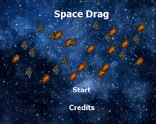
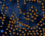
I think why the levels bother me is because they don't feel built with the space esthetic in mind, the levels feels like they are designed as a cave systems, rather then a asteroid-field. They are all too tightly packed and to tidy, with every asteroid is neatly stacked in a tight pattern outside the corridors. It ends up looking very stiff/unnatural (that all the asteroid animations are in sync also does not help).
With all that said, Its still a fully functional game, and I did have fun playing it! Hope my comments may be of use. Cheers
Hauo, can't thank you enough for your feedback and for playing my game! This was one of those situations where I joined late and had about a day to complete the entire game. This is really incredibly great feedback for me and I will make sure to incorporate more levels with the changes you have suggested provided I continue to develop this game. Thank you so much again dude!
That moment I know how to control the ship and its objective, my first thought was "I hope there's no jumpscare in this one ...." (I played a browser game, maze walking, which has jumpscare that kinda scarred me for lives :)))) )
That's a good control mechanic. Once, in the level with a gun, the ship didn't immediately turn around toward the grey asteroids in front of the Earth. The second time in that level, everything's work fine. Not sure if it's easy to reproduce this. :))
I personally loves the chasing meteor (or is that a meteor-look alien?) than the gun, btw.
Thanks so much for your feedback and for playing the game! I remember that game with the jump scare!!!!!
After the gun level it got really interesting... You should have more levels for that and I really need a larger mousepad... If you decide to keep developing it, change the earth to different space stations... Story wise, it makes more sense to go from station to station than to keep on returning to the same destination...
Awesome, great feedback thank you for playing!
The game got better after level 3.
BTW: I'm all for gentle onboarding, but the interesting gameplay shouldn't start after three boring levels.
The gun and time pressure make the game more interesting.
I agree, more gun and chase levels make it more exciting. Thanks for the feedback and playing!
I got to level 3 I had to turn down my mouse sensitivity to be able to navigate better. Still I had fun.
Thanks so much for playing!
Interesting interpretation of the theme and limitation. The ship's hit box is too big in my opinion.
Thanks so much for the feedback!