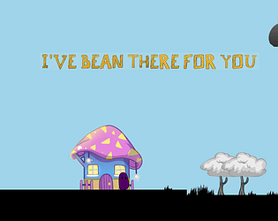
Play game
I've bean there for You's itch.io pageResults
| Criteria | Rank | Score* | Raw Score |
| Presentation | #46 | 3.402 | 4.500 |
| Overall | #100 | 2.693 | 3.563 |
| Use of the Limitation | #101 | 2.646 | 3.500 |
| Enjoyment | #107 | 2.268 | 3.000 |
| Concept | #108 | 2.457 | 3.250 |
Ranked from 4 ratings. Score is adjusted from raw score by the median number of ratings per game in the jam.
Team members
Magdalena Drezner - Design, Anna Drezner - Art, Bartosz Kręgiel - Sound and Testing, Andrzej Drezner (me) - code
Software used
Game Maker Studio 2
Cookies eaten
Around 15 and a lot of Pringles
Leave a comment
Log in with itch.io to leave a comment.


Comments
congratulations on being the first game in the Jam I played that got me emotionally invested in the character I played. Very simple yet effective.
I was getting worried at the end, as to how you were gonna end off the story (Please by god don’t be sad), had to stand outside the house for a bit and think about what might happen if I enter home alone. 10/10 game, well done : )
I cheered up so many beans :) Nice little platformer with a moral message. Artwork was stunning! Controls were great, I didn't feel the 'boing' jump fit with the theme and mood, the 2 frame animations worked well. Overall a short but enjoyable experience.
A nice short game with a good message to go along with it. The game despite mechanically how simple it is manages to effectively hold your attention and to feel for your little bean character, good job on that. The end especially drove that home and made me worried for the little bean that something bad would happen. While this definitely was a story / emotion driven game I still think that overall the design could have been improved some. At one part I tried to explore parts of the level which were just ways to get back up from a fall. I believe should be clearly marked in some way for a game which appears to have "find the goal" type gameplay on first inspection. I also tried to interact with the newly coloured background assets the first time with a bit of keyboard mash only to find out that they were symbolic rather than gameplay driven. Perhaps you could create a sort of "blast of colour" from the characters as you meet them or add other background assets which get coloured in to the first character's screen to more clearly indicate that it is just adding colour to the world. These issues are quite minor, but they did affect my experience. All that being said I did enjoy the game a lot and thought the level (and all the art assets for that matter) looked very nice. The art combined with the music created an atmosphere that felt well defined and made the game more emotional. The world becoming more colourful as you progressed gave a good sense of achievement and made you feel like you were really improving the world of the beans, a nice feeling to have. Good work with the game!
Thank You very much for taking time to play and feedback! And I agree, we could do more with some visual effects, I really find them to be my weak point as a programmer, because I usually do the design part :) We will surely pay more attention to it in our next game, and I myself would love to learn some ways to make it more visually appealing.
really liked the drawings and nice concept. ps.: at the end you misspelled forget to forcet :)
Thank You! :D And with that misspell, it's the fault of the font, it is a liiiiiitlle bit unclear indeed ;)
I couldn't download as I use Mac. The screenshot looks very well polished. I'm sure the game was great!
I wish I could make a Mac build, but GM2 licence for it is crazy expensive for hobby development ;D One day I'll get it for sure!
https://hebini.itch.io/ive-bean-there-for-you-web I've bought the licence and built the web version to solve that problem :D
Thanks, I'll comment your game submission page :)