Play game
ReDiscovery's itch.io pageResults
| Criteria | Rank | Score* | Raw Score |
| Enjoyment | #3 | 4.154 | 4.154 |
| Concept | #3 | 4.231 | 4.231 |
| Overall | #5 | 4.038 | 4.038 |
| Presentation | #7 | 4.231 | 4.231 |
| Use of the Limitation | #21 | 3.538 | 3.538 |
Ranked from 13 ratings. Score is adjusted from raw score by the median number of ratings per game in the jam.
Team members
Jacob Green
Software used
Unity, Blender, Audacity, etc.
Use of the limitation
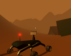
The player's rover is weighed down by the items it is carrying.
Cookies eaten
Not enough
Leave a comment
Log in with itch.io to leave a comment.


Comments
That was great! My only possible complaint is that I got stuck on the podium with the sword a bit, but that's just physics being physics, good presentation!
Everything about his was super good, loved it.
This is very cool. I love the atmosphere of mystery. The melancholy landscape, the soulful music, the enigmatic remnants of a lost civilization... I'm getting some Heaven's Vault vibes (and I mean that in the best way).
I, too, got my poor rover stuck. While trying to recharge my battery, I got stuck half on and half off the platform, making my wheels useless.
Also, with so few landmarks, it is a bit too easy to get lost, even with the (admittedly very helpful) beacon in the sky.
Great art. Awesome gameplay. :-)
The visuals look amazing, and the atmosphere is pretty sweet too. I like the concept.
My god I would LOVE to play a fully featured mars rover exploration game. Super relaxing vibes. Fun driving physics. I did crash into the base station at one point and got completely stuck in but that's almost more realistic than if I hadn't gotten stuck.
Getting stuck is part of the process I guess! To be honest, making this game and in such a short time, I would actually love to make a longer, better version with more of a story. Maybe I will. Thanks for the feedback!
Very nice presentation and relaxing exploration game!
Thanks!
Very cool and atmospheric! The haze and visuals look awesome and really set the mood! I think some control UI in the game could help such as the flashlight and pickup controls, all the information in the start menu was a little overwhelming (but completely understandable with the time frame of the jam). And I think the map could use some more recognizable points of interest, like the buildings silhouette was visible in the haze, but it was harder to navigate and find other points of interest, since they weren't easily visible. The haze/fog looks awesome and you definitely keep it, just maybe making more obvious areas to explore.
Great work! Really liked it! :D
Thanks so much, I appreciate the kind and honest feedback! I definitely agree with the landmarks - it was tough to make certain things obvious from a distance, but if/when I go back I will certainly try.