Play game
C05-M0 (Cosmo)'s itch.io pageResults
| Criteria | Rank | Score* | Raw Score |
| Enjoyment | #10 | 3.750 | 3.750 |
| Overall | #19 | 3.848 | 3.848 |
| Presentation | #24 | 3.857 | 3.857 |
| Concept | #27 | 3.786 | 3.786 |
| Use of the Limitation | #29 | 4.000 | 4.000 |
Ranked from 28 ratings. Score is adjusted from raw score by the median number of ratings per game in the jam.
Team members
Underpaid_Goblin
Software used
Construct 3
Use of the limitation
I used an 8 x 8 art style for all the elements in the game.
Cookies eaten
1, and it was delicious.
Leave a comment
Log in with itch.io to leave a comment.


Comments
[Previous Thoughts Before The Voting Phase]
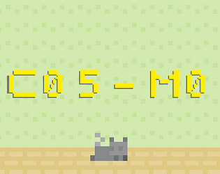
C05-M0 engages the Player with the story it's presenting from the very beginning. Using the Title Screen with the button to [POWER ON] this robotic cat is such a nice touch. It's something you don't usually see a lot in modern indie games. I'm aware that this idea has been executed well before but I feel the Underpaid_Goblin was able to make this work with very simple cute animations.
While I'm aware that the duration to create an entry for this project is quite stressful depending on the scope of your project. I will admit that while it's still great that the game is the way it is. I just feel that there was slight immersion being broken for me when I selected: "POWER ON", only to find that the game immediately jumps to the gameplay. I really feel a short animation or short transition could've really made this feel more like you are powering on this robotic feline. However, this is not discrediting the Developer. I actually feel that even without this simple transition, the game still holds well on its own.
Unfortunately, there is the issue of not always being able to read the text presented to you clearly. This is definitely something I would highly recommend fixing as I feel the story is very important. After all, the ending to this game is what really defines the tone that this Developer is trying to present us with.
Great use of 8x8 artwork! I really liked how everything just fit really well together. From the first location which I feel was the most atmospheric. To the location that I feel stands out even more, the final scene. However, I still enjoyed the scenes before the ending. I just feel there wasn't much to take in. I also liked the attention to detail of the cat being behind the table legs, etc. That was another great addition to attenton to detail.
[Gameplay Mechanics]
Battery is something that is heavily focused on in this game. I really like how the battery deplenishes slowly while you are making progression through the game. I feel the Developer didn't want to make this game challenging and really just wanted to keep the immersion of the Player exploring this world. Whether intentional or not, you could even begin to theorize as the player who lives in the house. There's pictures on the wall that clearly show that this robot cat lives there. It's all very strange and I feel the music itself really reflects on this too.
Breakable Vases is something that I was instantly reminded of games like Spyro, etc. I feel that the Developer made great use of Physics in this project. There's really not much more to say but I really liked everything that the Developer had thought of while making this game.
Overall: 8/10! Definitely something that needs some improvement but I feel the general idea here has been captured too well. You certainly deserve a higher score! Keep up the great work, Developer!
I'm really grateful for the comment and the intensive review! I'll create an updated version of the game keeping your comments in mind. Thank you for the kind words and constructive criticism!!
Wanted to let you know I finished the update if you were interested in checking it out!
You're truly most welcome, Developer! I definitely think the changes you made were great. There's still the problem with the battery UI not always working correctly. I appreciate the additional content you added to the barren areas. It's looking a lot better. I still think there needs to be a few more locations to visit. I think it gets to the end too quickly for the ending to have as powerful as an effect as it should have. I also feel you should add some pictures on the wall of that woman with the cat to really capture the emotion of the Player's sadness by the sudden ending. Anyway, I really enjoyed it again. I also think you should try to make the hedge cover the (Ending) so that it's even more of a surprise when the Player slowly approaches it. You can do this by changing some of the ordering layers. Anyway, it looks a lot better! Great work! :)
Wanted to let you know I updated the game and added a new level, hope you like it, and thanks for the suggestions, they really help me take this game to the next level!