Play game
They came to wreak Hell (Nesdev Compo only page) - NES rom's itch.io pageResults
| Criteria | Rank | Score* | Raw Score |
| Overall | #15 | 2.622 | 2.714 |
| Originality | #15 | 2.691 | 2.786 |
| Overall Impression | #16 | 2.622 | 2.714 |
| Art and Style | #16 | 2.760 | 2.857 |
| Sound | #16 | 2.484 | 2.571 |
| Polish and Completeness | #18 | 2.553 | 2.643 |
Ranked from 14 ratings. Score is adjusted from raw score by the median number of ratings per game in the jam.
Category
Game
This category is reserved for games. Any tools or toys should be submitted to the other category. Mapper 28 compatible entry up to 64KB with NO PRG-RAM is required! Must be free or include a free demo.
License
Agree
This game may be used in a physical and digital multi-cart release and distributed by jam organizers as part of a digital archive (ZIP).
Leave a comment
Log in with itch.io to leave a comment.


Comments
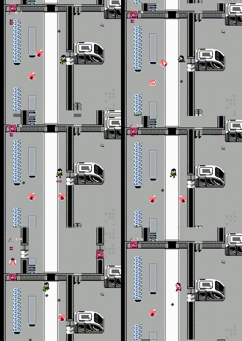
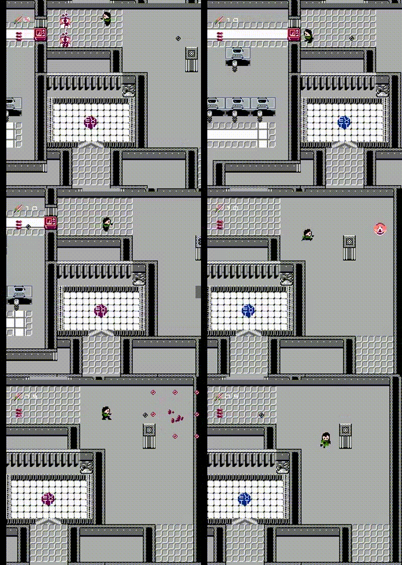
This is a fantastic demo, and a few tweaks away from forming a killer game. The controls are about perfect. The ability to strafe was such a pleasant surprise. Levels are enormous for this platform. The intro overview shows that off, and provides guidance.
The simplest change that would make the biggest impact is more color. There's colored elements in the background - you've obviously handled scrolling that in. Tinting whole rooms, or decorating them with similarly-colored objects, would make navigation more natural. It would improve the at-a-glance identifiability of the already-present variety.
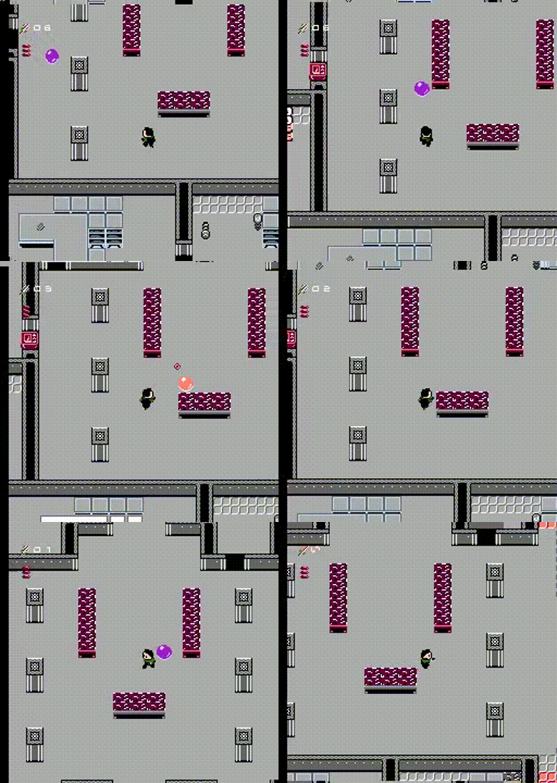
Enemies, same story. They have a great range of behaviors. The cliche of palette-swapping to show which thing they do is cliche for a reason. Having to guess whether a turret is going to fire diagonally, or even come at you, is holding back the combat, when movement and shooting are this tight.
Thanks, this is great feedback! Coincidentally I've just been working on tying the enemy behaviours more closely to the animations to give them more of a cohesive feel and give the player some indication of what is about to happen. I absolutely think the levels could use more sense of direction - I made huge levels and then carved them up for the compo - I'll probably cut them down which will give me more tile combinations to work with and allow me to add greater detail.
Thanks for taking the time to comment!
This is impressive! Music sort of reminds me of DOOM. But I get just a black screen if I do a warm reboot, that might be worth checking on.
Thank you! And thanks for the bug report, I'll have a look!
A pretty interesting Alien Breed clone game. Congrats !
That's awesome, thanks for playing!
Impressive to see scrolling in all directions and 8-way movement! I like the ability to strafe. The shaking of the screen when hit by an enemy is a nice touch! I enjoyed the music, but it would be nice to have more sound effects. The meanings of the HUD elements weren't immediately obvious to me, and they are a little hard to see sometimes.
Overall - nice work!
This is great feedback, thanks for playing and taking the time to comment.
Free scrolling and 8-way motion on the player avatar--impressive for a NES jam!
Thanks! I've been checking yours out too - wow, those graphics, animations and just general presentation on yours, it makes everything fit together so nicely!