Play game
Slaughter's itch.io pageResults
| Criteria | Rank | Score* | Raw Score |
| Originality | #7 | 3.647 | 3.647 |
| Overall Impression | #13 | 2.941 | 2.941 |
| Overall | #17 | 2.565 | 2.565 |
| Polish and Completeness | #21 | 2.176 | 2.176 |
| Sound | #22 | 1.882 | 1.882 |
| Art and Style | #22 | 2.176 | 2.176 |
Ranked from 17 ratings. Score is adjusted from raw score by the median number of ratings per game in the jam.
Category
Game
This category is reserved for games. Any tools or toys should be submitted to the other category. Mapper 28 compatible entry up to 64KB with NO PRG-RAM is required! Must be free or include a free demo.
License
Agree
This game may be used in a physical and digital multi-cart release and distributed by jam organizers as part of a digital archive (ZIP).
Leave a comment
Log in with itch.io to leave a comment.


Comments
this was awesome. I can't believe you were able to pull this off. I am a huge fan of the "boomer shooter" and I love that you brought it to the NES. It runs really smooth too, I have no idea how you did it.
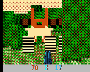
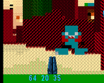
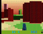
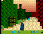
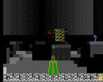
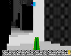
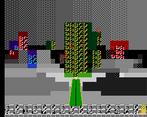
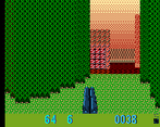
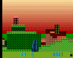
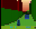
I know this is a proof of concept, but I feel the 3D enemies and height differentials make it a little confusing. I feel like having it be single plane with sprite enemies (like wolfenstein 3d) would have made it much more playable for longer periods of time. I got lost pretty easily and didn't know what was a hill or a wall or an enemy, it all kinda smooshed together.
Still, so much potential here. I'd love to blast stuff in an NES FPS. Awesome job
Yeah the complex open arena as a first level was a poor choice. The height differences are staying, though. Different constraints go in a new game. What's going to make this game easier to read are faster updates, diagonal tiles, and possibly ceilings. (And better levels.)
Some complexity is required, because this engine supports up to a thousand enemies at once. The name is the goal.
That you've implemented an FPS is really impressive - I need to take a look at the source some time :)
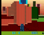
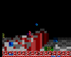
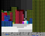
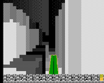
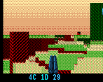
Given the way the graphics are rendered, I wish at least the game's description page would tell more about what's going on, what the enemies are, etc. I still haven't figured out what "Edit" or "Suffer" do, or what all the numbers on the bottom and at the top mean (but seeing the screenshots, I wonder if the ones I saw at the top were just garbage tiles out of the safe area)
The game has a full map editor. It's not documented because the compo version is, in general, kind of a mess. Directions on the second controller change the height and texture. B+direction on the first controller will move the cursor. Select on first controller will open a hex-editor view, where directions on the first controller move the cursor, and B+direction changes height and texture. (Like I said: kind of a mess.) Start in the hex editor will change to editing the enemy grid, which is its own kind of jank.
The Suffer option just removes health. It was a debug feature I found amusing enough to leave in. I think the compo version source code even remarks on how needlessly edgy it is.
The stuff at the top is there because apparently FCEUX is not a very good emulator to develop with.
The premise so far is, to paraphrase Yahtzee Croshaw, "here be enemies, shoot they ass." The intended tone and context largely has not been implemented. I've been fixing bugs, improving performance, and adding features, since the deadline. That'll get posted when voting ends. A version that is an actual complete-ish game should be out by end-of-year.
Should.
This marks the second FPS i’ve ever played (the first being the original DOOM) and i’m impressed that you’ve managed to make something here on the NES where i can even almost tell what’s going on!! Great job!
Really awesome technical demo of what can be done on NES. It's a littler hard on the eyes at first, but I got used to it quickly. I hope you will continue to work on this some more.
Really good job!
Really interesting stuff!
Thank you! I'm only annoyed I broke the "attract screen" somewhere between yesterday afternoon and yesterday evening, and didn't notice until literally one minute before the deadline. Whoops.
I invite harsh judging. The game part of the game is limited and the engine could be better. The technical flex was great fun to work through, and I'm surprisingly pleased with all the art driven by technical constraints, but - execution is everything. What a game could be, or how it could look, is brain crack. The ROM is what it is. If someone doesn't enjoy playing it, or playing with it, then I missed.
Heads-up - this is obviously incomplete. I'm sharing it now for other people to build on. This engine is open-source, and as you can see, there's nothing to get in the way of your own art.
It's currently a 16 KB NROM. CHR is mostly junk. One nametable is untouched. There's plenty of room for whatever you want to make. (And plenty of room for improvement. I'd recommend picking a mapper that can move more tiles onscreen.)
Very cool, thanks for sharing!