Indie game storeFree gamesFun gamesHorror games
Game developmentAssetsComics
SalesBundles
Jobs
TagsGame Engines

ZINE IS OUT!! Sticky

A topic by jwhop created May 10, 2023 Views: 329 Replies: 10
Viewing posts 1 to 3
Host(+3)

HELLO ALL

thank you so much for participating in the jam, I loved looking over the google drive folder of everyone's submissions!!

the zine is finally out, and you can find it here! https://jwhop.itch.io/ows-zine-1
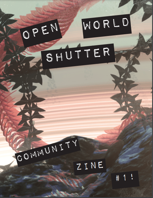
if there are any mistakes I made or if I missed you at all, PLEASE LET ME KNOW and I'll update it! this was an extremely hectic week for me because I also had final projects at school. 

much love to all!!! maybe we'll do another one in the fall?? <3

-Jonny

(3 edits) (+1)

hi there is a mistake on zin's page (and in the zin itself) in my and other participant's nickname cause it's in cyrillic...  the right way it should look "мяу вау" and "сгусток вал"
also it saddens me that some of screenshots are weirdly cropped (why) and if not, they are too small. and you also misnamed the game on one of hypern0thingness's work (last screenshot) it's Dark Souls III not Elden Ring 


Host (1 edit) (+2)

the elden ring one is fixed in the most recent version uploaded on the page! Will definitely fix the name issue, so sorry about that! 


I definitely struggled a bit with the croppings of them, it was a bit hard because almost all of the screenshots were in landscape 16:9, so it was hard to position them all on vertical pages to make them legible.  if theres a specific cropping youd like fixed I'd be happy to take a look!


the zine was under a pretty tight deadline and this was my first time doing something like this, but in the future i hope to get better at the positioning of everything. 


thanks for the feedback!

(+2)

i absolutely adore ows and kudos to you for creating this amazing tool but i just think it's very crucial that all of works are represented in a right way (the way that authors see [sent] them) otherwise it loses it's purpose a lil bit...

(+2)

i'm sorry if it sounds too harsh.. i actually feel you and understand that doing this all alone as a small independent artist isn't an easy thing

Host (1 edit) (+2)

no worries, i totally understand and appreciate the feedback! it's really helpful to get honest feeback. now thinking about it, if this happened to my work i'd probably be sad about it.  I'll start to look at ways to maintain proper aspect ratio while also being readable and shuffle things around! might take a bit of time, though. i was also planning on testing printing of it next week, itd be a good opportunity to see how readable it is while printed

(1 edit) (+2)

so glad to see that zine is become real, you've done a great work, jwhop!

also, yeah, miauwau already said about elden ring >ds3 naming and thanks for quick response (we met on Twitter, I remember<з)

what I want to add is:

1. can you, please, change the image from that used in "Dark Souls" section, and replace it with "/Exposure245Max.png" from my folder? I am in love with your choice of photo, but the chosen pic was the result of "backstage", within the series the most important thing for me is what I pointed out

2. as for the format, it seems to me that the most "humane" thing would be to give each person two paged spreads, because now the photos are really quite small or make the photos vertical/change the aspect ratio of the zine

we need to discuss this issue before printing, let's wait for feedback!

Host(+2)

will definitely do the photo replacement! Sorry about that, was totally obsessed with the original photo and was wondering why it wasnt in the folder. 


im starting to play around with making the photos bigger, which means more pages. trying to find a balance so it wont be too many pages! I do agree theyre pretty small at the moment. Not sure about giving each submitter their own page, because i like the idea of showing different peoples submissions together. 


will keep playing around with different arrangements!

(2 edits)

hi, thanks again for your really helpful tool, which we continue to use, but it was really sad to look at zine (sorry). we fully agree with all the problems mentioned, but we also want to ask please:

1) change the photo by kookooshka to 13_kookooshka (VRChat + ActiveWorlds 3D).png or 3_kookooshka (VRChat + ActiveWorlds 3D).png

2) change the image by сгусток вал to 2_сгусток вал (VRChat + ActiveWorlds 3D).png or 12_сгусток вал (VRChat + ActiveWorlds 3D).png

3) we also believe that virtual photography is not only about images from different games/applications, but also the strange connections behind them, so text (not only ours, but also the trivia by other authors in general) about them are very important. yes, the zine is limited, but it can be added like qr codes or fragments/quotes of the authors' statements about theme or methods if they want it 

4) sorry again for the pressure

Host(+1)

hi,


sorry you feel that way. Will work towards these changes. You did incredible work and wanted to add some of your explanatory text, but initially felt weird about your submissions being the only ones with text in the zine.  


again, the deadline was pretty tight and also during finals week at school for me, so I wish I couldve spent more time on it. Will spend more time fixing for an edited version. Hope you understand

Hello!

Just want to say thank you for your work and for this opportunity you've created! I'm totally fine with displaying of my work, you can crop it however you want. It's always hard to create such things with multiple authors, there are a lot of difficulties and unexpected moments in that field. Moreover when you need to work with such big event as A MAZE.

Personally I think you did great job! Best of luck with printing <3

P.S. Can't wait for the next one!