Play game
ENCORE!'s itch.io pageResults
| Criteria | Rank | Score* | Raw Score |
| Playability | #1 | 5.000 | 5.000 |
| Theme | #426 | 3.000 | 3.000 |
| Cleverness | #864 | 2.500 | 2.500 |
| Artistic Style | #957 | 2.000 | 2.000 |
Ranked from 2 ratings. Score is adjusted from raw score by the median number of ratings per game in the jam.
Judge feedback
Judge feedback is anonymous and shown in a random order.
- I'm not sure what happened, but during the Encore section, the game just stopped earning me money. I had to stop playing because the game wouldn't go any further. I'm finding it really difficult to experience the theme of "Spreading" in a lot of these idle clickers. Not much creativity is being implemented on this front. All I do is watch numbers go up while being *told* that I'm spreading X across Y. Very simple art, mechanics, and story. Unfortunately, nothing too interesting or creative here. Would have liked to see more than simple math occur.
- Not too big on clicker-styled games, but the concept and cleverness of the way you incorporated the overall theme was nicely done in my opinion. Music was enjoyable as well
Did you include your Game Design Document in your downloadable files?
Yes
Tell us about your game!
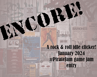
This is a solo-developed idle clicker game, single-player, where you are the social media marketer for an up-and-coming rock band! Add to their social media output and rack up the follower count and ticket sales to spread the word about this awesome band, and invest in upgrades to expand your reach even further.
Did you remember to include your Game Design Document?
Yes
Is your game set to Public so we can see it?
Yes
Extra Notes
This was my very first game jam, so I wanted to keep it very simple. Thank you for hosting this!
Leave a comment
Log in with itch.io to leave a comment.


Comments
Not very fan with clickers but this prototype was solid and not too long !
Maybe adding more effects on the screens ( seeing exactly how much followers we gain with each action ) or for actions that ask to wait having the button fill up until it's ready would be great !
A little note : I couldn't read the fonts very well as the letters are too close of each other with a big color contrast
Very cool! I like your interpretation of the theme :)