Play game
Xane's itch.io pageResults
| Criteria | Rank | Score* | Raw Score |
| Graphics | #10 | 3.536 | 5.000 |
| Overall | #19 | 2.563 | 3.625 |
| Gameplay/Design | #19 | 2.475 | 3.500 |
| Fun | #20 | 2.121 | 3.000 |
| Audio | #21 | 2.121 | 3.000 |
Ranked from 2 ratings. Score is adjusted from raw score by the median number of ratings per game in the jam.
What would you like feedback on?
Gameplay, difficulty test, boss fight. Any other things.
What did you update?
This is correct build, where boss spawn and some other mechanics works properly. The issue was, that during Boss Rush Jam I accidentally upload a bit older build, that has some bugs and missleadings. For example boss was not spawning at all. Details here: https://octopusx.itch.io/xane/devlog/687419/xane-reuploaded
Name of updated upload (if downloadable)
Xane v0.182 and higher.
Leave a comment
Log in with itch.io to leave a comment.



Comments
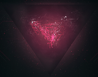
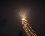
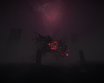
So a couple of things. First off, I love the visuals. The very pixel-y aspect to them is great and you nailed a really ominous/eerie vibe. The biggest issue I had is that it really wasn't clear to me what I was suppose to be doing. The problem with geometric shapes is that it is not always obvious what is a cool piece of scenery and what is the boss. I also found it not very difficult as it felt like I was barely taking damage/at threat while running around. So I think you could make the enemies deal more damage without making the game too tricky. My biggest feedback is just more UI guidance in general about what to do and where to go. This is also very minimal as I figured it out no problem, but you should probably put the words "Play" or "start" on the main menu so people know where to click. It's obvious to long time gamers but I could see the menu confusing some people. Otherwise, I really like the aesthetic of the game on the whole as well as the little menu animations as well so I think you did a great job. Just needs a tad more polish.
Thank you for your feedback, you are right, a lot here needs to be rethought and adapted for greater clarity. I'm working on it.