
Play game
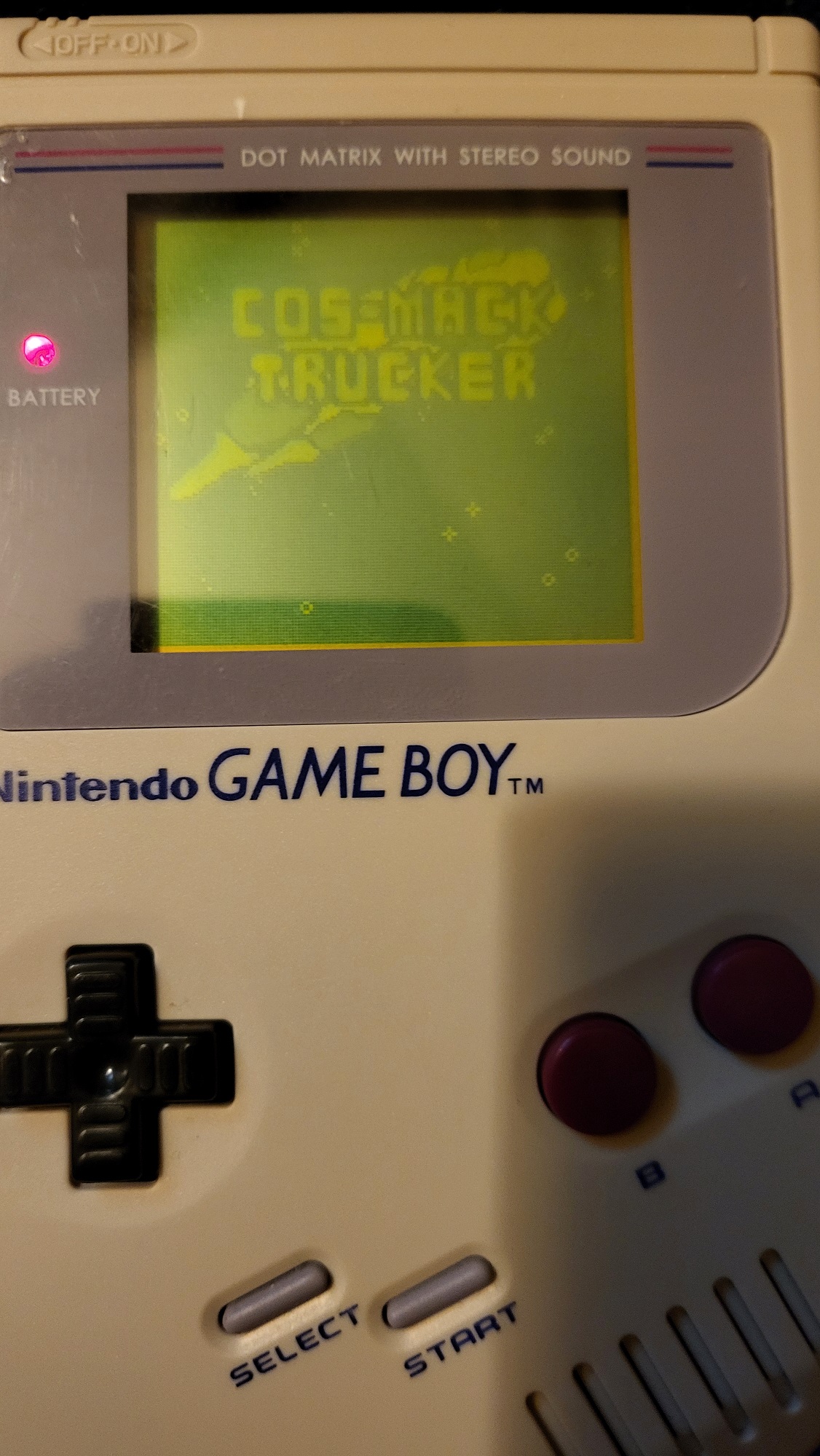
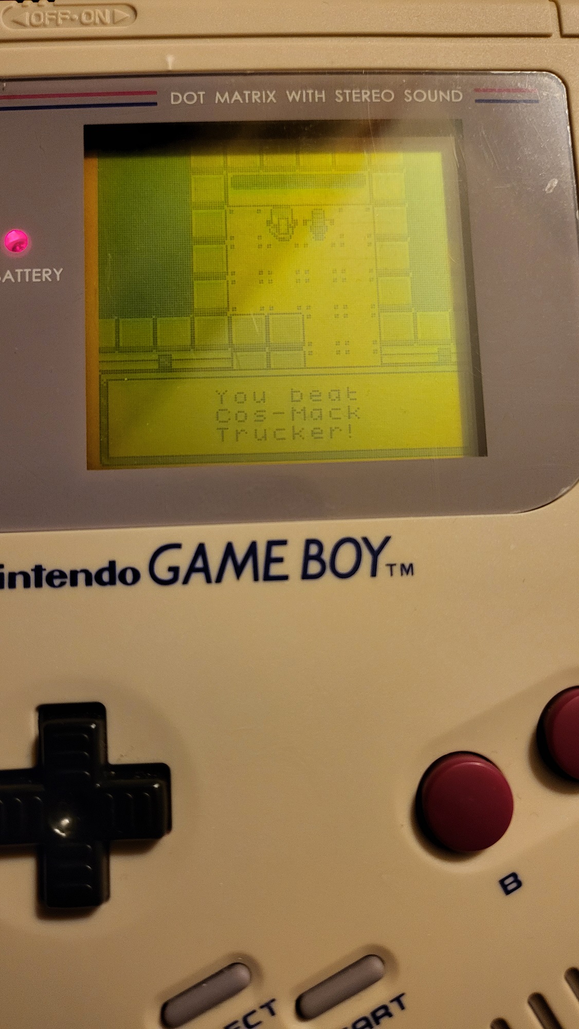
Cosmack Trucker's itch.io pageResults
| Criteria | Rank | Score* | Raw Score |
| Graphics | #4 | 4.250 | 4.250 |
| Gameplay/Design | #10 | 3.500 | 3.500 |
| Overall | #11 | 3.313 | 3.313 |
| Audio | #15 | 3.000 | 3.000 |
| Fun | #17 | 2.500 | 2.500 |
Ranked from 4 ratings. Score is adjusted from raw score by the median number of ratings per game in the jam.
What would you like feedback on?
Any part of the game is welcome, from the overall gameplay to the art and characters. This is the first project that I have made the music for myself as well so feedback is very welcome on that.
What did you update?
I added two full locations to visit, NPCs that you can recruit, the ability to buy ships and furniture, and space pirates to the travel scene among many other changes.
Name of updated upload (if downloadable)
A new page was created for this version of the game, so the uploads are current on this page.
Leave a comment
Log in with itch.io to leave a comment.
Comments
I'm not entirely sure what to make of this game; it comes off as somewhat disorienting. That might have to do with the way that everything's tutorialized; maybe this is just me, but I think it would be better if the mechanics and locations are gradually introduced to you as you play rather than having a big tutorial for everything at the start. As is, there were a lot of things that I didn't understand or get the point of. Why would I buy stuff from the store if I still have debt to pay off? What do I even buy from the store? What does my co-pilot even do?
The music and sound design also could've used some work and were honestly a bit distracting (I know when Erik Satie's Gymnopedie isn't transposed properly). The visuals are very well-drawn, though the locations seemed...I don't know, indistinct? I'm not sure how to describe it, but I often wasn't sure what kind of place I was in. There's definitely potential in here, but I think this still needs some work.
Thanks for playing and the feedback! Breaking up the tutorial is definitely something I'm going to look into. The co-pilot part is described in the cargo tutorial but it would probably be better to break it off into either a travel tutorial or its own co-pilot tutorial once you get one.
The game is definitely a bit of a create your own fun experience like Animal Crossing, so the items are really there for people who enjoy customizing their ship to fit the look they want rather than being a crucial component. I'll take a look at fixing up the music and trying to make each location a bit more distinct. I'm planning to do a dialogue pass with NPCs too to help fill in some of the blanks about what each area is.
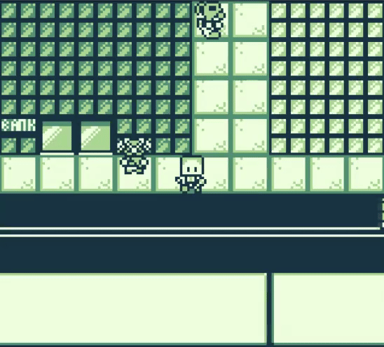
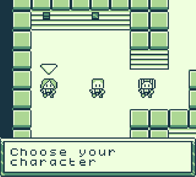
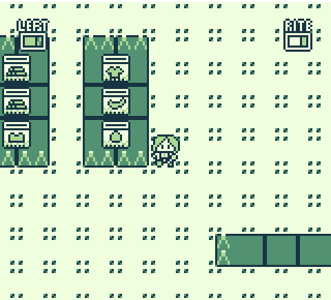
First impression: strong OG Pokémon vibes, which is great. Cool that it's playable on a Gameboy. This has a good style and it seems there's quite a bit to explore. Here's my feedback after playing for about half an hour.
Text: I wouldn't move the text box up and down for each new line of text, only at the start and end of dialog. It's a bit easier on the eyes that way. The amount of text shown at a time is also not a lot, which makes it harder to read a full sentence, I think the font could be smaller so sentences aren't broken up into three or four parts. It could also help to only start a new sentence at the top (meaning, don't make the last of those three visible lines the start of a new sentence).
Tutorial: it's a lot of text. I'd much prefer a sort of trial run as a tutorial, the kind where I do immediately get to play the game but the game takes me through the steps by highlighting the right elements. The arrows you use do this just fine, but the text still makes it feel too much like reading a manual right now. Try to limit the text down to the absolute bare necessities. A line like "You can talk to this NPC over there" could easily be cut, because the arrow hovering over the NPC already tells me where to go. Something like the save station that "clones your DNA" is really funny and clever, but an animation could explain this too instead of stating it through text. Basically, try using visuals as much as possible to show/explain things.
I'd also cut the tutorial up into smaller sections and sprinkle them throughout the game itself. In Pokémon, you're not immediately told how to battle, gain XP, take on gym leaders, etc. after all. Firstly, you're simply told to visit Prof Oak, so the player gets to learn how to navigate the world and interact with NPCs. Then, you're taken through your first battle. At the first gym, an NPC tells you about those. Etc. I'd incorporate much smaller, gameplay-focused tutorials like that for your game as well. Make your tutorials as much as possible a part of the game itself.
Music: the ship music is great, I ended up enjoying that tune a lot. The shipyard tune on the other hand sounds too chaotic and random to play for that long, I'd probably prefer something more chill to listen to while I'm going around shops and talking to NPCs. The music in the area that had lots of greenery and tumbleweeds was okay, but also had a beat that felt a bit too random.
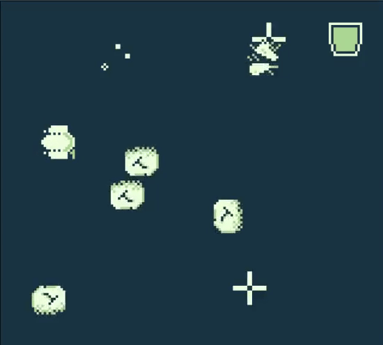
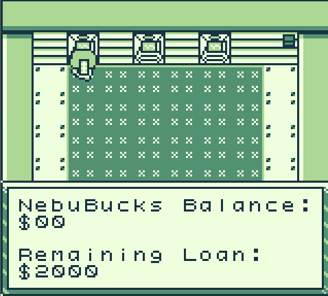
Lastly, some random additions: are you limited in color use? If not, giving each area its own distinct feel with color would make them stand out more from one another. Storywise, I felt a lack of motivation for paying my debt, because it didn't feel like my debt all that much. How about a short intro that has the player crash or otherwise cause something that causes a debt? Just a thought. The flying minigame had slightly jagged controls, sometimes shooting upwards at high speed, sometimes lagging a bit, but it was otherwise a welcome bit of variation in gameplay. The controls for walking and interacting are good. I liked the NPCs I came across and enjoy the ability to pick different crewmates as co-pilot.
Anyway, this ended up being an essay, hope you can use some of that feedback. Very promising game!
Thanks for the detailed feedback! I'll have to see if I can adjust the font. I know custom fonts are supported by the engine but they may be size-restricted. That's a great point on sentences being broken up. I've been trying to limit the number of boxes as much as possible but if it means breaking up a sentence, it may be better to separate into its own box. I'm pretty sure the dialogue box is limited to where it is though so moving it around may not be possible without modifying the engine.
I really like the idea of breaking up the tutorial more though. I think that would be a good way to break up the long text blocks. Maybe the first area should require you to go to the market price area before letting you out so that I can ensure you see or have the option to see the tutorial without overloading the player at once. For the colors, I am heavily restricted on them a certain degree. For original GameBoy, it is using all the colors available. There is an option to make it playable for GB and GameBoy Color which would allow me to use the engine to recolor a couple of things so I am planning to do that for the final version. This would have the GameBoy run it with just those colors but if it's played in web/GB Color then it would look better, just haven't had a chance to get to that since I have been working on the mechanics/maps first.
I really appreciate the feedback on the music too. It's the first time I've made music so I've definitely been struggling with trying to make it not too repetitive but also making the transitions less chaotic. Definitely going to have to keep working on that and I should focus on making the music more relaxed. You're absolutely right that a chill soundtrack fits best.
Interesting game! I like the concept. There are many features, and I felt encouraged to explore both the map and the gameplay.
Unfortunately, there are some things that made it very difficult for me to enjoy the game. I found it hard to read the text, for multiple reasons. The font you used is not easy to read; I'm not sure if it's because of the font itself or because the hap between letters is too large. I understand there isn't much space, the screen is rather small, but you should try to not split sentences between multiple screens whenever you can. I'm not a native english speaker, I struggled to keep track of the conversation. Also, the label transition between texts is unneccessary and a little annoying. It's cool when you start and stop talking, I don't think should be used between the same dialogue.
I loved the graphic, sprites and animations are neat. The retro style is cool and well executed.
About the music, the tracks are very good, but I felt they didn't quite suit the mood of the game. When I heard them I feel tension and anxiety, while the gameplay feels relaxed and without pressure. In my opinion having tense music constantly in the background quickly becomes annoying.
Overall the game looks promising, I love the art and the concept is cool! ^-^
Thanks for the feedback! Definitely some of the tracks are a bit too tense for what I had in mind so I'll have to revisit those. The text is largely a problem with the engine although there are two font types so I'll have to give the other one a try too. I can't fit more than three lines per box or else the engine starts drawing text on top of each other which is a bit frustrating. Definitely my fault for choosing to make a GameBoy game. I'll keep trying to cut down on dialogue as much as possible and I should simplify the wording in some areas to make it more readable.