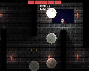
Play game
Star Guardian Tower's itch.io pageResults
| Criteria | Rank | Score* | Raw Score |
| Creativity; innovation & originality across design, concept & execution | #6 | 3.000 | 3.000 |
| UI & UX; visual design, clarity & ease of use, guidance, accessibility support | #6 | 3.000 | 3.000 |
| Features; gameplay enhancements, integrated systems | #10 | 2.667 | 2.667 |
| Gameplay; core mechanics, objectives, balancing, progression | #13 | 2.667 | 2.667 |
Ranked from 3 ratings. Score is adjusted from raw score by the median number of ratings per game in the jam.
Judge feedback
Judge feedback is anonymous and shown in a random order.
Unfortunately the game didn't work for me, it booted but the only thing functional was the 'quit' button. Shame as it looked interesting. Feedback
I completed a play of your game, this concept is very different but is interesting to play. The graphics design is done well and the animation of the main character is different to the usual animation, the character seems to float along the map. The puzzles do present a challenge and eventually finding a merchant in the game was a nice added function. While I do agree more development is needed for the game I would advise some sounds be added to break the silence, some ambient music or other type is good to break the silence. I might have missed the storyline but if there is currently none it would be good to add an intro to explain this.
Although you do have some UI system within the game itself (such as the quit button), it should be a good idea to add a main menu system. Your documentation is also laid out well with descriptions on game development and screenshots to follow it up.
Summary
For a demo it is certainly a good start and with more development put into it this will become a very entertaining game. There is certainly room for improvement but then again there always will be in game development. As a YouTuber and game developer myself we consider it a pleasure to try your games and I am pleased to have had the opportunity to try your game.
Thank you.
LCripps.
Website: http://fellowplayerstudios.com/
YouTuber – FellowPlayer: https://www.youtube.com/channel/UCXzcduiD99hcDMhhCzByRiA
Documentation
There was a very early discussion about 'caches' being good in games. While using a cache is required for performance reasons in some circumstances, trying to use a concept arbitrarily because it was 'mentioned once' isn't the right way to approach it. Was there a legitimate reason to use a cache? Did you profile the loading of your rooms to find that it was too slow, and then try to improve on it?
The physics code is described as '... way more advanced than what was given ...' but no rationale is provided.
Game
I thoroughly enjoyed the approach taken to introduce tutorial panes into the game. It is an excellent approach to on boarding.
The keyboard controls are incredibly frustrating to use. The game plays excellently on a controller.
After having died twice and moving to the next room, I was presented with a blank screen and had no choice but to quit. How much testing of normal user interaction did this have?
You are introduced to a weapon at the very start of the game, though it has no use for a long period of time.
The respawning mechanism may need to be reconsidered for some areas. For example, there was a vertical drop which was flanked by staggered buzz saws which, If you died during this fall, instead of being respawned on the ledge leading up to this fall, you are respawned in the air. This means that if you don't move your character, you will complete that section without trying.
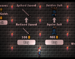
At the end of the initial section, I was presented with a wall jump to what seemed to lead nowhere. While I now know it leads to a shop, there should be some kind of indication to the player. Once presented with the shop, it felt very out of place - especially given that on the first entrance, I'm unable to purchase anything.
Leave a comment
Log in with itch.io to leave a comment.


Comments
No one has posted a comment yet