Play game
CubeVCube's itch.io pageResults
| Criteria | Rank | Score* | Raw Score |
| Features; gameplay enhancements, integrated systems | #4 | 3.333 | 3.333 |
| Creativity; innovation & originality across design, concept & execution | #6 | 3.000 | 3.000 |
| UI & UX; visual design, clarity & ease of use, guidance, accessibility support | #6 | 3.000 | 3.000 |
| Gameplay; core mechanics, objectives, balancing, progression | #13 | 2.667 | 2.667 |
Ranked from 3 ratings. Score is adjusted from raw score by the median number of ratings per game in the jam.
Judge feedback
Judge feedback is anonymous and shown in a random order.
Really sorry but i've ran out of time to write a full review.
This game has a large number of features but falls short on the player experience.
- It very important in these types of games that the player movement feels good. The controls for this game is complicated. Also get stuck on the wall alot. Things to try:
- Try adding gamepad support and playing with different control layouts.
- Try different camera styles? possibly split screen?
- work on movement code to help the player slide alone the wall. getting stuck is frustrating and doesn't support the core mechanics.
- I can tell you were just excited to implement loads of features. Thats cool but if you want to try and create a more refined experience in the future try to focus more on the essence of what the game is and getting the core game loop working well before going wide and making lots of features.
- It very important in these types of games that the player movement feels good. The controls for this game is complicated. Also get stuck on the wall alot. Things to try:
Nicely presented, good game-flow, like the UI + animations with it. Game itself certainly needs some work, the motion-mechanic is good but needs improvement (doesn't quite feel right). Feedback
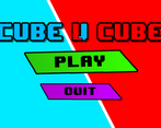
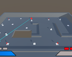
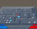
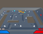
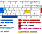
I played your game and it was pretty entertaining to play. The choice of multiple maps helps with changing the difficulty a bit and allowing multiple methods of hurting the enemy gave that extra challenge to deal with. Your UI system was also built well with a Main Menu and control descriptions added in addition to a quit button.
While these were certainly a positive influence to make this game stand out it did feel a little lonely in the game without any sounds or ambient noise, these should always be added to break the silence of a game so it is more entertaining and players will play longer, I did have some minor issues moving my player as sometimes when hitting into a wall I would come to a complete stop.
Your documentation unfortunately does not go into any detail about your games development or stages of construction with no screenshots either, it felt more like a brief checklist on what the game contained, you will need to add a lot more for documentation in the event future errors were to crop up in the game and you have documentation to fall back on to fix unknown issues.
Summary
Some needs to be done for this game to help enhance gaming experience but with a few extra assets added such as the sound it would be much more entertaining to play. There is certainly room for improvement but then again there always will be in game development. As a YouTuber and game developer myself we consider it a pleasure to try your games and I am pleased to have had the opportunity to try your game.
Thank you.
LCripps.
Website: http://fellowplayerstudios.com/
YouTuber – FellowPlayer: https://www.youtube.com/channel/UCXzcduiD99hcDMhhCzByRiA
Leave a comment
Log in with itch.io to leave a comment.


Comments
No one has posted a comment yet