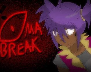
Play Coma Break
Coma Break (Game Jam version)'s itch.io pageResults
| Criteria | Rank | Score* | Raw Score |
| Fan Favorite | #28 | 3.714 | 3.714 |
Ranked from 7 ratings. Score is adjusted from raw score by the median number of ratings per game in the jam.
Leave a comment
Log in with itch.io to leave a comment.


Comments
Very buggy game. You could escape from enemies by changing rooms a few times, even if it was just back and forth. I suspect you were supposed to be able to escape by running far enough.
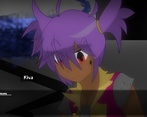
During certain scenes, the text box wouldn't disappear after so you'd lose visual on part of the screen. The end game seemed to expect a text box given the positioning of name elements. Game seemed very inconsistent how text was shown.
The notes definitely made it very clear who you were pretty early on.
Might want to mess with your hitboxes a bit, the obstacles weren't very fun to deal with, especially when some items require to be extremely precise.
You could completely prevent a certain ending without an earlier save if you accidentally saved after a certain event.
The first riddle seems a bit off. There was no way to cancel most riddles/puzzles. The clock puzzle wasn't entirely clear at first what it expected, especially given the red herring there.
The book puzzle only uses one book and you later end up with 2 books again?
The light berry puzzle is incorrect. There are more berries that you can see at the top of the screen.
Not sure where exactly the clue for the sleeping puzzle was supposed to be, but for that puzzle and one other puzzle, you can keep trying until you get the right answer (you will die after though).
The fire and blocks puzzle didn't seem to have any real clues. One block is too close to the entrance given how precise you need to be.
Your character mentions seeing the code somewhere before, but as the player, you don't really see the relationship until after (assuming you even have the code at that point).
The enemy spawns made it really hard to really read things or do puzzles, though I was able to just transfer back and forth until they disappeared. Maybe give the player a bit more of a chance to read things, especially clues.
Really, fix the bugs, the hitboxes, and enemy spawns.
Thanks for your review, a lot of these issues have been brought to our attention already, and once the Jam is up we will be fixing these. We also plan to move this to an engine outside of rpg maker, due to limitations with time we faced during the rushed production to get this ready for the game jam. So we can take away from the bugs and such and apply fixes for a better version later, both rpg maker and what we use next.
If anything more, this is just a proof of concept. Also took note from your stream about the face hud, it really did obscure a lot of things in places, but I got some chuckles out of it. Guess that will be adjusted in the fixed-up version of this and will have a ton more to fix around. Noticed some spelling issues that should have been fixed, but again rushing to get games up before the deadline, guess it's easy to mix them up. Again thanks for your review, we'll be adjusting things for later versions. Oh side note, I made it to where the monster stops as you're reading or in a conversation, even if it spawns. lol I'm glad to see so many people panicked about that. So in short, yes you are completely safe or should be safe as you're reading something ha ha. Anyways notes taken down, to apply for later.
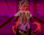
This game is kind of like an anime, but you're in an escape room.
The hit boxes to select items are pretty bad. You have to line up the character and the object just right and at the correct angle to get them to interact. I inspected the room found nothing, went to another room found nothing came back to notice that if I walk to the left of the shiny object it actually is a thing I need to interact with, but if you try to interact from the top or bottom it doesn't work. That's gunna be an issue for some people.
It's got four directional movement, but only up and down sprites. It's not the easiest thing to make a large and tall sprite, and even though this one is missing the up and down, it looks pretty decent.
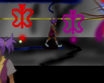
The transfer event transitions look really weird. The player gets magically teleported to the center of the room and it looks odd. A simple fade out, xfer, start next event, fade in would have made the transitions look much better.
The music cuts out and loops at a weird place in the song. Like it just abruptly stops and then goes silent for a second, then fades in again. Check your bgm (or maybe it's bgs) loops.
The sound effects could have been picked better, but they're okay I guess.
I have an issue with the monster creature showing up as soon as I activate an event and start reading the show text. Of course I'm prompted with a show choice before I can even read the text while the monster is chasing me. You need to run a check to see when a player is in an event, and if they are in an event you should NOT 'spawn' the monster. I totally had to skip dialog and make a decision without any knowledge as to what I just picked or what it would do in the show choice while the monster chased me.
You lose the ability to use the controller while in the input number event, but that's usually not an issue for people, I just wanted to bring it up. Speaking of the input number event though, maybe don't force the player to input an answer if guessing the wrong number deals damage to the player, because quite often I have no idea what number to input nor would I have made a wild guess, if the game didn't force me to make a guess. And without the proper information how is the player supposed to know the answer? So all this ends up being is punishment for exploration in the end, and the fact that you also don't allow the player to save the game without finding a specific item in the game and then using it at specific points in the game means tons of loading and very little saving. Repeating the same tasks over and over.
This game is not fun and it's executed very poorly but I appreciate the use of custom art and I like the idea of using parallaxes as backgrounds for maps. There's a few good ideas in here but unfortunately the game is riddled with bad design choices.
Congratulations on submitting a game for the jam and good luck with your next project, I'm sure you've learned some new stuff in the whole process.
Hey, thank you for your honest review. Yeah due to the limitations of RPG Maker, we had wanted to so much more, but we just didn't have the appropriate time, so we aim to make this better using another engine. What you pointed out though with it being an escape room seemed interesting, and we may apply that factor for the future game. Sorry you didn't have fun, but yeah it was more of a find the notes to progress, but the lack of detection with RPG Maker, the sprites being locked in a 2-dimensional space, which throws off the touch function, the choice problem with it hurting (fixed in another version though compiler perhaps messed up) there were so many issues popping up. The save function not having an explanation, it was urgh. The controls mess up? That is new, and honestly, nothing should have been affected there. My goodness lol. We're just happy to be done with it, but it was a good test. What we know now though is, to get what we really want, we'd need to use something else, which we are. So I hope you keep an eye out for a much better version of this in the future, again thank you for your review, glad you liked the art as well, we can only move forward from this and make it better later. If anything I guess this made for a really good tech demo ha ha.