Play game
Escape Machine's itch.io pageResults
| Criteria | Rank | Score* | Raw Score |
| Sound | #92 | 1.706 | 2.000 |
| Aesthetics | #96 | 2.132 | 2.500 |
| Overall | #101 | 1.786 | 2.094 |
| Gameplay | #104 | 1.599 | 1.875 |
| Theme | #105 | 1.706 | 2.000 |
Ranked from 8 ratings. Score is adjusted from raw score by the median number of ratings per game in the jam.
Leave a comment
Log in with itch.io to leave a comment.


Comments
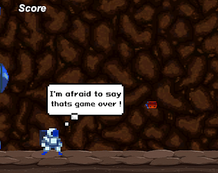
Neat little runner! I liked how responsive the jump was, though it'd be cool if I could jump even higher and there platforms to climb on as well! I liked the lose screen its pretty funny! I think one thing you should try to do is have it so when you jump over a bullet you get a point. I like how they move faster and faster it can get quite challenging! Good work!
The leader-board is disconnected from the players score, so it is not qualified for the game jam. Basic endless runner style game. A scrolling foreground would have added to the sense of motion. The music is very pensive for a game called "escape the machine".
And don't tunnel boring machines make tunnels out of rock? Are you running inside the soil or something? Very confusing setting.
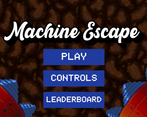
The User interphase at the beginning is beautiful and well designed , clear and well explained controls , the drilling machines on the sides and the buttons are well composed.
here's some points that maybe can help you improve your game:
-the gameplay would enrich even better if you add objects that also fall to the main character
-including horizontal movement to it will make the experience even more enjoyable
-also a good thing that will help is to include some pause or gameover menu that gives you the option to go back to the main tittle or give you a view of the leaderboards.
I love when the astronaut gets hit made me giggle how suddenly says ''I'm afraid to say thats game over!''
you did a cool job !
Its a simple runner game, i think you could improve in the polishing and graphics, the whole thing looks a little blured on my machine.
But nice job and game!
I like the theme and the idea, the hitboxes are way 2 big tho