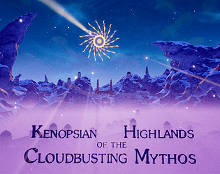
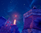
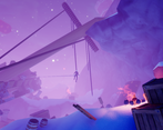
Definitely an awesome atmosphere and interesting universe that I would love to explore some more! Also think you managed to use a lot of your assets in very creative ways! :) -I must however agree with some of the other comments about the clarity of where to go/what to do as I did find a few parts pretty confusing.
Play game
Kenopsian Highlands of the Cloudbusting Mythos's itch.io pageGame Link
https://www.coregames.com/games/89e3d1/kenopsian-highlands
Category
Comments
Very cool atmosphere and use of common assets with great details - wish my entry could have more of this! Got a little disoriented doing first-person platforming though and was hard to tell where was up, with the ruin-like construction. Managed to make it to some fox statue.
I really enjoyed walking through this scene with gorgeous structures and small details to make the scene alive.
I really like the theme of your game, the visuals and some of the level design is great, but I wish there was more direction in it - even at the very beginning it is quite confusing where should I go. Collisions on the ropes should probably be turned off, the one at the beginning was really annoying. There are multiple places where you can get stuck even by simply walking on the snow - consider making voxel details higher on your terrain next time :) I think if you work on the parts where it is annoying, this could be a really great visual experience :)
Thanks for the reaally constructive comment! I'll work on tuning the problem with the voxels; and while one of my intentions was to make the player feel that they had to really explore to get up, I may have needed to spare more on proper soft guidance. May I ask which parts did you feel that needed a bit more direction (I you remember, surely, if not there's no problem :D). Again, thanks a lot for the feedback!
I found some time to play your game again and this time made it to the end :)
I think, regarding the direction, problematic are:
- the beginning (because you are starting opposite to where you need to go)
- the ship, because it looks like the crates were layed down for you to climb (the door is less visible and gets less attention)
- going down the ship (it's not obvious that you should go there) and further (a lot of empty space)
The climbing would be mostly ok if not those places where you can get stuck in. Some moments are a bit confusing (one or two jumps felt more like I'm brute-forcing the solution instead of finding a way), but still, the player sure knows, that he must go up, that's very intuitive. :)


Leave a comment
Log in with itch.io to leave a comment.