Play character
Porcelain Demon - Realtime Character's itch.io pageResults
| Criteria | Rank | Score* | Raw Score |
| Overall | #2 | 4.280 | 4.280 |
| Creative Development | #3 | 4.400 | 4.400 |
| Research + Development | #4 | 4.400 | 4.400 |
| Final Presentation | #4 | 4.600 | 4.600 |
| Technical / Workflow | #5 | 4.000 | 4.000 |
| Project Documentation | #16 | 4.000 | 4.000 |
Ranked from 5 ratings. Score is adjusted from raw score by the median number of ratings per game in the jam.
Judge feedback
Judge feedback is anonymous and shown in a random order.
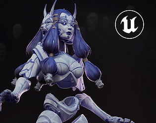
- Hi! First of all, congratulations on taking part in SFAS. Participating in a contest like this is always a challenge. Your submission is looking pretty cool, honestly. Love the concept and the atmosphere. Here you have some thoughts/feedback: - You nailed the research and documentation process. Congrats! Creative feedback: - Can’t say much here. The color palette, the atmosphere created in the renders and the lighting is looking good. Good work :) Technical feedback: - As you said in your documentation, the topology is looking mostly good but I think some optimization can be done in the character overall. Not only the face mesh can be reduced, some areas in the chest piece can be reduced too. - Good use of UV mapping. So good to see that you straightened the Uvs as much as you could. Sometimes, even organic forms are straightened. - This is something that varies based on how the character will be displayed in game but you could have saved some geo capping the inner parts of the legs and forearms. - Good that you merged a lot of the hair in one piece and made a different mesh for specific hair strands. - Details like the small knots in the brown hair bands can be relied on the bake. - An option in order to reduce topology in the inner sides of the body meshes could have been merging edges. Great work! Can’t wait to see what your next project is. Keep doing great art! Jose Gonzalez
- First of all, I want to thank you for the work you've done; you've done well with the task. I found it very interesting to evaluate your character. Thank you for your effort and diligence. I liked this character more than any other; I'm glad to observe the journey from concept to 3D model, excellent sculpting, anatomy, and texturing skills, it's pleasant to see the harmony of color. From a technical standpoint, I also like everything, but the number of polygons could be reduced without compromising the overall visual. Excellent work! I want to wish you good luck in the challenge and creative success! Denis Beletskii. 3D Concept Character Artist. Wargaming. Also, I would like to add some useful materials on working with characters and more. I hope they will be helpful to you when working on new excellent characters. Good breakdowns in my opinion: Sin Nombre—Valerious by Kristina Perinska https://www.artstation.com/artwork/YBQrOX Frostpunk Explorer: Character Design for Cinematics https://80.lv/articles/001agt-frostpunk-explorer-character-design-for-cinematics/ Game Res character by William Paré-Jobin https://www.artstation.com/artwork/oAonE4 Yokai Breakdown by Anastasia Fomina https://www.artstation.com/artwork/OGOn06 Creating a Strong Male Character by Annina Weber https://80.lv/articles/creating-a-strong-male-character-in-maya-zbrush-substance/ Marilyn Monroe by Aleksandr Lyan https://gamesartist.co.uk/marilyn-monroe/ Useful literature: Excellent anatomy books for sculptors. https://anatomy4sculptors.com/ A book explaining the use of lighting for artists. https://www.laurenceking.com/products/light-for-visual-artists-second-edition Anatomy for 3D artists. https://www.brownsbfs.co.uk/Product/Legaspi-Chris/Anatomy-for-3D-artists---the-essential-guide-for-CG-professionals/9781909414242 Character design. https://store.3dtotal.com/products/fundamentals-of-character-design https://store.3dtotal.com/products/sketching-from-the-imagination-characters Another book on lighting, but this time for portraits. https://www.ammonitepress.com/mastering-lighting-flash-photography/
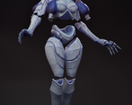
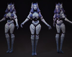
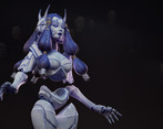
- Research + Development - Great start, i do love some of the design influrances that was incorporated in both your research and design. I would have liked to have seen a little more evidence of reference analysis. Technical/Workflow - Very good pice over all, love the design, workflow and effort put into the design and final product. Good use of Uv space however there needs to be a lower polycount in some areas e.g. shoulder. The textures are nicely painted however adding gradient value changes to the body and colour variation (accent colours) would help push this pice even further. Also the shapes are clean overall but appear a little noisy on the hips and lower half of the character. While the top half of the character is well thought out, the lower half is not as resolve - try incorporating more angular silhouette and form changes to the hips and groin area. Creative Dev - A great nuance interpretation of the brief, hitting on several SFAS themes 'emotion embodied, metamorphosis, neo punk' . Love the over all overwatch feel to the design and shapes. Final Presentation - Excellent clear presentation, the mood is set from the start. In terms of lighting, i'd love to see an alternative lighting solutions e.g. blue and purple/magenta lighting. Project Documentation - clear, clean and well presented , interesting narrative introduction. tho lacking a little more depth on the concept refinement and research around it - e.g. how you achieved the initial concepts look, iterations made to the full body concept. Love this project over all and the professional tone to it!
Challenge Tier
Search For A Star
Leave a comment
Log in with itch.io to leave a comment.


Comments
Woah, what a great concept for a character… she instantly grabbed my attention! I love how the colour scheme is quite simple but you got a lot of colour variation at the same time
This is so good! God I love this as a concept so much... The detailing and porcelain panelling is gorgeous! Now I wish I went for something more realistically rendered hahaha ^^;
Haha thanks so much !