Play asset pack
Cargo Town's itch.io pageResults
| Criteria | Rank | Score* | Raw Score |
| Overall | #1 | 4.378 | 4.378 |
| Final Presentation | #1 | 4.556 | 4.556 |
| Technical / Workflow | #2 | 4.444 | 4.444 |
| Project Documentation | #3 | 4.444 | 4.444 |
| Research + Development | #4 | 4.222 | 4.222 |
| Creative Development | #5 | 4.222 | 4.222 |
Ranked from 9 ratings. Score is adjusted from raw score by the median number of ratings per game in the jam.
Judge feedback
Judge feedback is anonymous and shown in a random order.
- This is a really great project Ben! Great documentation, great step by step, technically is really good and final renders are gorgeous. Nice one, congrats!
- A very well executed scene. Of course this is visible in the final images, but the well written documentation describes the technical and lighting approach. The use of a well executed, modular kit fits well with the time schedule allocated too. Well done!
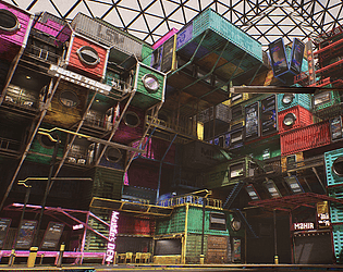
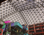
- You have created a fantastic modular environment, You’ve taken on technical challenges of implementing techniques such as world alignment, channel packing, vertex painting and atlases, and used them very effectively. Your scene is extremely cohesive. Your workflow being based on a master material throughout the environment is very impressive, it is complex and well structured. Using a very effective master material has ensured that all your textures match with a strong sense of style. You’ve shown where you have researched and implemented ideas and have displayed a good collection of references. I think you could push the narrative of the scene further by incorporating the story of why the dome exists into your shipping crate environment, such as by having the advertisement boards display gas masks. You could also make the outside environment more toxic in appearance by having some heavier grime or dust on the glass of the dome to show pollution. I enjoyed reading your thought process behind the lighting of the scene. It’s great to see you have also tried making cubemaps, as it’s a daytime environment you could adjust their brightness to be lower. You’ve implemented an array of advanced techniques and provided evidence of your research in the documentation. It’s refreshing to see a daytime cyberpunk inspired environment, and it displays your work well. I would have loved to see some pre-production composition sketches but did enjoy seeing how you blocked out the scene early in the process. You’ve provided detailed explanations of your model and environment choices, the development stages and key decisions. Your final presentation is excellent, and your documentation matches the style of the piece. All your work is referenced clearly, and I appreciated the extra description provided on your project page. This is a fantastic scene which demonstrates advanced techniques for environment modelling. Well done!
- A lot of work here, and also efficient in the workload. It's shippable quality, I don't have much to do apart it would have been nice to present your work with different lighting scenarios. Though I see in your documentation that you tried but wasn't your expertise, you played safe and you're right! Good job.
- As a technical project, this was really impressive. Your demonstration of how you developed your materials and various components was great. However I'm really lacking some feeling and some sense of place: in pursuit of showing off your technical skills, you lost sight of the environment as a whole, and the story of this being a dystopian housing development for poor people. The result is a (very nice, but) brightly coloured patchwork in which the signage and even the reasoning behind the theme of the dome is almost completely lost - somehow it feels almost toy-like. What could potentially have prevented this was a more in depth study of your reference materials, breaking down and looking closely at what created the vibe of what you were trying to create, finding more references, and thinking more about the people that live here and the society that this environment has grown out of. I also do not see any exploration of composition, which should have developed as a result. An interesting point of reference could have been Containment City from Killzone Shadow Fall for example. Overall an excellent technical achievement, but lacking in foundation.
- Good use of modularity, nice cyberpunk vibe, some interesting designs for things like railings. I feel like you could push the lighting a bit more, get some vibrant neon in there and still have enough light to show off the shapes and details of your models.
Challenge Tier
Search For A Star
Leave a comment
Log in with itch.io to leave a comment.


Comments
Looks really dope, nice lighting!!
Looks absolutely incredible wow!
Thank you so much. I love your submission too