Play game
Quick Emblem (Trial Version)'s itch.io pageResults
| Criteria | Rank | Score* | Raw Score |
| Humor | #2 | 3.500 | 3.500 |
| Audio | #4 | 3.500 | 3.500 |
| Mood | #5 | 3.667 | 3.667 |
| Fun | #7 | 3.000 | 3.000 |
| Graphics | #9 | 3.000 | 3.000 |
| Innovation | #9 | 2.167 | 2.167 |
| Overall | #9 | 2.667 | 2.667 |
| Theme | #11 | 1.667 | 1.667 |
Ranked from 6 ratings. Score is adjusted from raw score by the median number of ratings per game in the jam.
Expected duration
2 hours the trial.
Leave a comment
Log in with itch.io to leave a comment.


Comments
Full disclosure, I don't have a ton of time to write a well thought out review, so this is more of just a stream of consciousnesses thought dump. Take it for what it is: just one first opinion of a first impression.
Typo in opening sentence of the opening story events, not a good look.
In general, I liked a lot of the UI changes you made.
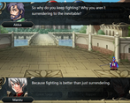
Poor writing tbh. Story seems like a big weak point/afterthought. Not interesting at all, not funny to me. If you're going to spend time writing little quotes for all of the named enemies and allied units whenever they fight, it needs to be interesting. Otherwise it just takes up time and feels like a distraction. Is it supposed to be throwaway writing, or are you trying to write an engaging story? You should pick either to write something interesting (with some humor sprinkled in) and get rid of the bad jokes (names like Fatty and Dorky Island tells me I shouldn't take the story seriously) or commit to full parody/satire. It feels like you're trying to do different things with your writing and it ends up just being that you do none of those things well.
You pirated awakening icons for skills it seems? For a small game probably not a big deal, but if you want to make it look more professional or ever release it as a full game, you will need to change that.
You need to finish translating it from Spanish to English. Seems like a work in progress, so I don't hold it against you since it's a game jam and we had only a few weeks.
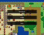
The bandit portrait looks terrible, there is a clear white outline around it.
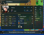
Sometimes when trying to check what a skill does the details window in the unit UI covers the Items and Skills and description at the bottom, and then I can't read it.
Poor translation/English is bothersome ("Even Marstu is winning me")
The movement abilities are all cool, keep those in for units (reposition, shove, etc.)
It's the first map, but it's hard to feel threatened when 3/4 of my army is barely hurt by enemy units. The second map seemed like there was a big power spike, I was careless and lost several units. That's probably on me, but just think about the jump in power/balance between maps 1 and 2.
Is the enemy archer Cameron recruitable in the first map? I couldn't figure out how to recruit him if so. If he's not, why name him? No story related thing happened, I had no reason to care about him. It just made me feel like I missed something. If I did, there wasn't really any hint as to how to recruit him or trigger a special event. Could just be me, but keep it in mind when designing for players.
Map design is pleasing to the eye imo. I think it's cool. I liked the way the map flowed for the most part. It's the first map, so it is what it is, but the best strategy is big ball of death, which gets old.
Holt just shows up doing 19 damage with 5 peg knights? Hmm.... All the other enemies up to this point were pretty weak. That was a big jump in damage and movement potential. I lost my archer and didn't realize. I could have avoided with better play though.
Burgh animation is really slow, which is a little annoying imo.
Jam promoted randomly when a voice started speaking to him... I don't know why. I don't like that I don't know why he promoted. I also have no idea what the different classes do, so picking wasn't really easy. I just picked swordsman, no idea if it was a good/bad choice, or even what kind of choice it was.
Overall, good UI.
"They kept a healer in a town hall" where is the town hall? Is that a recruitable unit? What does that mean? (event on first map at bottom house near boats)
So far I'm having an ok time, but there was a lot of dialogue I didn't care about between maps, and by the time the next map started... I just wasn't into it anymore, especially because it looked like it was going to be a slog with only a single end goal.
I liked the music on the first map. The song on the second map (player phase theme), I hate it. The trumpet sounds terrible. It's kind of busy and distracting. A good song for a power spike or story moment, something climactic, but if it plays the whole map I will go crazy.
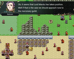
Lots of empty space on the second map. I'm going to have several turns of moving through empty stuff in the top left corner. Once you get to the city, the map design is somewhat engaging. Why place someone by themselves in a deployment spot at the bottom of the map? Could be good or bad, I personally don't like it much. The mercenary recruitment idea is neat, hard to say if it's balanced or not because I didn't play with it enough.
Overall, combat is not too hard, but I do have to think. Sometimes certain units seems really OP, while others are steamroll-able. There aren't really side objectives, which can make maps feel linear (maybe happens in later maps?). I don't have a lot of reason to care about units because there isn't a lot of quality narrative going on. I don't feel invested in my units. It could just be early in the game though and if I played more that would change. This brings me to my biggest criticism. I feel like I'm playing fire emblem, but with a worse narrative. The map design isn't particularly challenging, but it's in a good spot where I had fun the first map. As I began the second map, I didn't really feel like I wanted to play it tbh. I just didn't see a why. I didn't care about the story or the characters, and while it was decent, the gameplay didn't suck me in to the point that I wanted to keep playing without a story or characters or side objectives that engaged me. Map design is visually pleasing with the use of the RTP assets. You did a good job on visuals for the most part with the RTP assets. Couldn't figure out how to recruit people (if recruiting was even a thing). Map design from a combat perspective was ok. Didn't excite, nor did it bother me.
Overall, good job finishing a game. There were moments of fun, but the game ultimately didn't really excite me. It seems like standard fire emblem with a few tweaks, and there isn't any one feature that really engages me or stands out. I left feeling very "meh, it was basically an FE game that was ok-ish". Keep polishing, and maybe consider how your game can be unique. Why would i play this over other FE games or SRPG games? What new experience does this bring? What thing about it is better that really sucks me in? So far, this question has not been answered.
Again, good job making the game. Much of this can be fixed with polish, hard work, and feedback.
In spite of it's name, it wasn't very quick. Quite meaty, in fact. Maps were long winded and full of combat. It was nice at first, but the enemy spam quickly made itself apparent in the later parts of the game.
The system itself was bogstandard, maybe missing a couple features, albeit unnecessary to the enjoyment of the game. The class structure for the villagers definitely was intriguing and made the potential of replayability real, though the rest of the game unfortunately dissuaded me from doing so. While the maps themselves were fun, the intense enemy density made each map a slog, especially as I tend to play carefully without losing a single unit, and the massive amounts of threats in each part of the map made even small skirmishes take forever. That said, there were a lot of points in each map where I had fun strategizing each move, so it wasn't all bad.
The story was somewhat intriguing, but the self awareness and humor was definitely the highlight of the dialogue. Jermie, in particular, was a fan favourite amongst me and my friends, who I streamed this game for. It was very hard to take the game seriously, but I suspect that was not the point. Completely missed the theme for the jam, but since it wasn't mandatory, it didn't affect much. The item descriptions were also hilarious... 'citrical sword' is going to forever be a meme amongst my community now, thank you.
Balancing was definitely the weakest point of the game though... some classes felt unnaturally strong, while some felt uselessly weak. Axes just didn't feel satisfying to use, until Nemo got his prf weapon. Magic was unusually even more overpowered than it usually is in games like this, where enemies just did not have any res but plenty of def. Finally, there were too many times where I decided to just 'maid blender' the enemy force because it felt more productive than trying to tip toe dance around threatening enemy ranges, as Jermie is so nigh and utterly overtuned that she could very well complete the game on her own with little trouble and a bit of luck. I had fun finding out how strong the villager units could get, as one in particular turned into an assault paladin with absurd burst potential, but in this game, units felt like they lagged behind a lot harder than usual and it ruined the experience in the latter half of the game I'm sad to say. The final map in particular just stopped being fun part way into it because the enemy spam and the really unfair condition change at the end hit my enjoyment pretty hard. With a lot of tweaking though, I feel like this could be a really good game.
A more classic SRPG, the story is half-parody, half-serious and I enjoyed it a fair bit, even if sometimes the dialogue extended a bit much for my taste.
There are some pretty nice ideas and features, all units have skill to affect allies positions, and there are functional shields too. One interesting balance choice is that effective weapons are reeeally effective, and critical hits no so much. This makes using effective weapons a better strategy than depending on critical hits to finish tough enemies, and there was a good variety of weapons too.
But there are some issues that I didn't quite enjoy... I find that the maps suffer from a bit too much enemy density and also high enemy quality... the first map has 43 enemies in a 30x20 map, and the ones after that only increase in number, by the 3rd and last chapter of the entry we are talking about 127 enemies.
All strong enough to kill almost anyone that is ganged and also packed in formations that heavily punish trying to be agressive... so I found only two options, the good old turtling or just send Jermie, the self-proclaimed jeigan of the game that is so powerfull she basically soloes the maps as long as you give her enough daggers to keep countering.
I think that for a game called Quick Emblem... I was expecting something else, that's all.
This is pretty much standard fair fire emblem. Not that there is anything wrong with that. The game is plenty of fun even though it cruelly lacks polish. The game has some parts left untranslated. There are more English mistakes than I can count. Some portraits that were clearly made with transparency had the transparency removed, leaving white pixels here and there... I think the base game has potential, but more time needs to be spent getting everything on point.