Indie game storeFree gamesFun gamesHorror games
Game developmentAssetsComics
SalesBundles
Jobs
TagsGame Engines
A jam submission

Trashcan ManView game page

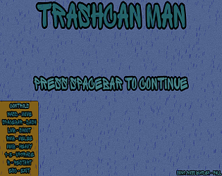
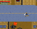
Top down endless shooter- dodge attacks, make upgrades, and see if you can beat your own high score!
Submitted by Hugernot — 2 hours, 26 minutes before the deadline
Add to collection

Play game

Trashcan Man's itch.io page

Results

CriteriaRankScore*Raw Score
Gameplay#82.3243.000
Theme#82.5823.333
Overall#92.3243.000
Sound#91.5492.000
Graphics#112.0662.667
Innovation#111.5492.000

Ranked from 3 ratings. Score is adjusted from raw score by the median number of ratings per game in the jam.

Leave a comment

Log in with itch.io to leave a comment.

Comments

Submitted (1 edit) (+1)

I had a surprising amount of fun with this! To anyone playing, I highly recommend that you read through the game's main page as there's a lot of mechanical depth that I missed out on by playing blind at first. The art's not super-fancy, but feels cohesive for the project. My only real complaints are that the upgrade notifications crowd the screen while also being hard to read while action is going on (maybe switch to an icon system?) and the font used for score/materials collected is interesting but also hard to read at a quick glance.

 Player movement and firing have a nice feel; though using my unreliable mouse-wheel button for the rockets is a pain but that might entirely be a problem on my side, not relying on middle-mouse as an actiony input might be something to look into.

Overall Trashcan Man's got potential and I could really feel the effort put into it.

Developer

Ayyyyyy. That means a lot to my team and I. XD

You have a lot of valid observations, and believe me, they all have reasons behind them.

  • Mechanical Depth: When the game is complete we plan on making some sort of tutorial to help players understand how to react. The melee is pretty under powered at the moment and so we want it to be able to reflect projectiles in the future.
  • Art: probably my fault, choosing the colors for the 32-bit color palette
  • Upgrade notifications: During development, those were supposed to be place holders for a full on GUI crafting menu. This was our first game as you've read, so we really over estimated how long it'd take us. In a little time, those upgrade notifications will disappear entirely. They are a but annoying lol
  • Font: Excellent point, we should change it
  • Middle mouse: I've known this pain back from my Minecraft days, so you've also got a point there. Just need to figure out which key it should be.

AGAIN, THANK YOU, IT MEANS A LOT YOU PLAYED IT :D

Deleted 7 years ago