love this
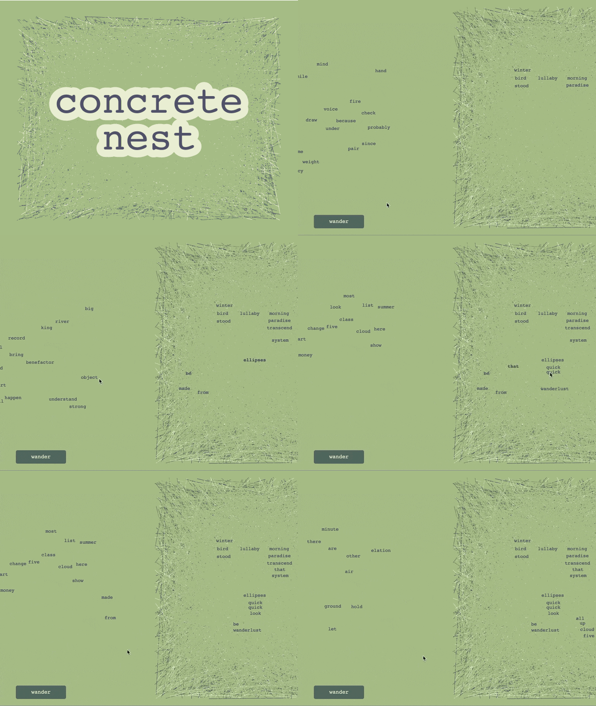
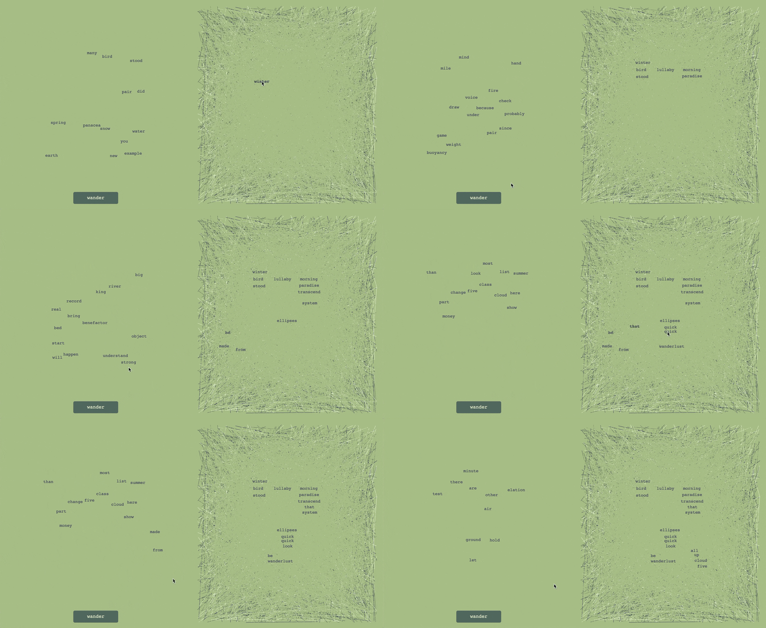
Play tool
Concrete Nest's itch.io pageResults
| Criteria | Rank | Score* | Raw Score |
| How nice it is to use | #4 | 4.333 | 4.333 |
| Overall | #9 | 3.593 | 3.593 |
| How innovative or original it is | #12 | 3.333 | 3.333 |
| How much I could potentially use it in the future | #15 | 3.111 | 3.111 |
Ranked from 9 ratings. Score is adjusted from raw score by the median number of ratings per game in the jam.
Comments
Good words! How did you find/build the list?
The bolding on mouseover is helpful; "wander" as a label is strong.
The lack of labels on the two buttons until mouseover was a bit confusing at first, but on second thought I suppose it's to avoid visual competition/confusion with the other/nestable words? I wonder if this may impact mobile usability (if that's planned) though.
It'd be neat if there was a bit of animation while wandering -- even something as simple as the words appearing in random sequence, after the others disappear.
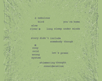
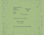
Definitely enjoyed using this. I've always liked playing with concrete poetry.
Thanks for making this!
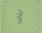
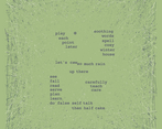
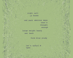
Thanks! The words fall under two categories. For the first I searched for lists of the most common words, and for the second I searched for lists of beautiful words. In total there are about 500 beautiful words and 500 common words. The beautiful words appear less frequently than the common words, to make them more special :)
Yeah the hidden labels were to avoid visual clutter but we were a bit worried it might cause some confusion.
Oooh that's a wonderful idea for an animation!
I'm so glad you enjoyed it! Thank you for all your feedback!!! :D
Interesting, "common" + "beautiful" is a thoughtful combination, and definitely works well for this. Thanks for explaining!
Label-wise, maybe special text treatment (e.g. size, font, opacity, or even using a photo of handwritten words) or icons (e.g. disk for save/export, boat or walking figure or bird with wings spread for wander) could help? Just a thought.
Come to think, varying the text treatment (bold, size, italics, color, font) for the words could be interesting too -- more like using actual clippings. Though honestly I kinda like it as-is; it feels more about the words themselves this way.


Leave a comment
Log in with itch.io to leave a comment.