Thank you! I was worried a few of those scenarios might be a little annoying, since it can kinda interrupt reflex/reaction mode and force you to switch to planning/solving mode mid-step.
wakeman
Creator of
Recent community posts
This one is quite a marathon--it was a relief to finally escape out the hatch!
It's interesting to me how different entries have their own aesthetic eras--this one feels more SNES-like. Quite impressed at how much space-cat you achieved out of an 8x8 sprite, and at all the visual customization put into this. Great work!
This is such an aesthetic treat. Everything works well together—the colors, the art, the music, the story-concept. I especially liked seeing the progression of night into day (treated with that color palette, under the layered effects).
Totally tried more than I should've to achieve the unachievable. Maybe I was still in a Ghost Trick mindset.
This is excellent. A great mix of puzzle, skill, and surprises, with a perfect dollop of story.
I did get stuck on the first lie / the bit before “playing rough” for probably longer than I should have—I kept thinking it was going to be a different trick, more like the one that came before it. The solution totally sense in retrospect though.
Although I tried to ponder the orb, I pondered the software. I found some orb designs more resistant to my attempts at orb-pondering—I might as well have been staring at a paper plate or a foam toy basketball. Others were more inviting, but nonetheless impenetrable. I found some backgrounds made me ponder differently. I pondered the similarity to a dress-up game—I enjoyed it in this capacity—and imagined musical runway accompaniment to the orb’s assorted fits. I imagined it sashaying in place, the motion technically invisible but felt with the force of a personality.
Although I tried to ponder the orb, I pondered the opacity of its pixels. The large areas of flat color made it easier to notice the reflections on my screen. I wondered if this was intentional. Like a painting, no light can pass through the orb representation, nor be bent in such a passage. This orb representation feels to me like a focal point, rather than a portal. It is framed and frames nothing beyond the reflection of my chin. Or does it?
Although I tried to ponder the orb, I pondered the context. I scrolled down and read and clicked links. “Paku Paku" is fantastic. Expectations and advertising go hand in hand in raising or ruining an experience. Discovery is a game, but how do we credit its friction? Isn’t it our own?
I pondered the author, the jam and its other participants. I pondered PICO8. I pondered anything but the orb.
I pondered my predicament, acknowledged my disappointment (in my flagging efforts to orb-ponder), and closed the window with a brief sting of remorse.
Orb, I have done my best to ponder you. I hope you do not now ponder me.
I enjoyed the vehicle—it adds significantly to the feeling of being outside on the sidewalk, of arriving at some meaningful destination.
I enjoyed turning around and seeing how small the door looked from where I had gotten.
I liked walking backward for a while, just watching things quietly recede.
I liked that the renderer started to struggle to consistently reveal the (increasingly) distant squares of ground. Only if I turned the camera the right way would a single row of pixels appear in the darkness. Eventually the only way I could tell I was going straight was by looking back at the lingering 1-pixel dot of the door and strafing slightly to center the intermittent blinks of the visible sections of floor I passed previously. Eventually I must have passed the final visible square and gone too far, because I lost sight of everything and became completely unable to determine my direction or distance from the entrance.
It was an interesting experience.
This is a pleasure. The audio and writing and color palette and obscure mechanics and finite window of play all work together beautifully. Collecting poetry line by line, out of order, missing some pieces and having too many other pieces, makes for an engaging mechanic. I have played through a few times now and intend to do so again.
This build is definitely a lot harder! I wish I could see whether there are emotions around when I'm replenishing the oxygen.
I was spending so much time going back and forth between masking & refilling oxygen that I didn't find much time left to look at the task pad. It looks like the boxes' colors correspond to the masks you can wear, but every time I tried to try putting on masks in the same color sequence I lost from oxygen or suspicion. Or are the boxes just a list of emotions you have to evade successfully?
Oh, and the suspicion bar was such a small suggestion that I'm surprised to see credit for it. It's very kind though!
I know I've said this before, but I really like the graphics and the sound, as well as the general theming & world-concept! I think the part of playing I've enjoyed the most actually is visiting the other NPC fairies' turtles and hiking around there, partly because the little forest is a pleasant space to wander, and partly because it's fun to try out different loops through all the cleanup spots. And the framing of "helping" the fairies that way feels nice too. It's super chill and cheerful!
I also agree with what others have said: setting up the initial collection of 4 of buildings feels a little rough--it feels like I'm waiting to get started, and when I see the cost go up for each consecutive grass plot my brain sadly translates that into extra waiting. Once the initial cluster is set up there's kind of a fun whack-a-mole pattern that emerges with gathering the output, it just takes a little while to get there. Leaning more clicker-style with clicking-to-speed-things-up might help with the intro, as much as tweaking the initial costs. It might also be neat if a tutorial NPC gave the player "free vouchers" (or maybe just loaned out rainbows) for each initial building in series, so after you add a building you can go back for the next voucher (or rainbows) until you've built the full set. (Afterwards, maybe you could optionally pay this helpful NPC back and get a little cosmetic bonus as a surprise thank you.) I know dev-wise that might be a bit of a stretch though!
The other comment on allowing a bit of accumulation per generator would also be nice. Without any accumulation (and until there's auto-collection), it feels like my role is to be a very important cog in the machine at all times, and if I take a break then everything will grind to a halt. Allowing a bit of leeway there would make it easier to be social or explore during the early part of playing (before you can afford the tier of generators that auto-collect). Maybe the level-1 generators let you have one collection waiting and only halt production after two are waiting, and level-2 lets you have up to three waiting. Or maybe the production rate could slow down as more collections are waiting (0 = 100% generator speed, 1 = 75% generator speed, etc) and the slowdown effect reduces with each upgrade. Just a thought!
A couple more wishes/ideas:
- Scheduled downtime ("break time," "fairy holidays," day/night cycles, etc) could be a fun & chill route to explore, just to encourage exploration, being social, or just taking a break yourself.
- Foraging loose objects (finding colors floating by / landing on your turtle) could be a fun little distraction that also helps the world feel more alive.
- It'd be fun if wings could let you fly around a little!
A couple more things I enjoyed:
- Changing the cosmetics to be mushrooms and flowers and caterpillars, to make a little wilderness garden.
- The wing varieties, especially the moth-like wings option!
On the whole this is a very nice casual jam game and it feels like there are a lot of directions you could take it. (Also it makes me want to make a game about small creatures around a puddle outside.)
Good job!
I like the new location!
I think I've said it before, but I enjoy the world design, choice of original work to riff off of, ambience, and little details like the deadbolt. The day-schedules may be a little ambitious even for longer-term development, but I do hope you consider working on this further, or adapting some of these details into future projects. While far from finished, it is a promising start!
Love the aesthetic! Substantial and varied puzzles. Really solid work!
A few things on my wishlist:
- some fanfare when collecting the key at the end of an area (large-scale animation/flash/particles + happy audio beeps)
- some talking characters + backstory (even if it's just fluff, I'd enjoy it and think it would help fill out the game-world)
Admittedly I'm taking a break midway through (it's late and my brain is too tired to push blocks) so I might have missed some things!
Final submission to the greenlight jam: https://wakeman.itch.io/a-hike-through-an-uncertain-landscape
Hah, with all the overlong titles getting cut off, I managed to select the wrong version to submit to the final sprint. This is the design doc instead.
The actual link should be https://wakeman.itch.io/a-hike-through-an-uncertain-landscape
Ha, I like the intro and the human thief's hair. He could be stashing so much loot in there.
Is there only one level right now? After my first theft I ended up with 200 nuts which seemed to cue the end & a "retry level" overlay (I liked that I could ignore it and keep playing though).
Will there be more comedic cutscene stuff between the other levels?
It looks like the other comments have already covered what I was going to say.
Looking forward to seeing the switch to a typing minigame!
Thanks for the thoughtful feedback! Honestly, I originally planned and had started to build out more strategic gameplay elements (fatigue, supplies, time) on the first day of the production phase. After subsequently missing over a week and a half I decided to scrap those elements though--there just wouldn't be enough time to build out balanced, quality content for them that prioritizes narrative and mood over fail conditions. I'm curious how far the remaining parts of the game can be made to work though. Still on the fence about the results so far, but I'm committing to it for the rest of the jam.
Thanks!
As much as I'd love to explore visuals for the narrative scenes (I really like how Roadwarden approaches this), I don't think I'll be able to fit that in the jam timeline (I'm a pretty slow illustrator and feel weird about AI art). Hopefully audio helps with forming some mental pictures at least.
Oof, being able to move multiple tiles was not intentional! Kinda wonder now how many other people were playing that way, and whether it might flow better with longer jumps like that. It'll be interesting to see if anyone notices/objects to the "always move one tile at a time" change in the next release. Really glad you called that out!
Definitely planning on fleshing out the audio experience a lot. I feel like ambient soundscapes are a huge part of immersion for me.
Thanks for the feedback!
I like the "wander through a dark forest collecting ingredients" concept a lot! The chill music is a nice touch too. And I liked the adaptation of the Macbeth chant/recipe to plants (with location descriptions in the grimoire), rather than literal animal parts.
I felt like I struggled a lot with seeing everything on offer here though. A few rough edges that I stumbled over:
- Maybe my eyes are getting worse, but the UI seems maybe 50-60% the size I'd like. I had to keep leaning toward the monitor and squinting to try to make out the writing.
- The mouse sensitivity feels ~2x - 3x too high. It'd be nice if there was a slider or toggle to adjust.
- The uniformity & completeness of the darkness, combined with the topography around the campfire, and the sensitivity of the mouse, made navigation difficult in a way that feels more accidental than intentional to me—I couldn't tell how far I was turning because the visual feedback seemed to be 90% black + 9% almost-black + 1% stars randomly positioned, and also because the mouse sensitivity was difficult to predict. Going into full-screen mode helped a fair amount with the darkness (probably because the playable area isn't surrounded by white that way), as did turning my monitor brightness up a lot. Putting a tall dead tree or something nearby the campfire so that its lit portion is visible from further away would help with orienting, as might bright sparks or glowing fumes rising from the cauldron. A slightly larger candle-light radius and (if it's not too time-intensive) a bit more ground detail / a few more landmarks might also help once the campfire is sufficiently far away.
- I had trouble when a candle is nearly spent -- it seemed like it was going down, but I couldn't tell roughly what percent was left (it seemed like a lot of candle was left when it went out). Maybe there's an extended sputtering as some indication of being low? The light flickers so much it's hard to tell though. As a quick hack, just having a text warning ("my candle is low. i should head back.") appear could help. I also felt like I should be able to carry more than one, which would help when deciding how far to wander / when to turn back.
- It seemed odd that I was being attacked next to the cauldron & campfire. I thought that light would be enough to protect me?
A few bonus ideas, if you have time:
- A sound when the candle goes out might be a nice touch. Maybe an ominous tone, or just a light fizzle followed by a slow fade-in of a spooky night ambiance loop.
- It might be interesting to have the candle blow out due to wind, and need to be re-lit occasionally / when moving for an extended period. Or it might just be annoying, I don't know. I'd be curious to try it, though.
- A rough/partial map in the grimoire for some of the area could be a neat way to help with orientation & finding some of the ingredients.
I look forward to trying the polished version this weekend!
Very charming aesthetic! Gameplay feels like a mix of idle & builder, and it's easy to fall into a meditative rhythm of gathering. I appreciated the ability to rotate stations to make the collection routes easier.
I wish that products could "build up" a few times at a single location before the generator stops, though -- it'd make it easier to go exploring or considering cosmetic changes without worrying about halting your production.
Curious to see what else you have planned, and what the final version adds! (Hopefully some music too!)
The Oxygen meter definitely adds a bit of needed challenge and conceptually makes the whole thing darker since you're literally suffocating beneath a mask of emotion. I like the narrative detail when you pass out that they wait for you to wake up before getting rid of you.
Is there any way to "win" the game? It might be interesting to have another activity for you to try to get a "win" ending, and you have to stop doing that activity and put on your mask when the emotions show up. Mechanically this other activity could just be spamming a button 400 times or something, whatever seem doable. (You could say the character is trying to radio off-planet, or build an escape route, or pray to a passing asteroid full of ghosts, etc, anything that fits your story/concept.) You could also make oxygen run out faster if you try to do the action while wearing a mask (adding risk/reward), and make emotions catch you faster if you do it a few times while not wearing a mask. Just a thought!
I kinda want a "suspicion" bar filling up when emotions are present, just to add some panic to putting the mask on in time. Not super necessary though.
Also: It's great to know about Project HTMLifier, thanks for mentioning it!
This intro section is very immersive! Nicely moody too. I like the topography of the map in the daytime.
Just a heads up: I had some trouble with the ground disappearing/reappearing while approaching the town (probably due to culling or mesh bounds?) and similar issues with the lights ahead not showing up until I got much closer (which was kind of interesting honestly, just shuffling into the void armed with the faith that something would eventually appear).
I'm really looking forward to seeing more next week!
Great progress! I love the detail with the tail poses as you worm through the maze. (There are also some good head-smoosh poses against walls that came as a surprise.)
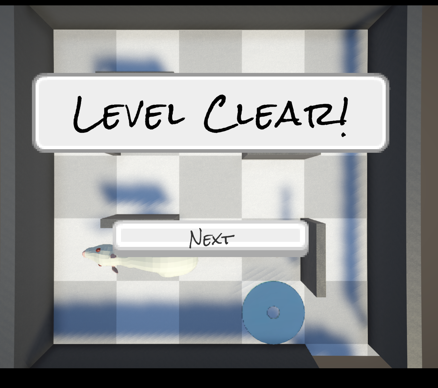
I found some issues with triggers seeming to be too large and prematurely clearing the level when things were next to the exit (which happened in both the pencil and CD areas--I've posted a screenshot below), as well as an issue with the mousetrap apparently ignoring wall collision after being set off by the cheese (I wasn't sure what its motion rules would be and ended up shoving it through a wall while testing a south-facing push).
I also liked naming the rats more than I expected. It seems like a potentially fun detail when sharing the code. (Minor nit: it would be nice if the "enter" key worked in addition to clicking the button to accept the name).
I look forward to seeing what you add in the final sprint!
(I've attached a screenshot of the premature level-clear below, which I imagine just comes from the trigger collider being a bit too large.)
Alas, I have not been able to stop the second attempt! (Although I understand the cause.)
One small request: It'd be nice if there were a clock, so I could consider event timing, how long it takes to travel between locations, etc. (Nothing fancy, just text at the top of the screen getting updated every second or so.)
Good luck on the final sprint! I look forward to seeing the final release!
Fun premise! Kinda reminds me of Tragedy Looper (a boardgame) and Deathloop (by Arkane Studios).
The prototype seems solid for this stage, great early progress. It's interesting how quickly the grey boxes' behavior becomes readable and also gives the murder this air of mystery ("what you are doing to the green box, you fiend?!")
I had some trouble parsing some of the tile graphics (the brick walls color & contrast-wise seemed like brick flooring at first, particularly since other walls by the start were dark grey), but I'm assuming these are placeholders like the party chatter.
Looking forward to seeing the full game!
I really like where you're going with this--the cat, the story, the planned mechanics, the concept art, and the level design are all very nice!
I'm having trouble pointing the camera where I want it in the prototype though--it would help if the cursor locked ("Cursor.lockState" in the Unity docs) after clicking, to stop it from leaving the area where the unity build can detect mouse movement. The mouse sensitivity/ camera motion also seems a little high for my trackpad, though it does kinda help with the lack of cursor lock.
Thanks for providing a web build!
You're off a good start! The driving feels good: nicely responsive & arcade-y forward momentum and tight turning (maybe a tiiiny bit too tight at higher speeds -- a little sliding would be nice).
I'm a little worried about the scope your page description sets up, with semi-open-world elements + upgrades + jrpg elements + content for missions & an overarching narrative (+ AI and polish) to do in 2-3 weeks as a solo dev. I wonder if it might be better to pick just one (or maybe 2) of those that most appeals to you for the next week, then for the second week consider whether to add another from that list or further develop what you already have. The driving & weapons already feel like a pretty good foundation on their own!
The mario-style jump-on-head mechanic feels surprisingly polished at this stage! The momentum / the time it takes to stop after letting go of input feels a little slippery to me, but it's still very playable.
I like the aesthetic reference images and the backstory! Looking forward to checking in on this again in two weeks.