Play game
Amalgamation's itch.io pageResults
Criteria | Rank | Score* | Raw Score |
Gameplay | #7 | 3.584 | 3.778 |
Theme | #8 | 4.006 | 4.222 |
Presentation | #8 | 4.006 | 4.222 |
Overall | #9 | 3.549 | 3.741 |
Horror | #11 | 3.268 | 3.444 |
Story | #12 | 3.162 | 3.333 |
Creativity | #19 | 3.268 | 3.444 |
Ranked from 9 ratings. Score is adjusted from raw score by the median number of ratings per game in the jam.
How did you choose to implement the Theme: Among the Stars in your game?
It's set in space
Did you implement any of the optional Bonus Challenges, and if so, which ones?
Yes, 1 and 2, it's in space and has aliens
Leave a comment
Log in with itch.io to leave a comment.
Comments
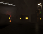
Excellent presentation. There were so many nice little bits of polish you put in there like the tutorial voice overs. The audio design was fantastic and created a really eerie atmosphere. I got stuck though after I used a battery to open a crawl space but then I reached a ledge in the crawl space I couldn't jump over. Overall this was really impressive!
Glad you enjoyed the presentation :)
Sorry you couldn't proceed past that I wonder if it's a bug but it was close to the end anyway atleast I guess. Thank you.
Otherwise, I liked playing your game. It's being 3D is already deserves some praise. The environment, animation and the implementation of the virtual voice is fantastic. Have you made all the props by yourself?
Hey thanks for the feedback and i'm glad you liked playing it. Yeah I uh kinda ran out of time for adding some options, so controls and retro filter control didn't really pan out.
Ah no for this jam I had help of a buddy of mine for the asset side of things, I did some things, he did some things. He for example made the awesome alien stuff as a highlight
Awesome! Keep it up! Does your friend has an Artstation page?
Ah no he does not have any social media to follow sorry
Thank you :)
Ah the battery slot next to it would have opened it, but you were close to the end anyway. Also yeah maybe i should have included ctrl, I always like having it at c personally but I should definitely keep in mind ctrl is common for the future haha.
Really dark, really hard to look. The details in this game is moderately good and the retro filter make the game looks nicer but also make it harder to look :P. I sometimes doesn't know the purpose of the keys and items picked up during the gameplay.
I wish I could find more good thing to say about this game, but I would say the game looks nice. Good job.
Thanks for playing, appreciate the feedback. Yeah I am most happy about the graphics aswell. Horror level design isn't my forte
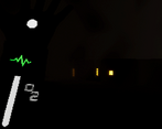
Love the environment that was built and the music fits it so well. Also the arm animation for viewing the oxygen level is so badass lol
Thanks glad you liked that it was definitely some of my favorite stuff too