Play game
Livmialon's itch.io pageResults
| Criteria | Rank | Score* | Raw Score |
| Visuals | #30 | 3.818 | 3.818 |
| Gameplay | #55 | 3.091 | 3.091 |
| How well does the game fit the themes? | #57 | 3.364 | 3.364 |
| How much do you enjoy the game overall? | #61 | 2.909 | 2.909 |
| Overall | #65 | 2.855 | 2.855 |
| Audio | #102 | 1.091 | 1.091 |
Ranked from 11 ratings. Score is adjusted from raw score by the median number of ratings per game in the jam.
How long was your dev time?
4 hours 7 minutes
Leave a comment
Log in with itch.io to leave a comment.


Comments
I think the depth of this game must be lost on me. Check out my review of your game at https://www.twitch.tv/scalphamission!
Thank you for the review! It was super rad to watch someone play the game. There are for sure some bugs and design issues which I think was causing your confusion. Sorry about that! Your video was very insightful to see elements we could have done better.
We have an update on the way which we hope should fix most of the issues. Keep an eye out if you like!
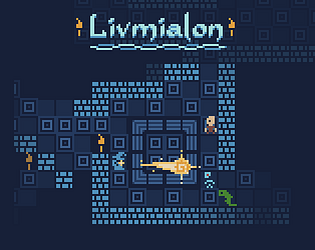
arts good, however enemy's can clip through walls, and this makes them hard to see. other than that good job.
We totally agree! An update is on the way for that. Thank you for playing and for your comment!
Nice idea and sprites. Id love more color since i had a hard time seeing the enemies. Control positioning on keyboard doesn't work out for laptops (no extra number field).
Great observations. We agree about the enemies and are almost ready with an update that modifies their visibility. As far as the controls for laptops, that is also a good point and we will keep that in mind. Thanks for your comment!
Cant wait to see the improved version, since the story and fight system look good already. Great work!
I really like the art-style and color scheme, although the camera skipping pixels was a little disorienting. Maybe a Lerp or something similar to smooth the camera movement would help.
Would love to check out a full version later if you intend to make one!
Thank you! I appreciate the feedback and agree a lerp would be the perfect thing to smooth out the movement.
Glad to hear that, we think we might polish it up and see where it goes!
I enjoyed it, I think the graphics look interesting, the concept of having three different spells makes it interesting and gives it kind of a puzzle feel which I enjoy.
The game ran well, I also think it's cool that you release the source for others to see and learn.
Great job for being the first time using your engine!
Thank you! We were going for a sort of puzzle feel, although it didn't come out quite like we imagined. We plan to make some improvements to the enemy pathfinding with should help though. Thanks for playing!
I like the idea of having different spells be specific to the different enemy types, but I am having a difficult time telling the enemies apart. It doesn't help that they can move through walls...
Thank you for the feedback! I agree with the points, and if I have some time I plan to fix the issues you brought up. Thanks for playing!
Doesn't work. I get to the story-text, but then i can't click on anything or press any buttons. Have tried in both chrome and microsoft edge. The text is almost touching the edges of the screen, could it be a problem with screen scaling? If there is a button there to proceed, I can't see it :/
Thank you for the heads up! You are right, it was a text scaling issue. The start button should be visible now :)