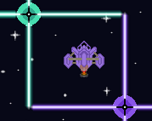
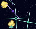
Some UI, information is missing, but otherwise, nice work!!
Play FasterThanLazers
FasterThanLazers's itch.io pageResults
| Criteria | Rank | Score* | Raw Score |
| Did you make it in 3 hours (put 5 by default) | #3 | 4.778 | 4.778 |
| Overall | #4 | 3.815 | 3.815 |
| Audio | #5 | 3.667 | 3.667 |
| Visuals | #7 | 3.667 | 3.667 |
| How well does the game fit the theme? | #8 | 4.333 | 4.333 |
| How much do you enjoy the game overall? | #10 | 3.222 | 3.222 |
| Gameplay | #11 | 3.222 | 3.222 |
Ranked from 9 ratings. Score is adjusted from raw score by the median number of ratings per game in the jam.
How long was your dev time?
3h10 (35' audio and 1h sprites, 1h25 code and 10' bugfix)
Comments
Well done, the game works well for such a short jam! Simple mechanic but smart way of using it with the lasers rotating and all.
Yeah, I might have gone the wrong way.. The explosion joke was kinda true because I tried polishing a 3 hour game (and simply saying that looks like nonsense) and the 5 minutes quickly became more than 20. On the other hand, that's a quick way to learn something, such as focusing on clarity and objectives before polishing.. Thanks for playing though !
Hi!
It's a nice game. Very different from your usual space shooters, as it does not have the shooting lol.
At first I had a little problem about what is the objective. I crashed on one of the similar color orb, so I thought I could break them, but turns out they damage me. It would be great if you include the 'how to play' section in either the game's ui or description so other people don't get confused.
Cool way to use the theme, but I had to read the comments to figure out how to play the game. Some useful UI would have really put this game over the top.
Always have to respect jammers who include music in the development time!
I turned invisible after dying a few times. So there's no penalty for different laser color other than the audio effect? Oh wait. Yeah there is. Would've been great to show the health. Time on music was well spent. Game starts a bit slow and easy.
Thank you for playing ! Yes, you basically starts with 5 (maybe 6..) health, and damages remove 1, but passing through a laser with the right color does not deal damages. It would have been clearer with some UI indeed ! I started with music to be sure to have one even if it meant less features in the end...


Leave a comment
Log in with itch.io to leave a comment.