Play game
Attack of the Time Gobbler - 2 Plane Flying's itch.io pageResults
| Criteria | Rank | Score* | Raw Score |
| Innovation | #85 | 2.887 | 3.333 |
| Relevance To Theme | #97 | 3.272 | 3.778 |
| Overall | #98 | 2.983 | 3.444 |
| Design | #110 | 2.791 | 3.222 |
Ranked from 9 ratings. Score is adjusted from raw score by the median number of ratings per game in the jam.
Are you a Beginner?
Yes
Does your team consist of all Beginners?
Yes, we both have no previous experience
Discord Names(s) with Tags
Soundboyy#3975
Leave a comment
Log in with itch.io to leave a comment.


Comments
I really like the idea of two perspectives of the same ship it feels very unique :). One thing that might be a nice touch would be to have motions have a visible effect on the other perspective (if you move up/down, your ship looks tilted on the left/right perspective, and vice-versa).
I also didn't quite understand the need for the orange/blue outlines. I know that one means you need to dodge on one side, and the other on the other side, but I feel like that doesn't need as strong a visual indicator because you can see by looking at one side of the screen that the whole path is blocked but the other it isn't. I think it's perfectly acceptable that people would learn to manuever without the need for the colors. Which gives you more creative freedom with different colors on your maps :). (Also to be completely honest, the description of the colors actually confused me more at first than if I just played)
Congrats on your first game! It was really well done :)
Hey, thanks for the great feedback!
I'm glad you liked the concept, our main goal was to come up with something original that also fit the theme well. It's good to see that that translated :)
The visible motions is also a great idea and something we were looking to implement . We had a few sprites for this ready to go, but unfortunately by the end we were rushing a bit to make the deadline and didn't get round to putting them in. This was out first Jam and working under such a short deadline was definitely a bit of a learning curve for us!
Regarding the outlines, we initially planned to have a few more levels and/or perhaps even a boss fight of some sort, but again we ran out of time. For these we were looking at increasing the difficulty by both speeding up the ship and putting the objects closer together. The idea behind the outlines was to be a quick visual guide in situtations where you didn't have much time to react, but I agree that these werent particularly necessary for the two levels we actually managed to get down. I can see why the description may have been confusing too!
Thanks again for taking the time to play and rate the game. We hope you enjoyed it :)
Nice game :) Great idea! I liked the music and sounds, well done!
Thanks for the feedback! I'm glad you enjoyed it :)
Everything about this game is perfect. Everything.
Thanks for taking a look at the game :) Really glad you enjoyed it!
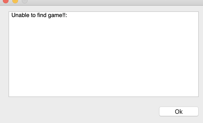
It says
Hey, thanks for letting me know, I'll have a look into it!
Yep, it says its damage on my mac too.Thanks for letting me know. I’m not sure if I’m allowed to reupload the mac file whilst the ratings are still open :(
This is very fun and well presented. It plays with two screens without being impossible to play. Nice job!
Hey thanks for the feedback! I'm glad you enjoyed it :) We were a bit wary of it being confusing so your comment means a lot!