Indie game storeFree gamesFun gamesHorror games
Game developmentAssetsComics
SalesBundles
Jobs
TagsGame Engines
A jam submission

All SwordsView game page

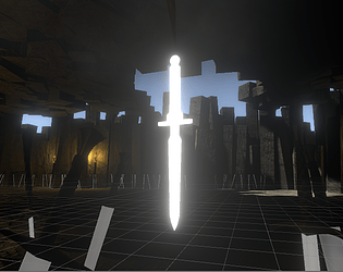
An unforgiving hack 'N slash where death is your advantage.
Submitted by Yungshizzle (@youngestshizzle) — 4 hours, 19 minutes before the deadline
Add to collection

Play game

All Swords's itch.io page

Results

CriteriaRankScore*Raw Score
Graphics/Animation#793.6673.667
Overall#1703.1113.111
Fun/Design#1713.2223.222
Theme/Limitation#1853.2223.222
Music/Sound#1942.7782.778
Technical Implementation#2362.6672.667

Ranked from 9 ratings. Score is adjusted from raw score by the median number of ratings per game in the jam.

How does your game utilize the limitation and theme?
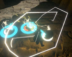
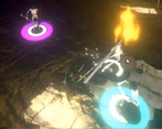
Collect swords to gain attack range and special attack ability. Go BACK to grave stone to retrieve swords.

What was your team size?

Solo

You worked alone

Which of the following content in your game is NOT 100% newly made for the jam?

Art/Animation

Code/Scripting

(Other than general-purpose custom code)

Music/Sound

Affirm you have followed ALL jam rules. (Select all below or your entry will be disqualified.)

We have credited all assets used in the game including our own name(s) or team name(s)

All original game code and original assets were made during the jam period

The game does not include NSFW or hateful content

The game works on the web or as a Windows 10 download

We have answered all submission questions honestly and completely

Leave a comment

Log in with itch.io to leave a comment.

Comments

Submitted

Really liked the idea of swords being a pickup, made the environmental design very interesting.

Submitted(+1)

Very cool game and I appreciate how adventurous you were with the scope. It's cool to see some 3d games with more complex ideas being in a game jam. Nice entry! 

Submitted(+2)

Trying to move the camera was really hard, I kept moving it too far. Maybe the mouse speed could be adjustable? And maybe make some way for the camera to see what's going on without constantly zooming in and out out of the player's control. I guess rotating cameras work best in openish environment where they don't constantly collide with the walls. I think a better way to handle indoor environments is to have the camera move up and see things from above: that does limit how far you can see (not like the walls don't do that too), but it makes sure anything near the player is visible. And when fighting the camera, it's hard to also fight enemies, especially if there's several of them at the same time. So yeah, I haven't got out of that cave, so I don't know what's outside, or how much there is.

I think the story text at the start looks a bit weird. The line that ends with "press enter to continue" is wider than the other text. Maybe it could be on a line by itself. And have the box be slightly taller. Right now there's a small margin on the right and a larger one on the left, but almost none in the top and probably none in the bottom. And I can read it just fine, but I'd suggest making the font slightly bigger. But at least it's a readable font and not a decoration-only font. With the width the box has right now, moving the "press enter" bit to a new line would probably make enough room horizontally to make the font larger without making the box cover everything. And even then, if enemies don't spawn while there's text on the screen (just don't let the player walk away keeping the text on, but I tried to do that and it did remove the text), I don't think text taking up a large chunk of the screen would be a problem. Maybe if you have time, you could even take the space outside the box and use it to show images of the places the text mentions, although that would probably require making those images.

Submitted

Maybe you could lower the sensitivity next time, but overall a really nice game.

Submitted(+1)

loved the graphics! Very nice game!

It'll be nice if you check out our game too (:

Submitted (1 edit) (+1)

Your game have a really good base, it has a lot of potential. The graphics looks really good!

You should make the camera movement less abrupt, I felt it was too fast.

Keep it up!

Check my game and tell me in what I can improve when you can!

(+1)

You have a game that potentially could be really great. I liked the battle system. The graphics were amazing. I didnt undertand how to travel there and back between the grave and the battlefield, i just suddenly got transported and could go back anymore. 


Feel free to play my game  

Developer

MUCH less laggy copy here (x4 the FPS on my desktop): https://yungshizzle.itch.io/all-swords-backup

Submitted(+1)

Just to be clear, I didn't play the full game because it lagged to much for me, sorry!

But from what I see it has great graphics and I liked how you could grab swords from the ground to use a powerful attack on the enemies, but here is some feedback

- You can die way too quickly, try giving the player some invencible seconds after getting hit, or else it will be almost impossible to kill a bunch of enemies together

- Really laggy stuff, at least for me, even tho I don't have that bad of a PC

- It's really hard to understand what the guy at the start is saying, the text is not big and you can press enter a lot of times and dont even know you skipped

Just polish it and it will be fine and playable, if you make another polished version after the jam ends, contact me and I will take a closer look, for now its almost impossible to play, thanks.