On Sale: GamesAssetsToolsTabletopComics
Indie game storeFree gamesFun gamesHorror games
Game developmentAssetsComics
SalesBundles
Jobs
TagsGame Engines

oh wow these are stunning. and nostalgic!

i hope you dont mind a technical question, bc i am rather rubbish at colors - if i were to make moon phases, do you suggest a step over in hue or in reducing brightness? or both? to make the shadow. i know enough to simply keep the moonglow in place, but creating a shadow that still shows the moon's features means i'm moving the pixel colors over... somewhere. in the palette.

(2 edits) (-1)

So glad you like it.

Answering your question, it depends on the pallete your are using. The more colors in your pallette, the more easy will be for lightning and shadowing; however i would recommend steping over your color pallete.

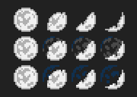
I share with you this example:

This are just examples but i think the third one looks better.

In both second and third row, i just reused the same colors that my pallette already have. (Of course, you can adapt it to your own pallette).

In the case i want, for example: the second row style but the shadow to be more darker. Beacuse that's the most "dark gray" that my pallette have, i would need to add that new color to my pallete and "reorganize my pallette".

Hope you find this answer helpful!

Regards.