your little gnome crop! squeee they are very cute
5ig0p
Recent community posts
could we ask a favor ? - i mean its not urgent since with our work piling up we may never finish this project - but we have had difficulties downloading (and sometimes sample playing) huge files like this. if you have it, could you point us to something that is after the victory + the losses were still massive?
a lot of the game offerings will either do Big Victory! Revving Up! or Now We're Very Super Sad ... but usually not both at the same time. like in the middle of a story. kind of like how in LOTR getting back to the Shire wasn't an instant happy ending but they were still glad to be back? something like that. if it helps, the setting is meadow / field / grasses. thanks, sorry for the bother
hey i dunno whats up but several of your generators are cutting off about 50-60 pixels, without touching the margin or overlay text. changing zooms and sizes doesn't affect it.
in regular it cuts it off on the right oops right and bottom. in full screen, it's the bottom edge which falls off. i cannot figure out if there's an element from itch or elsewhere doing it, but i don't think it's the ratings bar
huh. if we rotate, it then cuts off all the elements, margin and compass etc.
oh i see! it's every element, incl child elements. longer text gets its own margin cut off too.
like there is something wrong here
here's the sequence: enter full url with seed number right after '?'
then go to tags - tags appear to be right but the map is all wrong - and click generate from there
this is what happens
162328916=1623289160&tags=leafy%2Csecular%2Clarge%2Carea&seed=1741981272
it tried to generate a new seed TWICE because we entered it twice. only the middle one is what we entered first. see what i mean?
extremely sad that my old seed refuses to be entered into the new generator, so i cant link it to dwellings. via browser url or permalink or tags then permalink - all of them change the seed. whatever the url says in my browser (FF) is a lie, we go back to permalink and it's different. now have impossible task of a giant neighborhood and hand-making all those floorplans.
isn't there *any* way for us to see the old seeds? it worked in the earlier versions. now it's wiped out the moment we press enter.
oh i see! gosh, that's a lot of work for you... yeah listing out the dimensions or the proportions doesn't make any sense. but it will bother me forever to make a custom icon that doesn't line up with the others. could we view the central lines? like halving all the symmetrical/round icons? or! a placeholder icon that's easy to erase, like a spacer. like if we wanted to squeeze a custom icon in between the defaults, currently it'd take us so long to figure out what's going to run over. since it's not a fixed table, they're just floating to alignment, right? hmmm. tl;dr once we take it to another program, it's a problem of spacing , centering, and sizing, and there are no guides to keep everything even. it turns a 30 second job with a wingdings font into squinting at measurements for an hour. yeah, i think a spacer option would work best here, especially since you have asymmetric and irregular icons, and in different sizes.
as for the BB code, i just have a lot of longer title-text to put on the shields that's not numbers. like on the forms on the right hand column? so we needed a way to resize the fonts - and they do fit, visually! but the letter limit prevented entering them bc it counts the very lengthy BB code as part of the form. so that too we'd have to enter manually on our own program.
amazing ~
however, there is an extremely shrill, grating squeaking going on with the double-beats around 6:39 Always. like a glass bottle getting scraped on rock? i do not know the term - all that percussion sounded too "close", then by that time-check, it came from the back of skull. my migraine prone friends might have to bail out
your style is unique and i love all the details. they're so legible too
like legible enough that i think - spitballing, here - if someone wanted to shift time-of-day lighting / atmosphere, the details would still come through nicely
i'd like to see lots of people use this so maybe - is there a palette included? that would make it easier to design characters to fit your spaces. which totally needs to happen. i can see this fitting a lot of different game types.
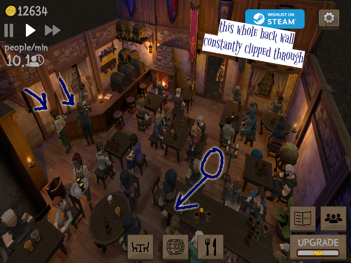
some late game weirdness. the most annoying is adding a plant next to the curtains causes instant waitstaff freezing. also they're going outside to service that corner - and through the wall. the right-hand wall from the door is the most frequent offender
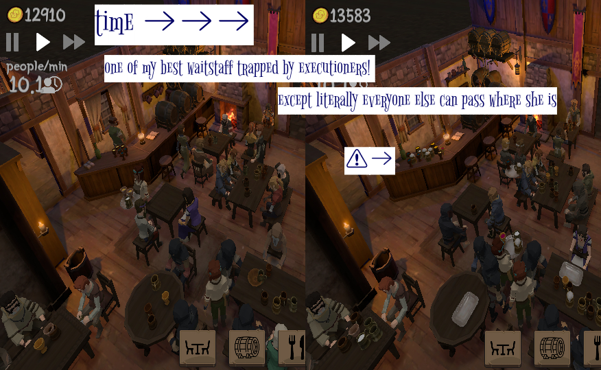
 (we tried to put as many in one shot) we could not recreate the large numbers of guests ending their walk early and sliding through tables in their sit-down motion. but yes they moonwalked through the furniture. second are the waitstaff just freezing - you can see the jobs still in front of them
 most of the snags were around this round table but not always. they'll just stop dead and no amount of changing interfaces or clicking gets them going again. all of the customer walk-outs due to that
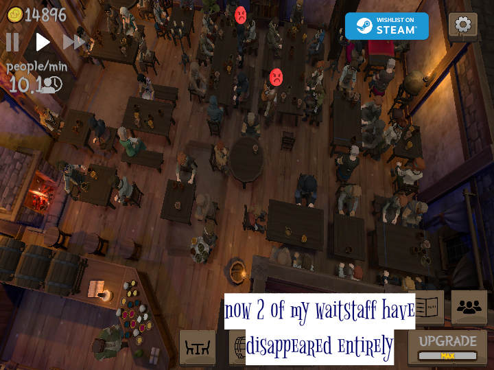
and this, i do not know. you can see my 1 waitstaff returning to the bar. looked everywhere could not find the other 2. many minutes pass. i had other business, came back and everyone was back.
EDIT coming back nearly 2x later: i fired Olga for disappearing. hired replacement. now i have 4 waitstaff because Olga reappears by the bar and stands there; i cannot fire her. meanwhile, ghost of Olga is... i think it is some of the kitchen dishes are being held hostage by her, bc the drinks are disappearing as usual. the only other clue is she is at max level and yet her XP is half, and there is an exclamation point next to it.

(again, if you want 4-seat tables to be normal, you have to give us that lost row of spaces with the stools no one can use. pathways with furniture in them are just going to add up to more clipping problems, and those in turn affect your gameplay)
and. your bookshelves are 1-2 shelves too high. they don't look sturdy and they obstruct nearly every angle of screenshot.
if you want a low (and low-poly) decoration without all those angles to cause clipping glitches, a decorative pot would have been standard. you don't have to *explain* that it's for spitting / chewing tobacco. the kids will just think it's a nice pot.
it would be awesome if some of the customers paused at the door and looked around before walking forward to sit down. yes it will cause so many problems at the entrance, so i realize the trouble with that. it would just be cool
and if you can't give the cook a ladle - that would be difficult - at least give him some oven mitts! he has dragon hands right now
could play this for hours. great game
* mathematically your front entrance area needs to be at least one square wider. didn't account for diagonal motion of the pathways = someone's going to get clipped, either by the waitstaff or patrons entering. none the layouts will do anything but waste space otherwise. part of your problem is where you put the fireplace. i'm. not sure it should be right next to the alcohol which evaporates or blows up, either. replace the far light-source with it, and the fireplace will continue to heat the *whole room* even as the tavern expands
* if you reeeeally need something visual there, then let us customize our tavern name and unfurl it there next to the bar :)
* not impressed by your gender roles :: jobs, dude. enough of my ttrpg friends agonize over mixing that up for their npcs, the audience is no longer as receptive. please don't perpetuate that. heck, if a second mesh is too much then mix up their names and see how many of ~those~ guys go scream at you
* say, everyone's pretty pale around here, eh? in before someone points out it's historically inaccurate to have a samey-same skin tone at a *tavern* where *everyone* stops
* ah yes. the employees increase their efficiency steadily and never get raises. you are a few hundred years early for the capitalism my friend. i don't want to be the tavern owner that gets pitchforked.
* the idle staff facing the bar like blair witch project is a little off-putting? i kind of want to see them in the corner gossiping
* there is something wrong with the efficiency of the bussing. i have three cleaning but the tables remain cluttered
* related to that, i would love love love a mechanic where if too many cups are in front of a customer, they get cut off to food, water, lemonade. i mean we can visually see the new drinks clipping out the empties. i think it would help a lot of people struggling with alcoholism, which is a right bitch, to see a barkeep doing their job
* yeah you should probably curb your simulation-no-ceiling-consumption maths before you do something ambitious like cater to the furries. because that demographic is going to shred through that, code and all. and you definitely want them on your side. as it is, i cannot recommend it to that crowd. yet.
but on a lighter note, i wanted to thank OP for not only separating the files, but adding descriptions that can be read on screen-readers and other adaptive tech. people who have no vision, low vision, and the not actually that rare colorblindness should have thematic ninja, too. which has been part of ninja media for *decades*.
...it would be a real awful shame if anyone thought those people are contributing nothing to the itch community.
.....not all of us are any good at picking palettes, even with palette generators. Much less matching them to themes. That is a skill, which is surprise, something people can sell. Particularly since one of the options is dumping the originals in an artist-thieving a.i. machine.
also i am curious how less than 1mb of files has set you off? There are literally asset packs made of stolen art numbering in the 100s and 1000s but this is your hill? of all the things to "cause data bloat"? will you come after me for using a png, next, instead of a gif?
like, dude, i seriously think you are projecting very hard on someone else. what community are you enriching, again?
i bet you think grandma's quilts don't cost anything and are taking up space.
i hate to break it to you but SEGA was going in the 1990s and emulating contemporary tunes, and that means this is 100% 1980s music, just sped up. this is neon light on big-shouldered suits and chunky jewelry and *hairspray* (a decade before they called it bling). this is some guy finger-gunning, and a wink with a clicking tongue. you want to find your audience i guess the techno dance crowds will find it, but that genre is remixing *from* something. just came around in a circle to the source: totally awesome
i'm glad someone still thinks our green-screen futurism is cool and cutting-edge, but man. some of us are still alive lol
does the tub come empty?
i'd just like to say we did actually do that. hard to believe but there are unpopulated areas where you can just set up a bathtub and soak out in the open air. (it was a pain to clean up, so there was a bit more 'setup' involved than indoors)
i regret never asking my grandfather how he got multiple tubs up that mountain but he'd be amused to see it in a game
love this game
i do want to beg for at least one extra art for the 'win' condition as it's so pretty but then the blank text is kinda a let-down (esp with no material payoff)
and i think it would be a better idea to de-couple the seed generation from the deck, and attach it to the store. you could even level up the seed types that way, if you want to do more complexity. i've had a lot of attack waves with no seeds in the ground, not for lack of resources but no draws with seeds, which increases in odds the bigger the deck
im not very far but enemies shooting at me from outside the clickable screen is meh?
mostly though, there's got to be a more accessible way to look up resource origins - not buried in submenus - and differentiate item shapes aka: legibility. i keep trying to gather for crafts and im in the wrong map for several rounds
other than that really hits the spot
edit: some of these item drops are only going up 10-20 at a time after several stages. sometimes switching lands helps but that also wipes out the stage progress. possible that the loot alert is going up but inventory isn't


