 I remember seeing progress of this in the Discord and thinking 'wow this looks really cool...but they do know they've got to make a game to go with it though, right?'
And at the current state, it kind of reflects that.
That said, the page? absolutely stunning, so cool, the attention to detail, all the little odds and ends, the movement of the manual with the page flipping, and everything encompassing that old school vibe even down to the carpeting. Not to mention the parody cartridge names and other bits, and the commercial footage with clips from other jam participants was a real neat touch.
Graphic design game on point. I hope to make something this cool if I ever commercially publish a game on this site.
The gameplay itself, not much to speak on right now, it's functional, parts are there, but feels like just a set piece so far, walk around smack stuff grab a key and repeat.
The code thing is a neat gimmick and as a nod to the old copy protection habits of old, is interesting
Some issues I found were enemies walking through doors and hitting you when they weren't visible on screen yet, remedied by me slashing like a lunatic at every entrance I went through, but probably not ideal, ha.
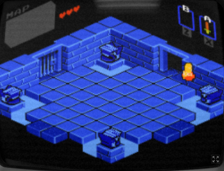
The Y sorting (I believe that's the right term) could be tweaked a bit to allow the pillar in the foreground of the door to render in front of the player when in the entrance area (as in the screenshot), which'd really help sell the pseudo 3D nature of the graphics.
I'm an absolute sucker for isometric games though, it's actually my favorite style of pixel art (and I know how finicky it can be to work with so props for that!) Looks real cool~
Hope to see you continue this and what you do in the future.
There's clearly a lot of love for the era on display here, and I'd like to see it become something truly special.

