Sadly devs have never communicated the "good reason" for years a simple post or message with an explanation like: with the current code it is impossible or something like that would do wonders
Viewing post in Exclude tags feature
Actually I do not remember any official statement about this. But this is just policy. Itch does not make official statements about most things. This is public community. While leafo sometimes posts here and even sometimes makes announcements, a thing like stating reasons for anything, is rather rare. Maybe for something concrete, like size limitations. But for features or lack thereof, no.
So all this is community speculations and discussion. But try to deduce from these three facts:
Single tag exclusion was developed by leafo in less than a day some six years ago.
The feature was not removed since then.
But not expanded upon either.
My deductions are, that single exclusion was super easy, and multiple exclusion is too much of a hassle to implement compared to the demand. They have server statistics, they know how often single tag exclusion is used.
And more imporantly, they know how many people used the feedback button to suggest features. The very first topic of the feedback button drop down box is feature request.
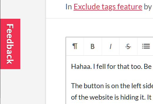
Hahaa. I fell for that too. Be sure to give this as a feedback too!
The button is on the left side in your settings and profile and some other pages (like communty - when replying to a post - as well). But you can't see it, because the CSS of the website is hiding it. It does not show the button, if your zoom is too high. Reduze the size of the site, so that there are more absolute pixels for width.
I also lose the feed and community button everytime there is a sale. They get pushed under the search box.
If they can't even do this properly, do you really expect them to introduce proper tag exclusion, as a gui element? Now that I think about it, maybe that is the real reason ;-) They do not want to redesign the page to accomodate for negative searching.
Not even Steam does this good. I had to search for the exclusion feature there. First I would have to enter search by searching blank and hitting enter to even see the filtering by tags and other stuff. Every tag of their limited list has a checkbox on the left and barely visible on the right a minus sign.
On Itch there is a dropdown tag box that is write in on top. Many people do not even know that you can freely write a tag in there. It took me months to realize that.


