Hey there! I wanted to submit this feedback to your survey but didn't see a space big enough to elaborate what I wanted to say, so I hope its okay to do here.
I have zero problems with the cutscenes and the story--just so you know the mom character's walk animation took me OUT, it was so funny. All of the cutscene animations were spectacular. I also think the core gameplay mechanic is really strong and unique, but I had a hard time getting the hang of it on the first dance battle because of the lack of hand holding, so I made some notes about how to potentially ease players into it more.
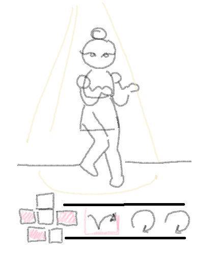
1. Understanding the movement that I was was supposed to mimic was intuitive most of the time, however there were some moves Ring was doing that I was like--how do I make that shape? I like that I am able to move at the same time as her to practice before it is my turn, but adding some tutorial arrows underneath her avatar to give a hint of how the mouse should move would be helpful, as well as the parts of the body she/I am supposed to move (this is only for the first few levels while people get a hang of the controls, and probably should be toggleable in the options menu--otherwise, the glowing body parts signifier is enough). The little movement hint would be similar to other dance games like Just Dance or Dance Central. This is not technically a dance game but the patterns are recognizable already so might as well use 'em. I drew a sketch below:

Also having a spotlight on whose turn it is would be a nice additional touch. Not necessary, but keeps the visuals clean.
2. There was a long stretch of music in the dance battle where nothing happened; it was neither the player's turn nor Ring's. I think we were all just waiting for the beat to drop? This should definitely be a freestyle section, or perhaps Ring and the player can trade some witty banter, or even both, whatever can fill the space so it doesn't feel dead.
3. I think the score at the top is fine, but in order for a player to understand that they are doing well until the screen at the very end telling them if they passed/failed, they need a visual representation that compares their performance to a benchmark while they are playing. The easiest way to do this is by having a "Score to beat" at the very top, but again dance games have paved the way with the much more readable "success bar". So players can see at a glance: Bar is high, I'm doing good, or bar is low, I'm doing not good. This would be a lot of additional work, but also adding in an aura for players who are doing really well and chaining their tricks just feels really good and keeps the visuals clean.
Overall I am a huge fan of this game, If the level of quality I've seen so far continues all the way to the end of production I truly believe it has the potential a hit because it was SO funny, and the skill level could actually get quite high so watching players get good at this will be really interesting. PITCH THIS GAME TO PUBLISHERS so you can get the funding to finish it!
Thanks for reading this, and I wish the whole talented team success in their future ventures!

