- itch.io page styling immediately makes it look unique
- Had to grab my microscope for this one, hehe

- Great QoL with the sound slider options, but they could do with some samples playing during adjustment so that I can tell what's too loud or quiet
- The uh... loading screen? was gone too quickly, I could only see "this was made" and then it was gone
- The "pressed a button" sound is a bit startling
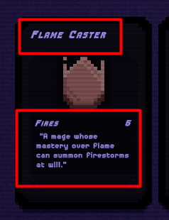
- All of this text is very difficult to read (I'm on Fullscreen 1920x1080)

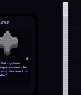
- The last entry in the merge book is cut off (I scrolled down all the way)

- Merge book scrolling via mouse wheel is very slow. Scrolling by grabbing the scrollbar is fine, but the bar is a bit difficult to see.

- I could not figure out how merging works: I looked up a combo in the merge book, had all the cards, but clicking on merge did nothing. "Activating" (clicking) only the three cards for the combo and then clicking merge also did nothing. Having those three cards in the middle row, clicking merge, nothing. Same goes for the top row.
- The amount of info in the merge book feels a bit overwhelming
Disclaimer: These are just my opinions, so a lot of it is very subjective.

