Hey there! Congrats on posting the demo once again! Starting a project and getting to release even just the demo takes a lot of effort and courage, so remembering how you've been wanting to make this from a long time ago and finally doing it is great and awesome! You should pat yourself in the back for taking the first step!
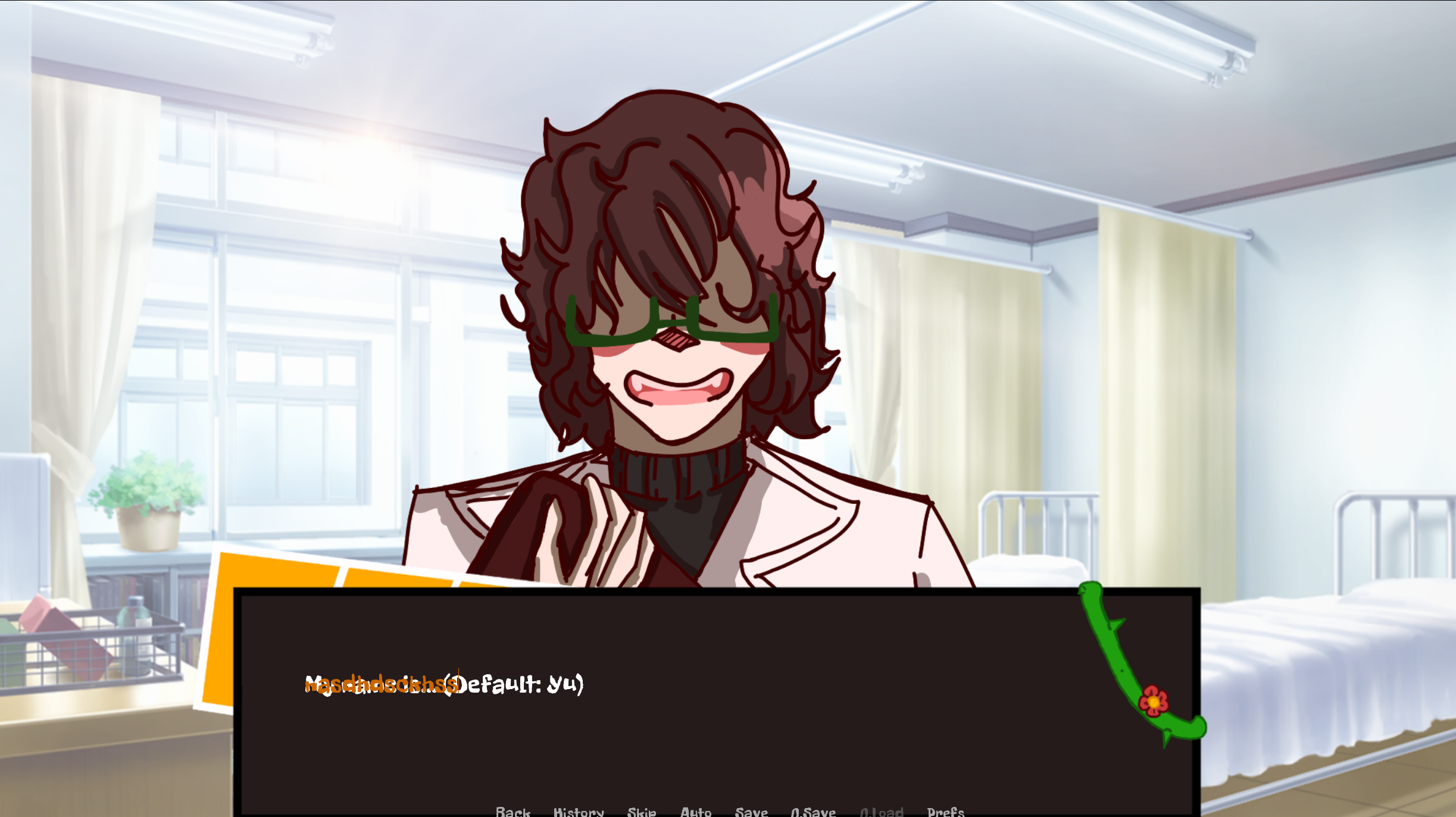
The art is cute, the main menu is pretty stylish, and the storyline is pretty interesting! However, there are some things that I feel you could do to make the game better. One is adding some music. You can use royalty free music as a BGM (my usual go to is dova syndrome, but anywhere else is good too). Another one is changing the dialogue font to something more readable (the one you use is okay for headers and menu choice, but it's not as good as a body font as it's too thick and messy. I recommend something a bit simpler like sans serif fonts). And the last thing is the name input. The input is placed on top of the question and it makes it harder to see.

To remedy that, maybe this tutorial might help (it's stylish and unique too!) :
Those are all just recommendations though! Whether you want to heed these or not is up to you since you're the developer and you have the freedom to do whatever you want! I wish you nothing but the best and good luck with the project! :D
